GARVEE 2 Pack 12″ x 24″ Stainless Steel Wall Mount Shelf NSF Certified with 10 S Hooks Metal Multifunctional Storage Rack with Backplash for Hanging Pots, Pans,cookware in Home and
Original price was: $98.99.$29.70Current price is: $29.70.
Description
GARVEE 2 Pack 12″ x 24″ Stainless Steel Wall Mount Shelf NSF Certified with 10 S Hooks Metal Multifunctional Storage Rack with Backplash for Hanging Pots, Pans,cookware in Home and
- Convenient 2-Pack: Set of two 12″ x 24″ stainless steel wall mount shelves, providing ample storage for kitchen essentials.
- Easy to Clean: Smooth surface and removable S hooks allow for effortless maintenance and hygienic kitchen environment.
- Strong Load-Bearing: Robust construction with strong weight capacity, providing secure storage for pots, pans, and cookware.
- NSF Certified: Meets stringent NSF standards for food safety, ensuring suitability for use in home and commercial kitchens.
- Versatile Storage Solution: Multifunctional racks with backsplash design, ideal for organizing and hanging various kitchen utensils and cookware.
Specifications
| Material | Metal |
| Color | 10S |
| Special Feature | Lined |
| Product Dimensions | 26″D x 8″W x 6″H |
| Shelf Type | Metal |
| Number of Shelves | 1 |
| Room Type | 1 |
| Assembly Required | No |
| Mounting Type | 1 |
| Recommended Uses For Product | Cookware |
| Included Components | Rod |
| Brand | GARVEE |
| Style | Traditional |
| UPC | 198290596157 |
| Part Number | 1 |
| Item Weight | 12.62 pounds |
| Size | 12″ W x 24″ L x 5.5″ H |
| Shape | Rectangular |
| Item Package Quantity | 1 |
| Special Features | Lined |
| Batteries Required? | No |
.aplus_module STANDARD_PRODUCT_ATTRIBUTES h3{
margin-bottom: 10px;
}
.responsive-table {
border-collapse: collapse;
width: 100%;
margin-bottom: 20px;
}
.responsive-table td {
border: 1px solid #ddd;
padding: 8px;
text-align: left;
}
.responsive-table tr:nth-child(odd) {
background-color: #F2F2F2;
}
.responsive-table tr:nth-child(even) {
background-color: #E6E6E6;
}
.responsive-table tr:hover {
background-color: #DDDDDD;
}
@media screen and (max-width: 800px) {
.responsive-table td {
box-sizing: border-box;
width: 100%;
text-align: left;
padding: 10px;
}
.responsive-table tr:nth-child(odd) td {
background-color: #F2F2F2;
}
.responsive-table tr:nth-child(even) td {
background-color: #E6E6E6;
}
.responsive-table tr:hover td {
background-color: #DDDDDD;
}
}
.aplus_module{
margin-bottom:24px;
}
.aplus_module img{
width:100%;
}
.aplus_module h1,h2,h3,h4,h5,h6{
margin:0 !important;
}
.count_imgs_wrap{
display:flex;
}
.count_imgs_wrap>div{
flex: 1;
margin-right: 30px;
}
.count_imgs_wrap>div:last-child {
margin-right: 0;
}
@media screen and (max-width:800px){
.count_imgs_wrap{
flex-direction: column;
}
.count_imgs_wrap>div{
margin-right: 0;
}
.count_imgs{
display:flex;
justify-content: center;
}
.count_imgs>img{
width:auto;
max-width:100%;
}
}
.img_floatleft{
display:flex;
justify-content:space-between;
}
.leftwrap{
flex:3;
display:flex;
}
.lefttext{
margin:0 30px;
}
.lefttext>ul{
padding:0;
}
.lefttext>ul>li{
padding-bottom:18px;
}
.rightwrap{
flex:1;
}
.rightwrap_inner{
border-left:1px solid #dddddd;
padding-left:30px;
}
.rightwrap_inner>ul{
background-color: white;
padding:18px 32px;
border-radius: 8px;
}
@media screen and (max-width:800px){
.img_floatleft{
flex-direction: column;
}
.leftwrap{
flex-direction: column;
flex: initial;
}
.leftimage{
display:flex;
justify-content: center;
}
.leftimage>img{
max-width:100%;
width:auto;
}
.lefttext{
margin:0;
}
.lefttext>ul{
padding-left:32px;
}
.rightwrap{
flex: initial;
}
.rightwrap_inner{
border-left:0;
padding-left:0;
}
.rightwrap_inner>ul{
padding-right:0;
}
}
Additional information
| Size | 600x320x140 |
|---|
Related products
-
- Sale!
- Cleaning & Janitorial Supplies > Trash Cans & Wastebaskets > Pull Out Trash Cans, GARVEE
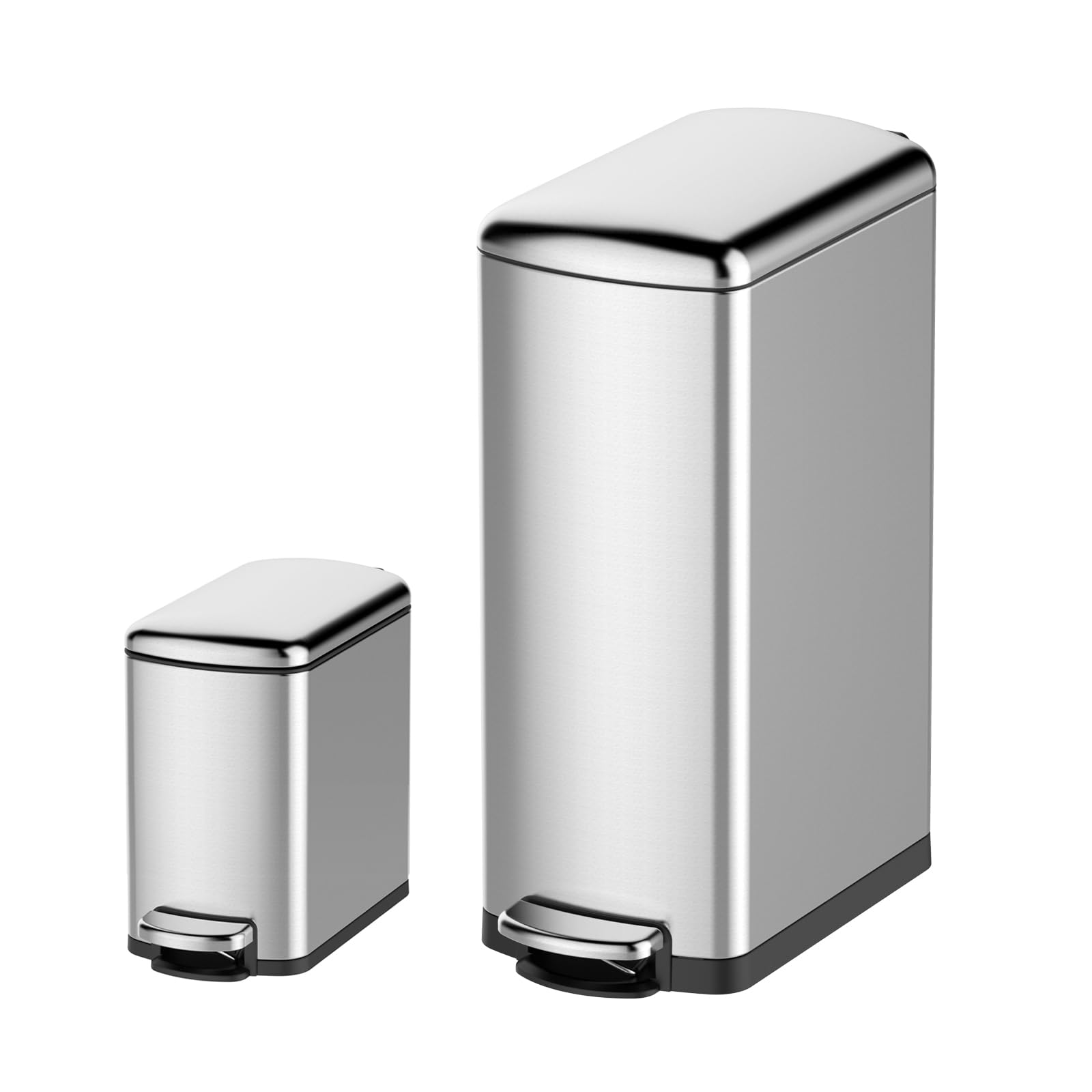
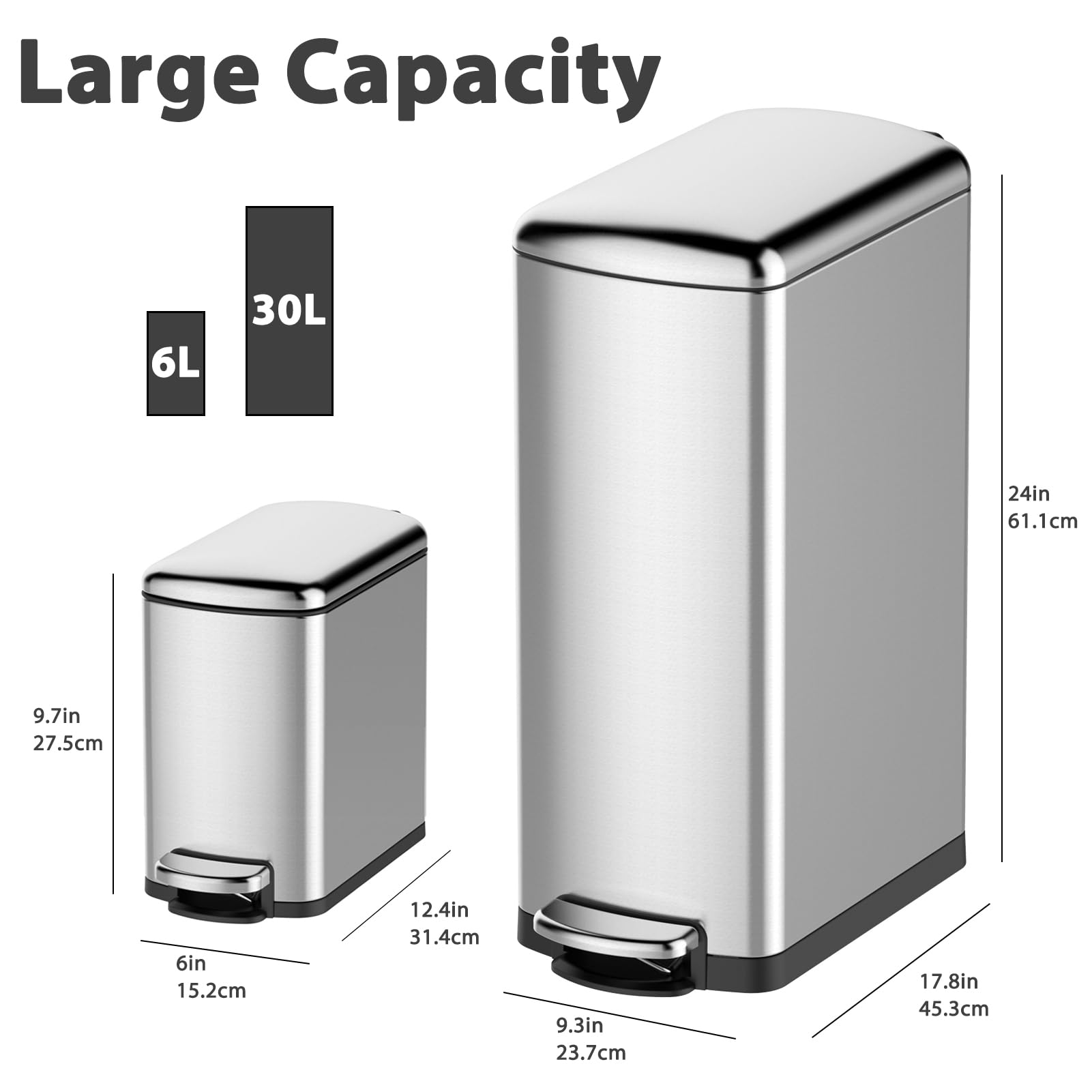
GARVEE Trash Can Combo Set, 8 Gallon and 1.6 Gallon Stainless Steel Step Trash Can for Office, Kitchen
- Original price was: $83.99.$25.20Current price is: $25.20.
- Select options This product has multiple variants. The options may be chosen on the product page
-
- Sale!
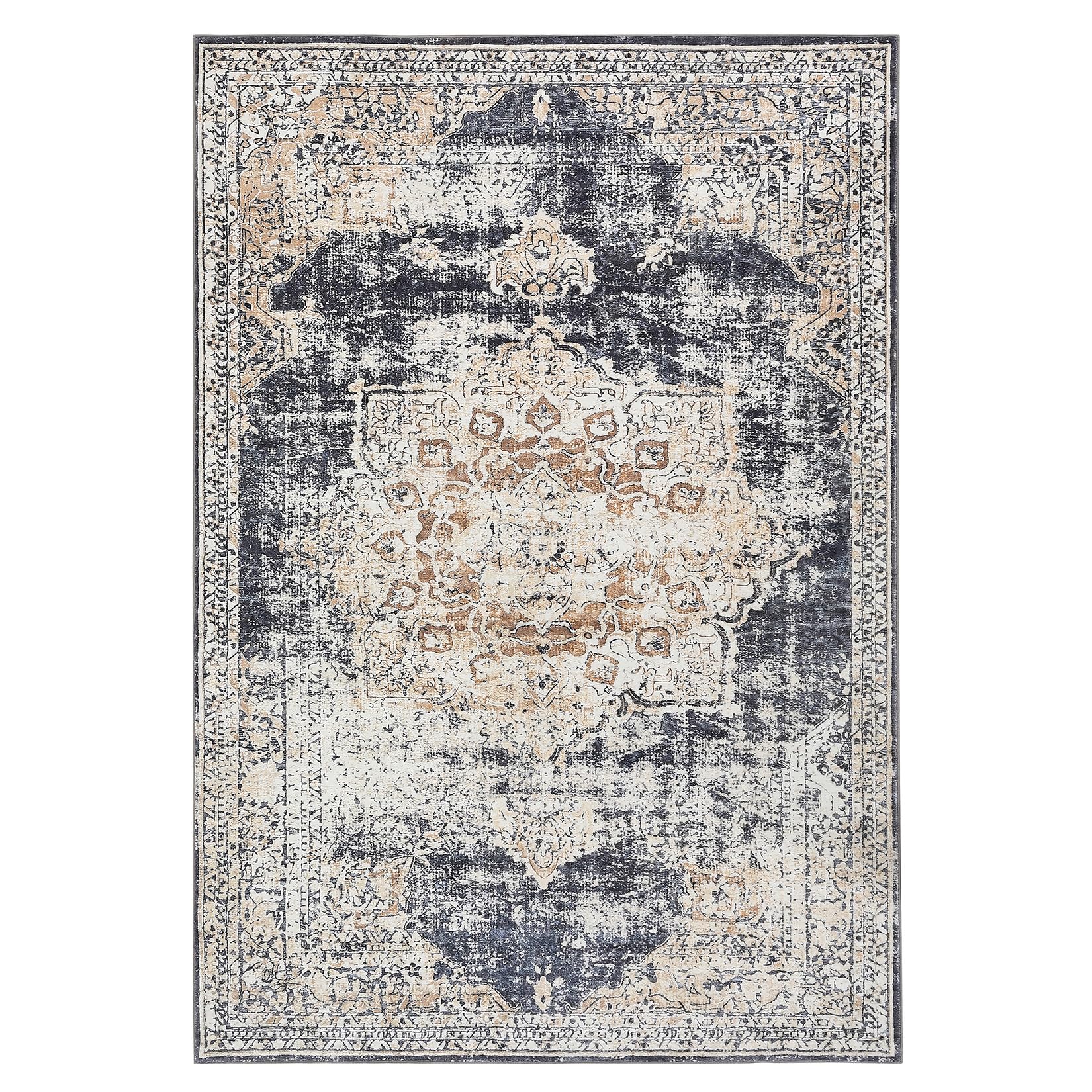
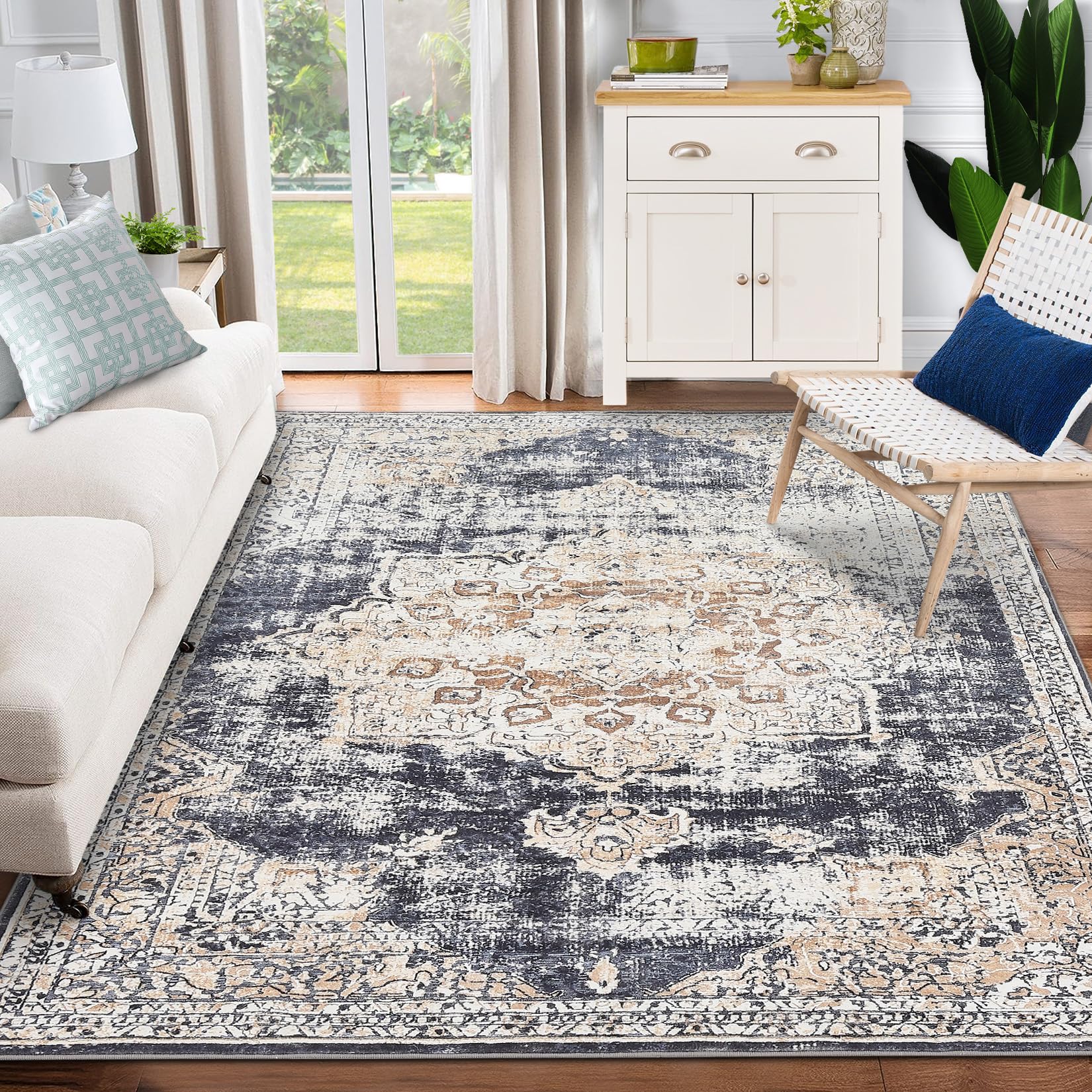
- GARVEE, Home & Kitchen > Rugs > Oriental Rugs
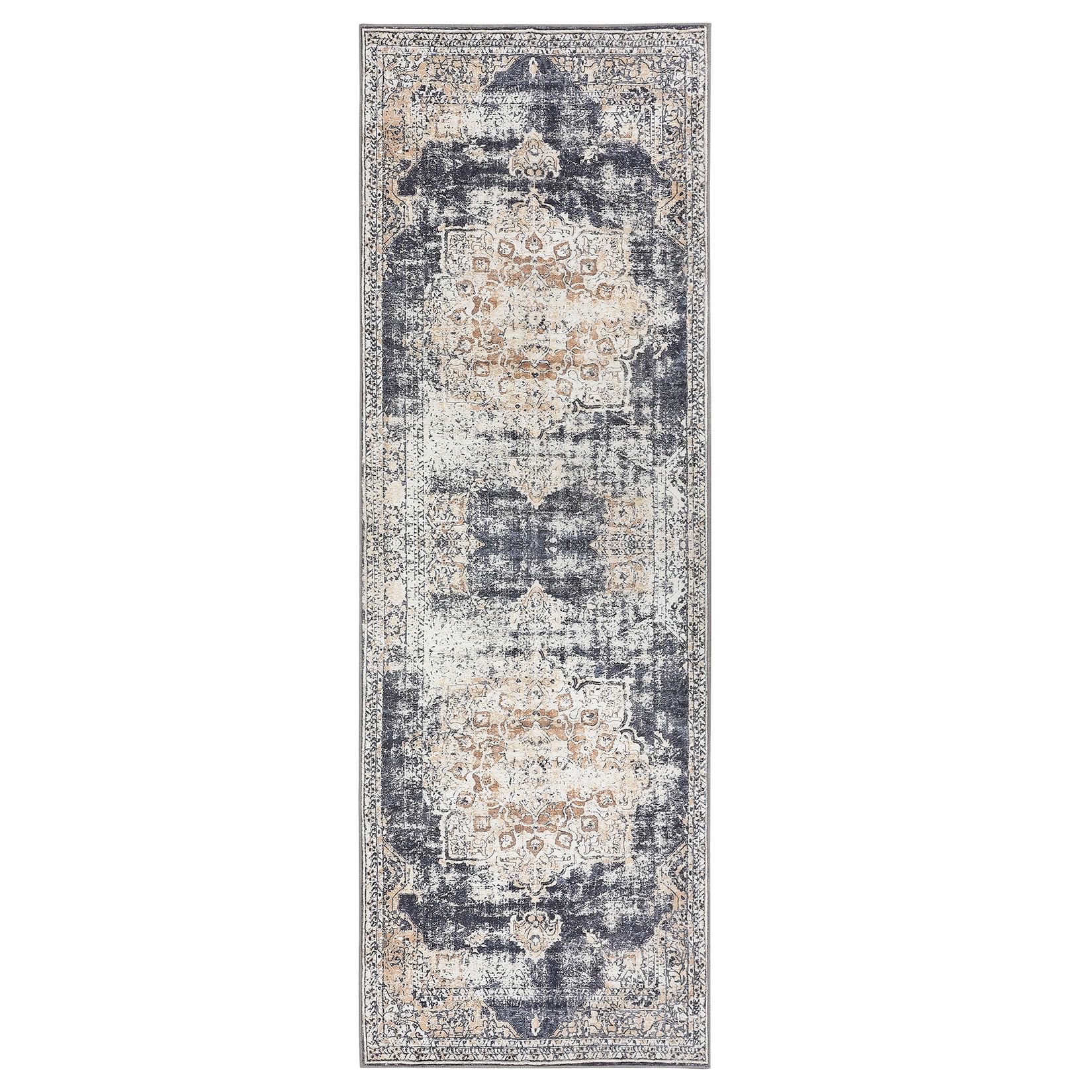
GARVEE – Alfombra clásico Lavable, de 2 x 6 Pulgadas, con diseño de medallón Oriental, Parte Trasera de Goma de Perfil bajo, Ideal para Sala de Estar, Comedor, recámara, Oficina, Color Beige
- Original price was: $38.99.$15.60Current price is: $15.60.
- Select options This product has multiple variants. The options may be chosen on the product page
-
- Sale!
- GARVEE, Home & Kitchen > Rugs > Oriental Rugs
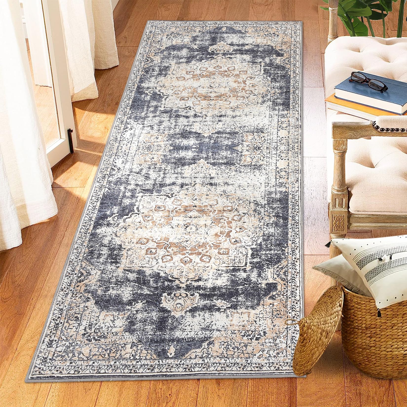
GARVEE – Alfombra clásico Lavable, con Estampado de medallón Oriental, con Respaldo de Goma de Perfil bajo, Ideal para Sala de Estar, Comedor, recámara, Oficina, Color Beige, 3 x 5 Pulgadas
- Original price was: $41.99.$16.80Current price is: $16.80.
- Select options This product has multiple variants. The options may be chosen on the product page