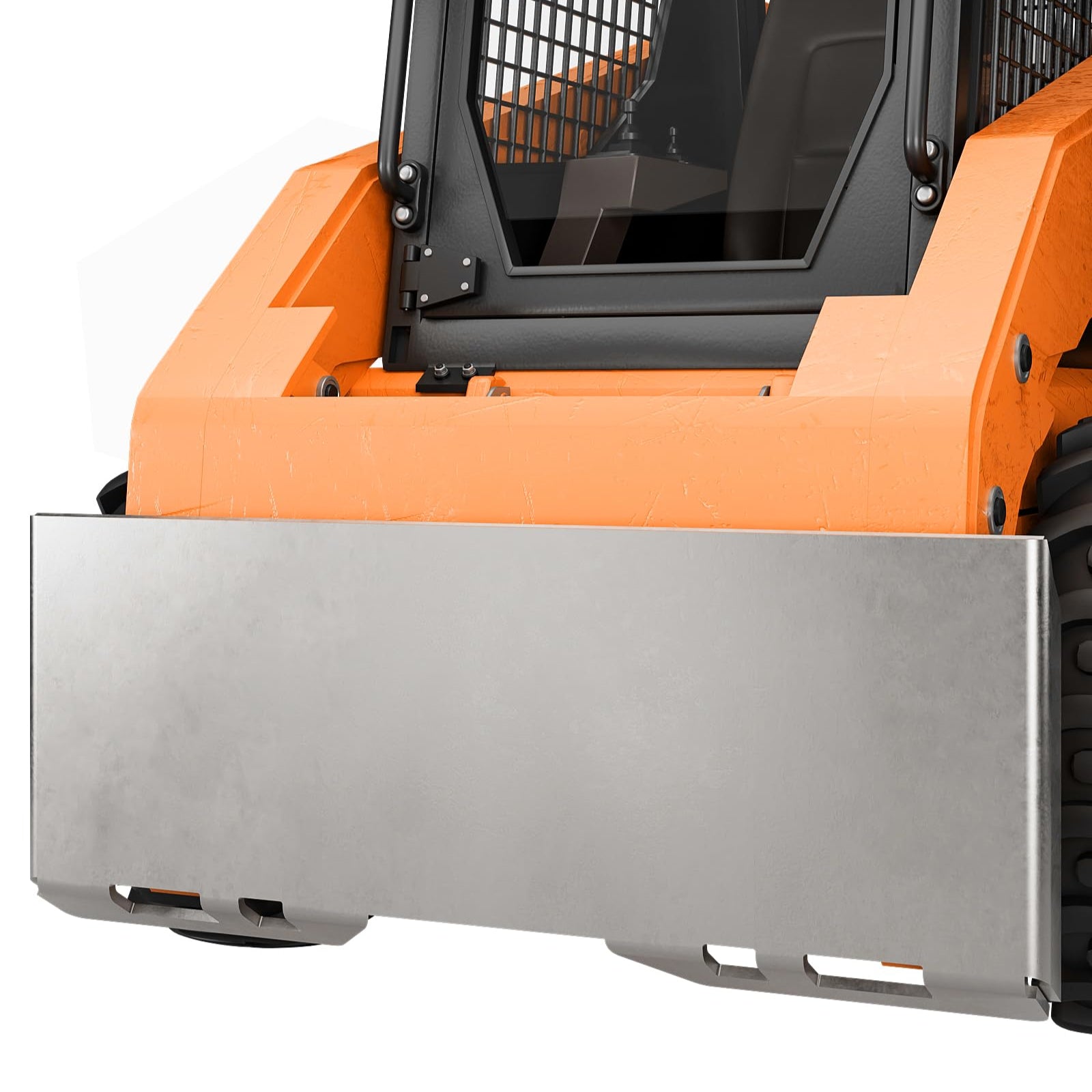


GARVEE 3/16″Skid Steer Attachment Plate,Quick Attach Plate,Universal Quick Attach Adapter Mounting Plate for Bobcat Kubota Tractors Sale
Original price was: $136.99.$34.25Current price is: $34.25.
Description
GARVEE 3/16″Skid Steer Attachment Plate,Quick Attach Plate,Universal Quick Attach Adapter Mounting Plate for Bobcat Kubota Tractors
- [Durable & Enduring]Say farewell to concerns about flimsy mounting plates.Our robust design guarantees lasting performance for your heavy-duty equipment.Crafted from top-tier materials,it effortlessly handles demanding tasks.
- [Simplified Setup]Installing our mount plate onto your heavy-duty equipment is a breeze.No need for professional assistance.Bid farewell to complex installations and save valuable time!
- [Multifaceted Application] GARVEE’s quick attach mount plates offer boundless potential for enhancing your machinery.With the ability to connect virtually any attachment,you can swiftly manage tasks like snow removal, debris clearing, and scrap transportation.
- [Broad Compatibility]The GARVEE skid steer attachment plate boasts universal compatibility with a wide array of loaders and vehicles.With an outer width of 45.2″ and inner width of 44.29″,it effortlessly fits various equipment.Its 16.81″ height and 3/16″ thickness ensure dependable performance and durability.
- [Longtime Assurance] Rest assured with our 80 years warranty and top-notch customer service.We take pride in providing professional support,ensuring all inquiries are addressed within 24 hours.
Specifications
| Part Number | RIV001 |
| Item Weight | 53.9 pounds |
| Product Dimensions | 45.2 x 3.54 x 16.81 inches |
| Size | 3/16 Inch |
| Color | Silver |
| Power Source | hand_powered |
| Item Package Quantity | 1 |
| Included Components | Skid Steer Attachment Plate Body |
| Batteries Required? | No |
.aplus_module STANDARD_PRODUCT_ATTRIBUTES h3{
margin-bottom: 10px;
}
.responsive-table {
border-collapse: collapse;
width: 100%;
margin-bottom: 20px;
}
.responsive-table td {
border: 1px solid #ddd;
padding: 8px;
text-align: left;
}
.responsive-table tr:nth-child(odd) {
background-color: #F2F2F2;
}
.responsive-table tr:nth-child(even) {
background-color: #E6E6E6;
}
.responsive-table tr:hover {
background-color: #DDDDDD;
}
@media screen and (max-width: 800px) {
.responsive-table td {
box-sizing: border-box;
width: 100%;
text-align: left;
padding: 10px;
}
.responsive-table tr:nth-child(odd) td {
background-color: #F2F2F2;
}
.responsive-table tr:nth-child(even) td {
background-color: #E6E6E6;
}
.responsive-table tr:hover td {
background-color: #DDDDDD;
}
}
.aplus_module{
margin-bottom:24px;
}
.aplus_module img{
width:100%;
}
.aplus_module h1,h2,h3,h4,h5,h6{
margin:0 !important;
}
.count_imgs_wrap{
display:flex;
}
.count_imgs_wrap>div{
flex: 1;
margin-right: 30px;
}
.count_imgs_wrap>div:last-child {
margin-right: 0;
}
@media screen and (max-width:800px){
.count_imgs_wrap{
flex-direction: column;
}
.count_imgs_wrap>div{
margin-right: 0;
}
.count_imgs{
display:flex;
justify-content: center;
}
.count_imgs>img{
width:auto;
max-width:100%;
}
}
.img_floatleft{
display:flex;
justify-content:space-between;
}
.leftwrap{
flex:3;
display:flex;
}
.lefttext{
margin:0 30px;
}
.lefttext>ul{
padding:0;
}
.lefttext>ul>li{
padding-bottom:18px;
}
.rightwrap{
flex:1;
}
.rightwrap_inner{
border-left:1px solid #dddddd;
padding-left:30px;
}
.rightwrap_inner>ul{
background-color: white;
padding:18px 32px;
border-radius: 8px;
}
@media screen and (max-width:800px){
.img_floatleft{
flex-direction: column;
}
.leftwrap{
flex-direction: column;
flex: initial;
}
.leftimage{
display:flex;
justify-content: center;
}
.leftimage>img{
max-width:100%;
width:auto;
}
.lefttext{
margin:0;
}
.lefttext>ul{
padding-left:32px;
}
.rightwrap{
flex: initial;
}
.rightwrap_inner{
border-left:0;
padding-left:0;
}
.rightwrap_inner>ul{
padding-right:0;
}
}
Additional information
| Size | 3/16 inch |
|---|
Related products
-
- Sale!
- Furniture > Living Room Furniture > Cabinets & Chests, GARVEE
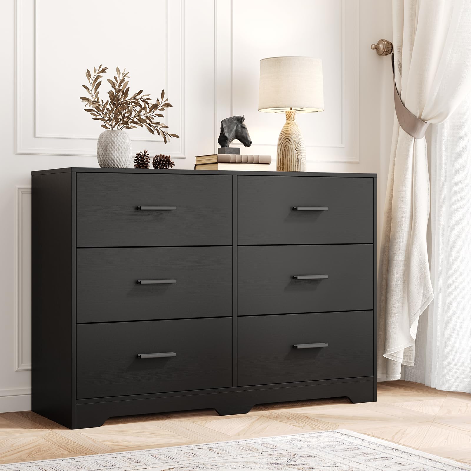
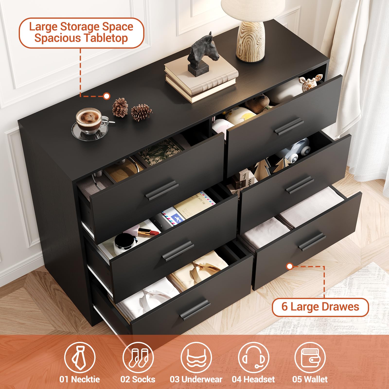
GARVEE Chest of Drawers with 6 Drawers, Modern Drawer Dresser Durable Structure with Deep Drawers,Anti-Tipping Device for Home,Office, Living Room In Black
- Original price was: $312.99.$62.60Current price is: $62.60.
- Select options This product has multiple variants. The options may be chosen on the product page
-
- Sale!
- Automotive > Tire & Wheel Tools > UTV & ATV Tires, GARVEE
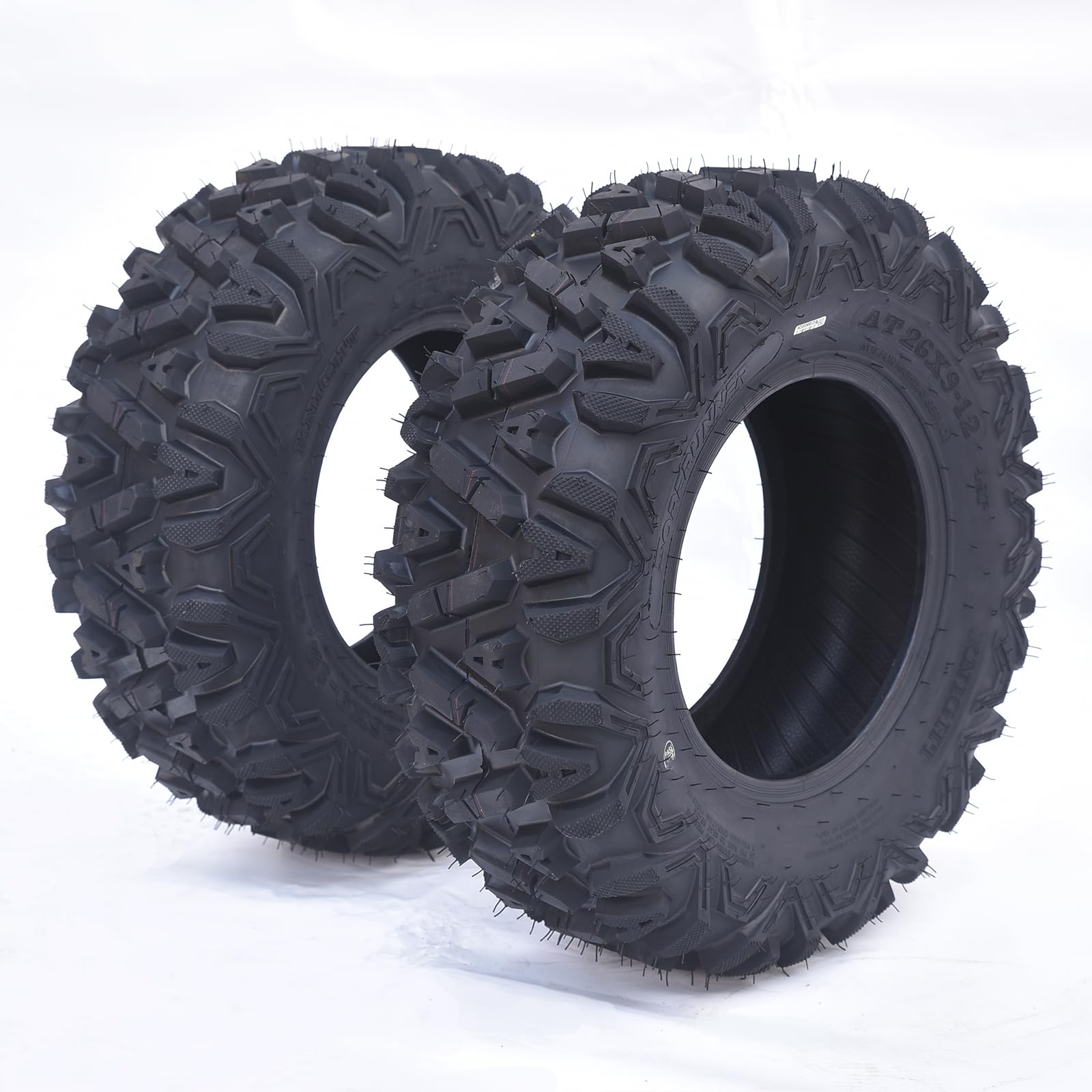
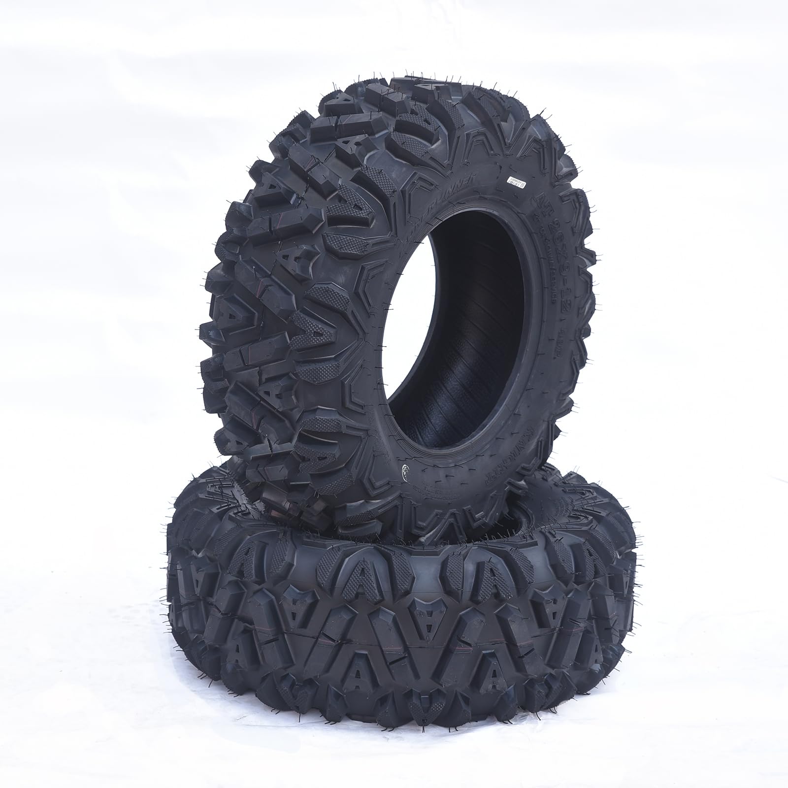
GARVEE AT26x9-12-6PR TL KNIGHT Set of 2 ATV Trail Tires 6PR Knobby Sport Tires, Tubeless – AT26x9-12-6PR TL KNIGHT
- Original price was: $175.99.$44.00Current price is: $44.00.
- Select options This product has multiple variants. The options may be chosen on the product page
-
- Sale!
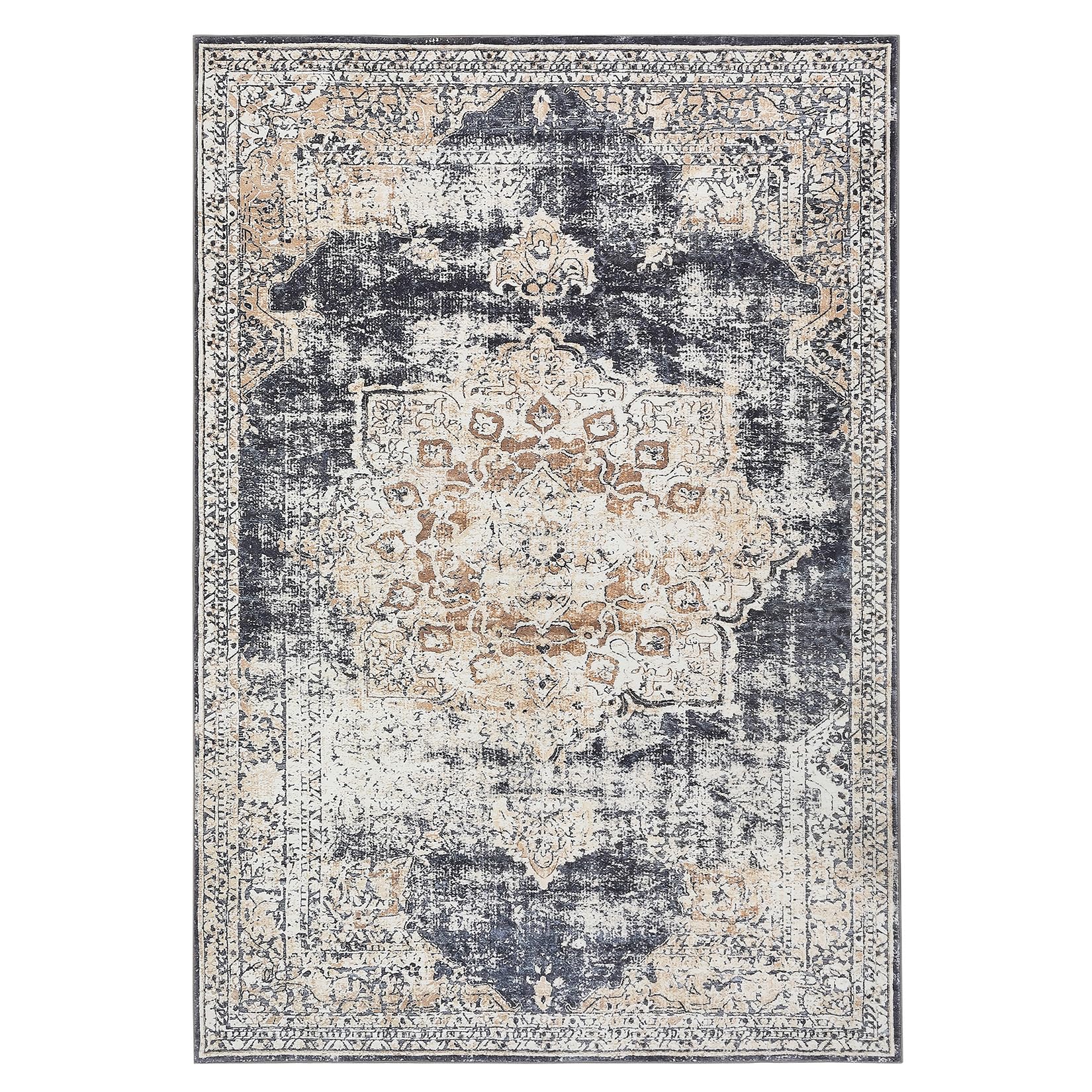
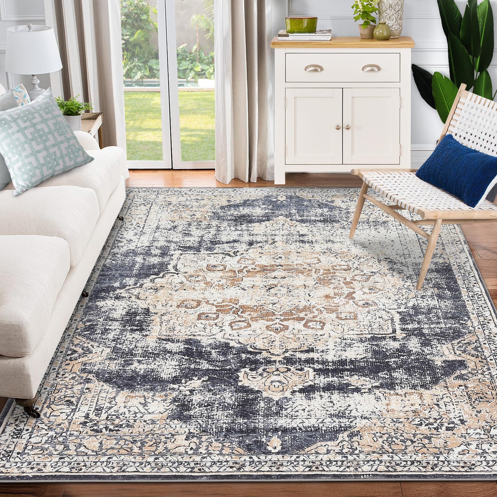
- GARVEE, Home & Kitchen > Rugs > Oriental Rugs
GARVEE – Alfombra clásico Lavable, con Estampado de medallón Oriental, con Respaldo de Goma de Perfil bajo, Ideal para Sala de Estar, Comedor, recámara, Oficina, Color Beige, 4 x 6 Pulgadas
- Original price was: $50.99.$15.30Current price is: $15.30.
- Select options This product has multiple variants. The options may be chosen on the product page