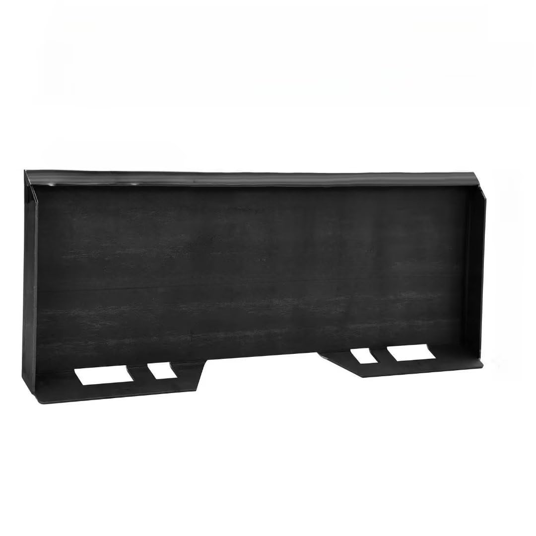


GARVEE 5/16″ Skid Steer Attachment Plate, Steel Quick Tach Attachment Loader Plate, [6000 LBS Max] Thick Skid Steer Mount Plate Fits Kubota, Bobcat, Tractors
Original price was: $134.99.$33.75Current price is: $33.75.
Description
GARVEE 5/16″ Skid Steer Attachment Plate, Steel Quick Tach Attachment Loader Plate, [6000 LBS Max] Thick Skid Steer Mount Plate Fits Kubota, Bobcat, Tractors
- 【DURABLE & STURDY】No more worries about weak mounting plates. Our sturdy design ensures long-lasting performance for your heavy-duty equipment. Made with high-quality materials, it can handle tough tasks effortlessly.
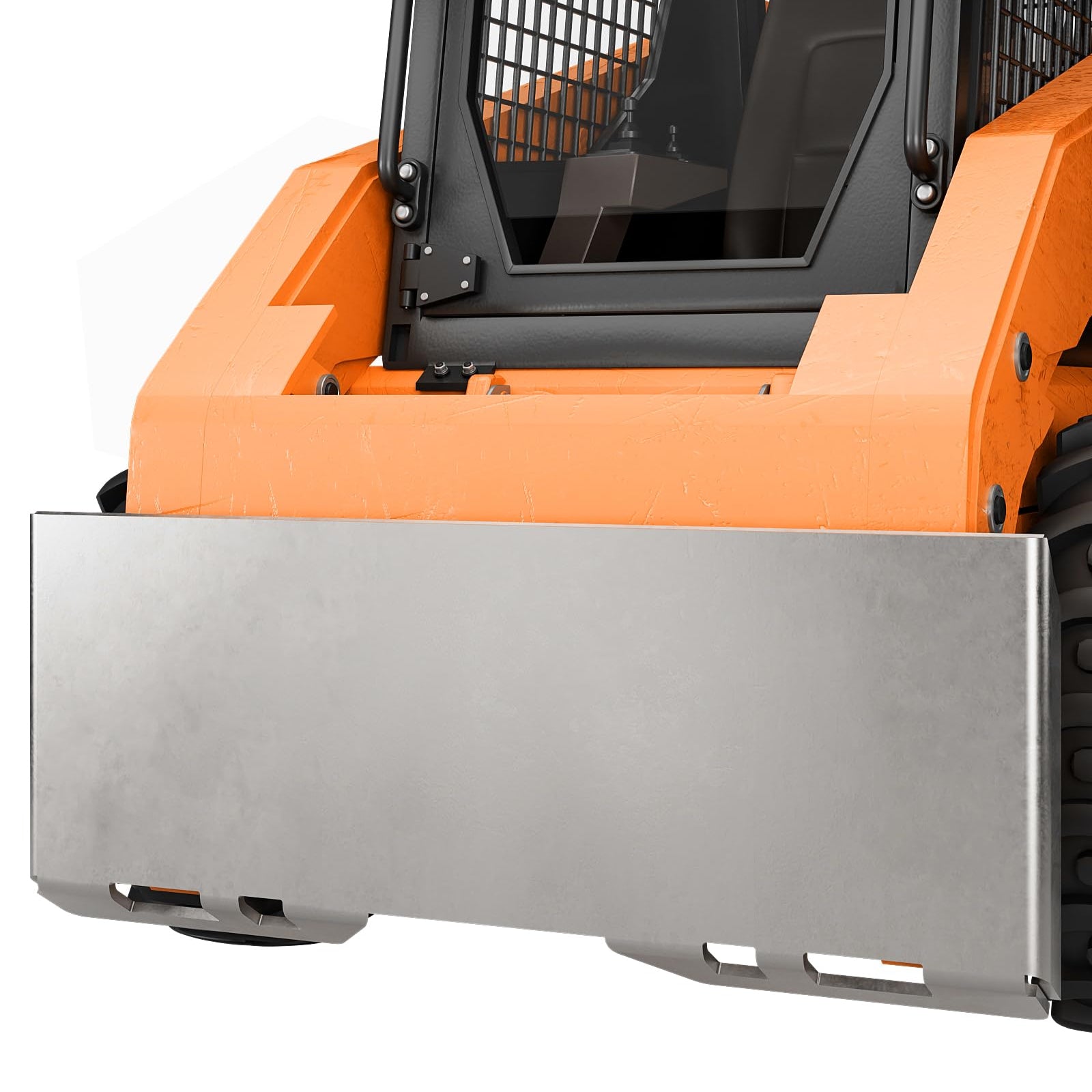
- 【EASY INSTALLATION】With our mount plate, installing it on your heavy-duty equipment is a breeze. No professional assistance required. Say goodbye to complicated installations and save time!
- 【VERSATILE USE】GARVEE quick attach mount plates offer endless possibilities for enhancing your equipment. With the ability to attach virtually any attachment, you can swiftly handle tasks such as snow shoveling, debris clearing, and scrap transportation.
- 【UNIVERSAL COMPATIBILITY】The GARVEE skid steer attachment plate offers universal compatibility with loaders and vehicles. With an outer width of 45.2” and inner width of 44.29”, it easily fits a wide range of equipment. The 18.5″ height and 5/16″ thickness ensure reliable performance and durability.
- 【LIFETIME WARRANTY】You get our 100% satisfied customer service. We provide professional service and all inquiries will be answered within 24 hours
Specifications
| Product Dimensions | 46 x 0.31 x 18.5 inches; 81.4 Pounds |
.aplus_module STANDARD_PRODUCT_ATTRIBUTES h3{
margin-bottom: 10px;
}
.responsive-table {
border-collapse: collapse;
width: 100%;
margin-bottom: 20px;
}
.responsive-table td {
border: 1px solid #ddd;
padding: 8px;
text-align: left;
}
.responsive-table tr:nth-child(odd) {
background-color: #F2F2F2;
}
.responsive-table tr:nth-child(even) {
background-color: #E6E6E6;
}
.responsive-table tr:hover {
background-color: #DDDDDD;
}
@media screen and (max-width: 800px) {
.responsive-table td {
box-sizing: border-box;
width: 100%;
text-align: left;
padding: 10px;
}
.responsive-table tr:nth-child(odd) td {
background-color: #F2F2F2;
}
.responsive-table tr:nth-child(even) td {
background-color: #E6E6E6;
}
.responsive-table tr:hover td {
background-color: #DDDDDD;
}
}
.aplus_module{
margin-bottom:24px;
}
.aplus_module img{
width:100%;
}
.aplus_module h1,h2,h3,h4,h5,h6{
margin:0 !important;
}
.count_imgs_wrap{
display:flex;
}
.count_imgs_wrap>div{
flex: 1;
margin-right: 30px;
}
.count_imgs_wrap>div:last-child {
margin-right: 0;
}
@media screen and (max-width:800px){
.count_imgs_wrap{
flex-direction: column;
}
.count_imgs_wrap>div{
margin-right: 0;
}
.count_imgs{
display:flex;
justify-content: center;
}
.count_imgs>img{
width:auto;
max-width:100%;
}
}
.img_floatleft{
display:flex;
justify-content:space-between;
}
.leftwrap{
flex:3;
display:flex;
}
.lefttext{
margin:0 30px;
}
.lefttext>ul{
padding:0;
}
.lefttext>ul>li{
padding-bottom:18px;
}
.rightwrap{
flex:1;
}
.rightwrap_inner{
border-left:1px solid #dddddd;
padding-left:30px;
}
.rightwrap_inner>ul{
background-color: white;
padding:18px 32px;
border-radius: 8px;
}
@media screen and (max-width:800px){
.img_floatleft{
flex-direction: column;
}
.leftwrap{
flex-direction: column;
flex: initial;
}
.leftimage{
display:flex;
justify-content: center;
}
.leftimage>img{
max-width:100%;
width:auto;
}
.lefttext{
margin:0;
}
.lefttext>ul{
padding-left:32px;
}
.rightwrap{
flex: initial;
}
.rightwrap_inner{
border-left:0;
padding-left:0;
}
.rightwrap_inner>ul{
padding-right:0;
}
}
Additional information
| Size | 5/16 inch |
|---|
Related products
-
- Sale!
- Automotive > Automotive Accessories > Tonneau Cover, GARVEE
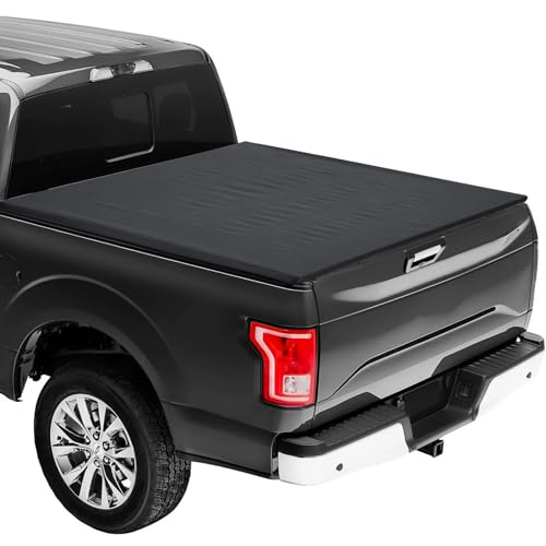
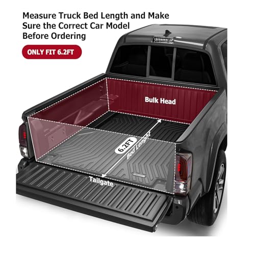
GARVEE ’15-’23 Colorado 6.2ft Soft Roll-Up Tonneau Cover Online Hot Sale
- Original price was: $164.99.$41.25Current price is: $41.25.
- Select options This product has multiple variants. The options may be chosen on the product page
-
- Sale!
- GARVEE, Home & Kitchen > Rugs > Oriental Rugs
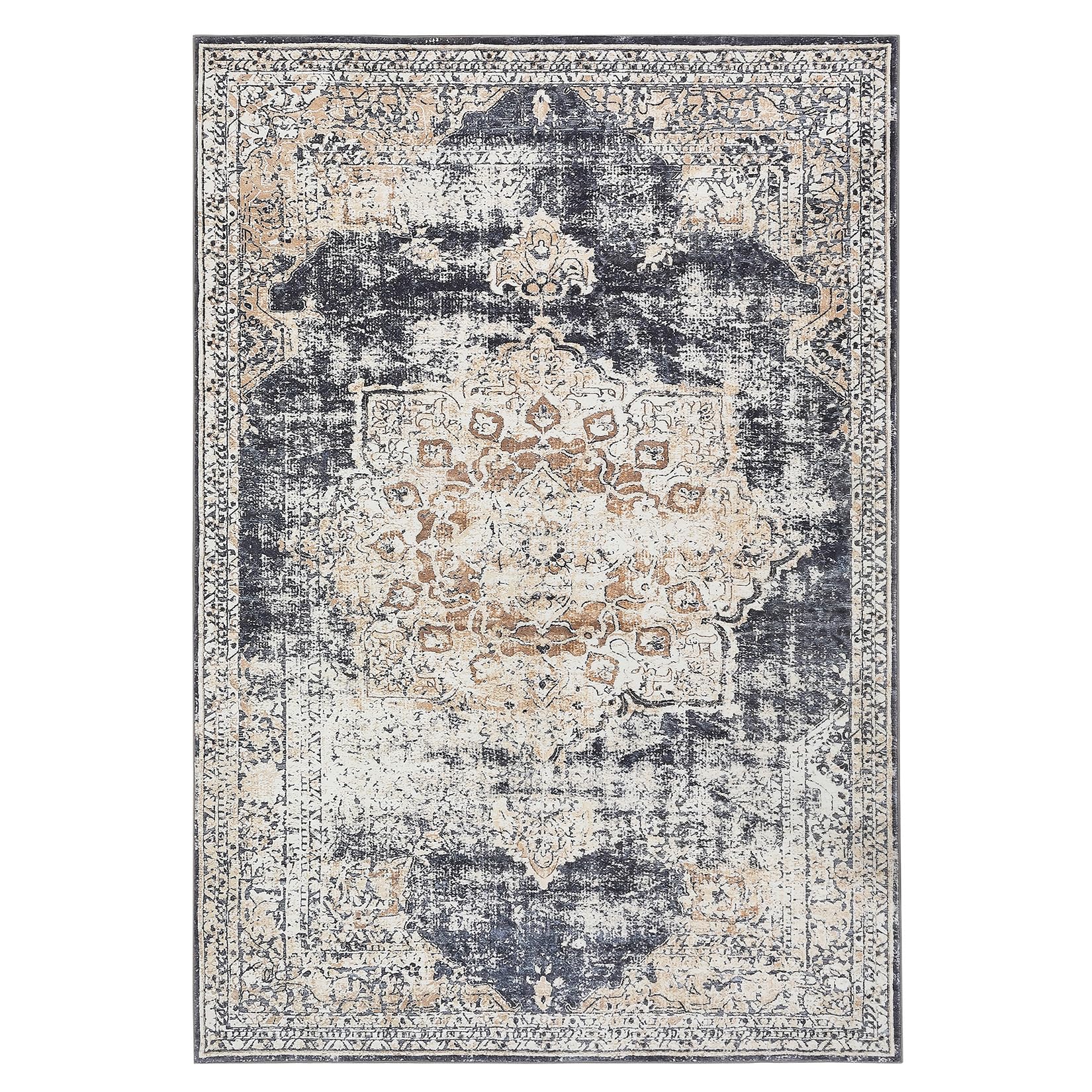
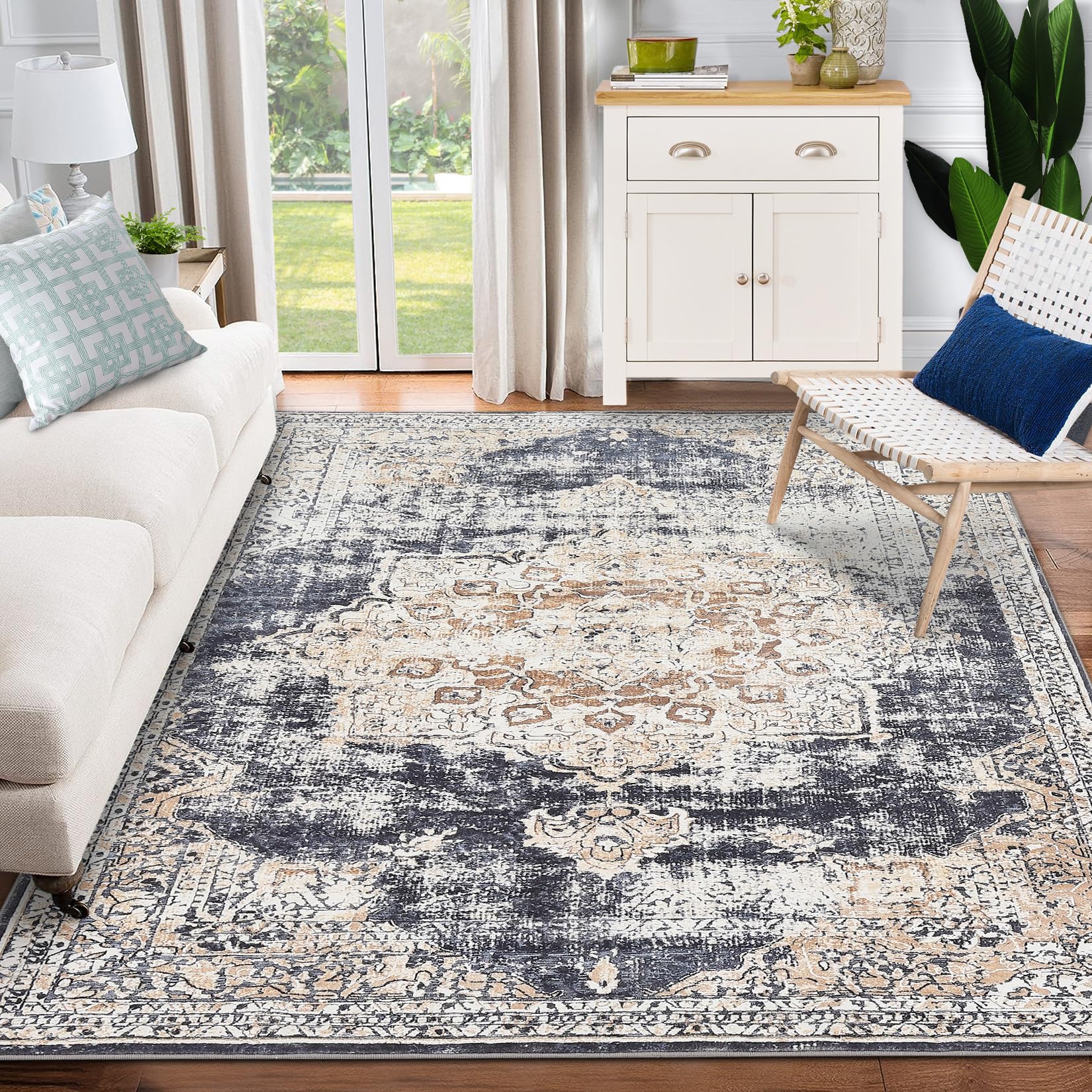
GARVEE – Alfombra clásico Lavable, con Estampado de medallón Oriental, con Respaldo de Goma de Perfil bajo, Ideal para Sala de Estar, Comedor, recámara, Oficina, Color Beige, 4 x 6 Pulgadas
- Original price was: $50.99.$15.30Current price is: $15.30.
- Select options This product has multiple variants. The options may be chosen on the product page
-
- Sale!
- GARVEE, Home & Kitchen > Rugs > Oriental Rugs
GARVEE – Alfombra clásico Lavable, con Estampado de medallón Oriental, con Respaldo de Goma de Perfil bajo, Ideal para Sala de Estar, Comedor, recámara, Oficina, Color Beige, 9 x 12 Pulgadas
- Original price was: $158.99.$39.75Current price is: $39.75.
- Select options This product has multiple variants. The options may be chosen on the product page