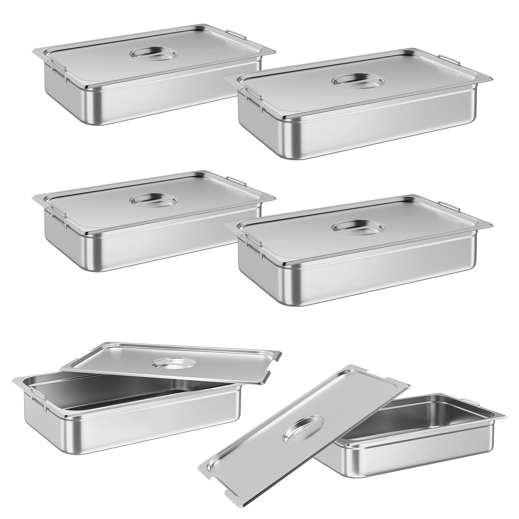


GARVEE 6 Pack Steam Table Pan,21″*13″*2.5″without Lid,[NSF Certified] Catering Food Pan Commercial Stainless Steel
Original price was: $73.99.$22.20Current price is: $22.20.
Description
GARVEE 6 Pack Steam Table Pan,21″*13″*2.5″without Lid,[NSF Certified] Catering Food Pan Commercial Stainless Steel
- 【Dimension & Capacity】Size: 21″x13″x2.5″, Capacity: 9 QT.Made of heat-resistant and high-grade stainless
- 【NSF Certification】Commercial stainless steel hotel pan with NSF certified will maintain a great level food safety.
- 【Durable Design】Integrated hotel pans with anti-jam stacking lugs for easy storing and release.
- 【Heavy Duty Package Box】Protect the hotel pan from damage during transportation.
- 【Wide Application】Large hotel pan chafing dish can serve a lot of guests, it is a good choice for hosting parties and holiday dinners. Such as catering, parties, restaurants, buffets, hotels, wedding brunches.
Specifications
| Brand |
GARVEE |
| Material | Stainless Steel |
| Size | Without Lid |
| Special Feature | Steam Table Pan Full Size Hotel Pan |
| Product Dimensions | 13″D x 21″W x 2.5″H |
| Occasion | New Year’s |
| Included Components | Steam Table Pan Full Size Hotel Pan |
| Product Care Instructions | Steam Table Pan Full Size Hotel Pan |
| Item Weight | 1.55 pounds |
| Is Oven Safe | Yes |
| Is Dishwasher Safe | Yes |
| UPC | 198290422340 |
.aplus_module STANDARD_PRODUCT_ATTRIBUTES h3{
margin-bottom: 10px;
}
.responsive-table {
border-collapse: collapse;
width: 100%;
margin-bottom: 20px;
}
.responsive-table td {
border: 1px solid #ddd;
padding: 8px;
text-align: left;
}
.responsive-table tr:nth-child(odd) {
background-color: #F2F2F2;
}
.responsive-table tr:nth-child(even) {
background-color: #E6E6E6;
}
.responsive-table tr:hover {
background-color: #DDDDDD;
}
@media screen and (max-width: 800px) {
.responsive-table td {
box-sizing: border-box;
width: 100%;
text-align: left;
padding: 10px;
}
.responsive-table tr:nth-child(odd) td {
background-color: #F2F2F2;
}
.responsive-table tr:nth-child(even) td {
background-color: #E6E6E6;
}
.responsive-table tr:hover td {
background-color: #DDDDDD;
}
}
.aplus_module{
margin-bottom:24px;
}
.aplus_module img{
width:100%;
}
.aplus_module h1,h2,h3,h4,h5,h6{
margin:0 !important;
}
.count_imgs_wrap{
display:flex;
}
.count_imgs_wrap>div{
flex: 1;
margin-right: 30px;
}
.count_imgs_wrap>div:last-child {
margin-right: 0;
}
@media screen and (max-width:800px){
.count_imgs_wrap{
flex-direction: column;
}
.count_imgs_wrap>div{
margin-right: 0;
}
.count_imgs{
display:flex;
justify-content: center;
}
.count_imgs>img{
width:auto;
max-width:100%;
}
}
.img_floatleft{
display:flex;
justify-content:space-between;
}
.leftwrap{
flex:3;
display:flex;
}
.lefttext{
margin:0 30px;
}
.lefttext>ul{
padding:0;
}
.lefttext>ul>li{
padding-bottom:18px;
}
.rightwrap{
flex:1;
}
.rightwrap_inner{
border-left:1px solid #dddddd;
padding-left:30px;
}
.rightwrap_inner>ul{
background-color: white;
padding:18px 32px;
border-radius: 8px;
}
@media screen and (max-width:800px){
.img_floatleft{
flex-direction: column;
}
.leftwrap{
flex-direction: column;
flex: initial;
}
.leftimage{
display:flex;
justify-content: center;
}
.leftimage>img{
max-width:100%;
width:auto;
}
.lefttext{
margin:0;
}
.lefttext>ul{
padding-left:32px;
}
.rightwrap{
flex: initial;
}
.rightwrap_inner{
border-left:0;
padding-left:0;
}
.rightwrap_inner>ul{
padding-right:0;
}
}
Additional information
| Size | 21"*13"*2.5" without Lid |
|---|
Related products
-
- Sale!
- GARVEE, Home & Kitchen > Rugs > Oriental Rugs
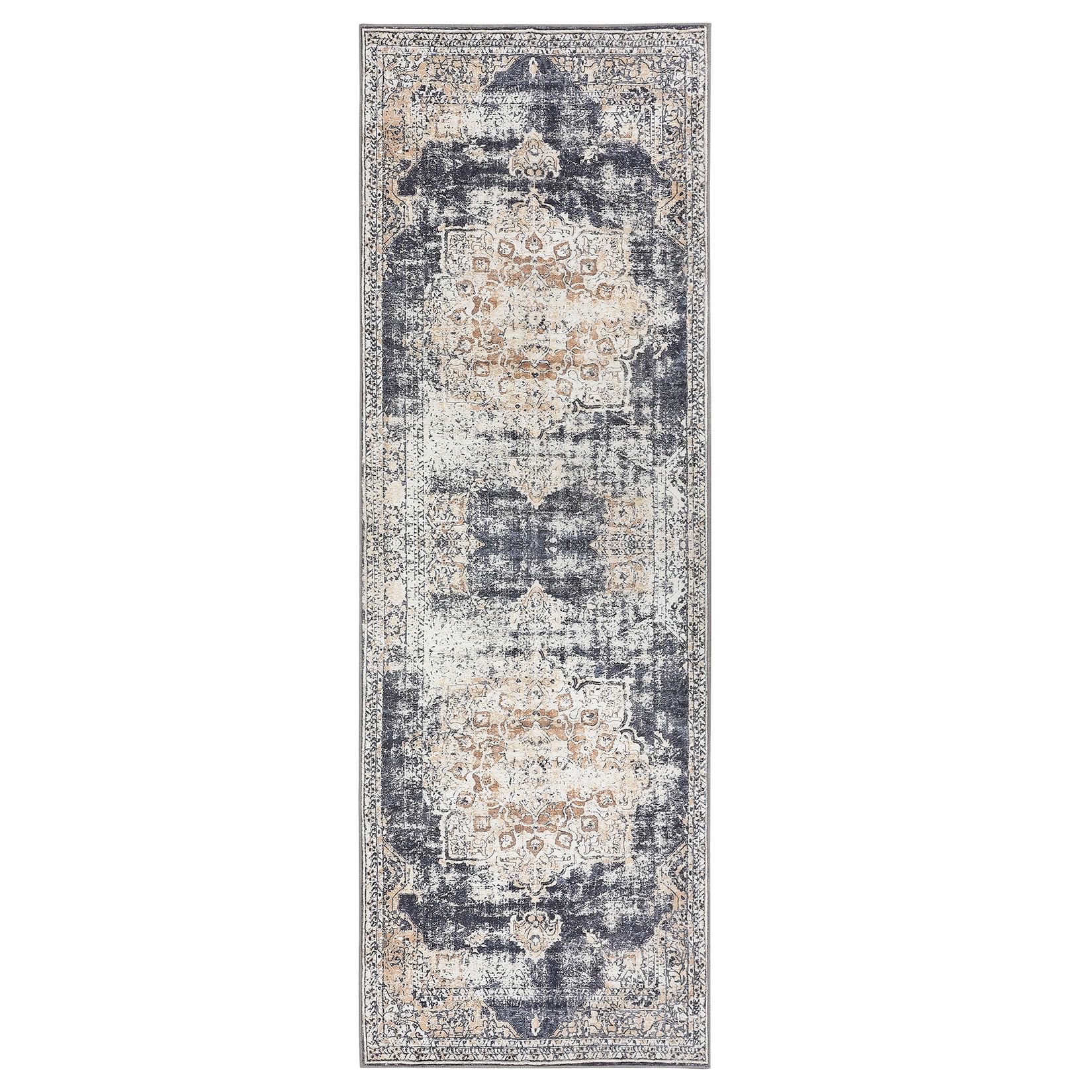
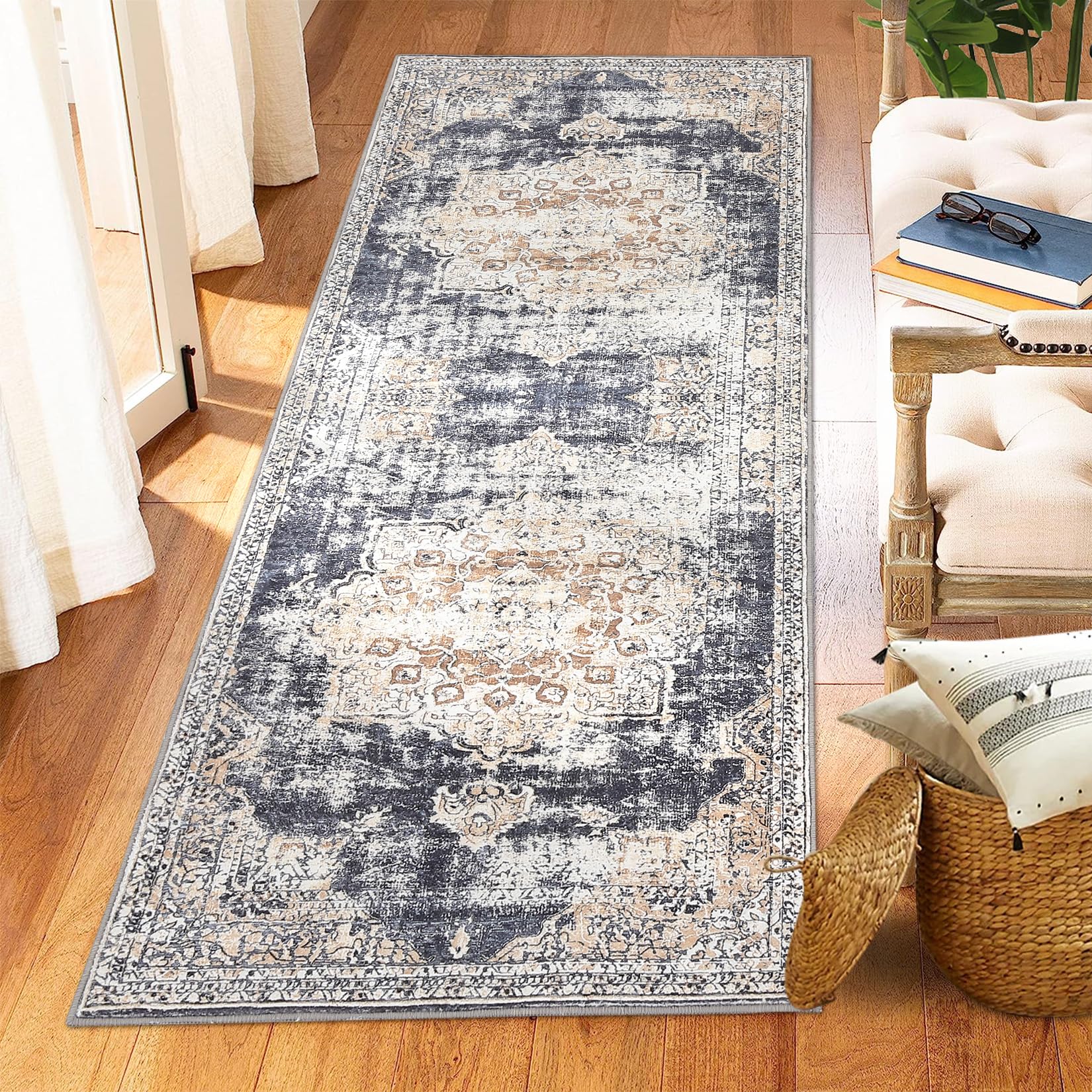
GARVEE – Alfombra clásico Lavable, de 2 x 6 Pulgadas, con diseño de medallón Oriental, Parte Trasera de Goma de Perfil bajo, Ideal para Sala de Estar, Comedor, recámara, Oficina, Color Beige
- Original price was: $38.99.$15.60Current price is: $15.60.
- Select options This product has multiple variants. The options may be chosen on the product page
-
- Sale!
- Furniture > Living Room Furniture > Cabinets & Chests, GARVEE
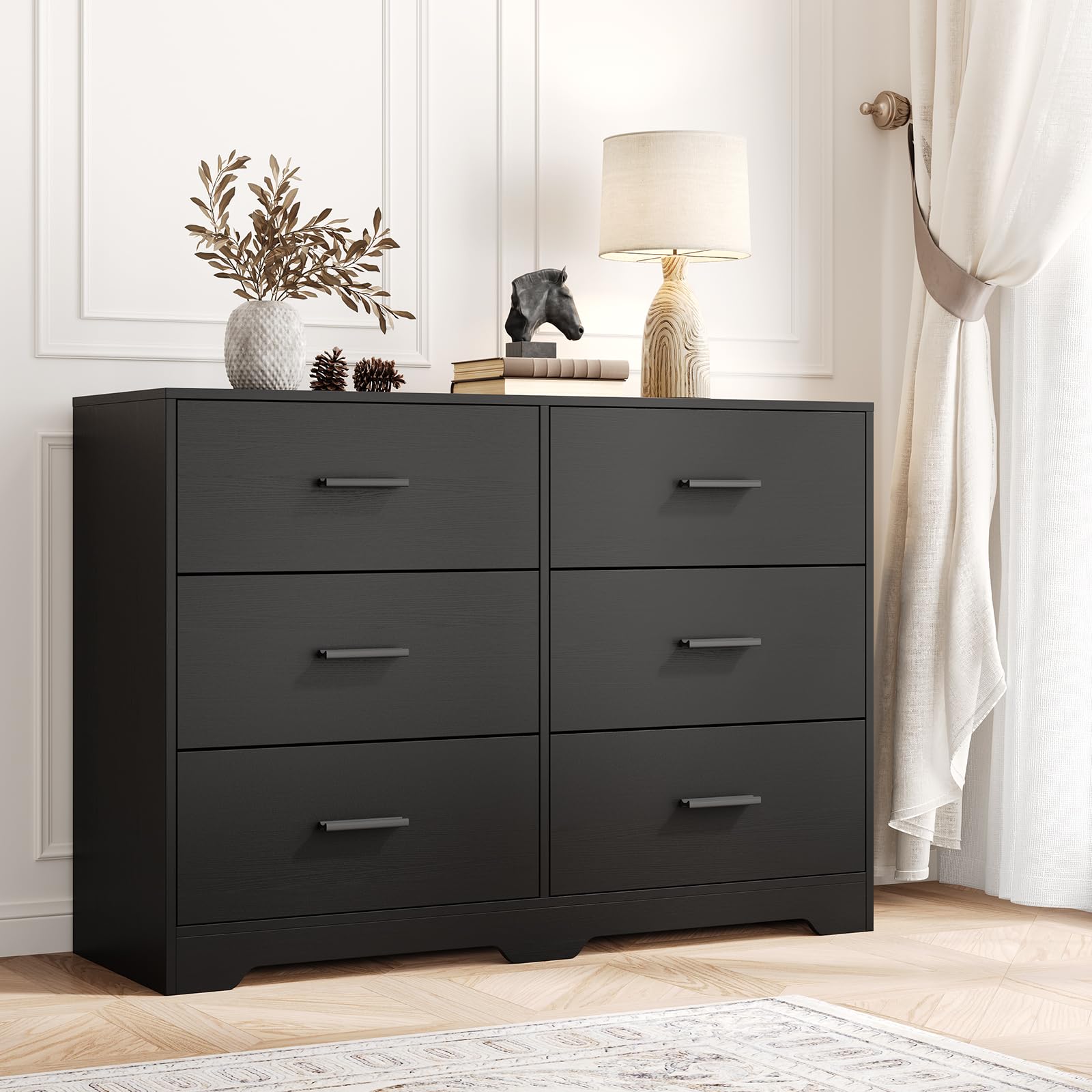
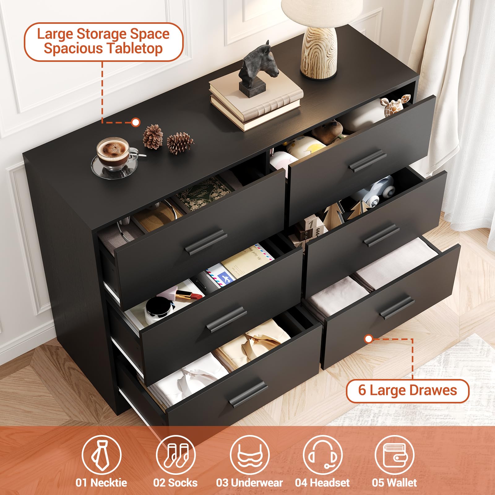
GARVEE Chest of Drawers with 6 Drawers, Modern Drawer Dresser Durable Structure with Deep Drawers,Anti-Tipping Device for Home,Office, Living Room In Black
- Original price was: $312.99.$62.60Current price is: $62.60.
- Select options This product has multiple variants. The options may be chosen on the product page
-
-
Sale!
- Furniture > Kids' Furniture > Kids' Tables & Chairs, GARVEE
GARVEE Kids Table and 4 Chairs Set with Graffiti Desktop, Height Adjustable Toddler Table and Chairs Set, 4 in 1 Activity Table Play Table for Reading, Drawing, Playing, Eating,Beige
- Original price was: $133.99.$33.50Current price is: $33.50.
- Select options This product has multiple variants. The options may be chosen on the product page
-
Sale!