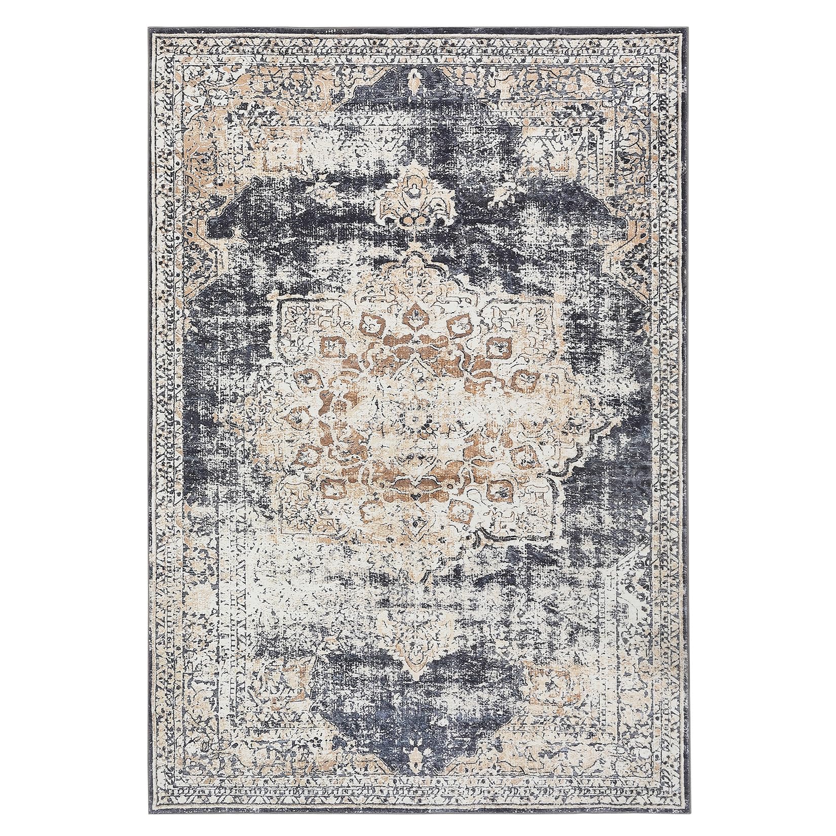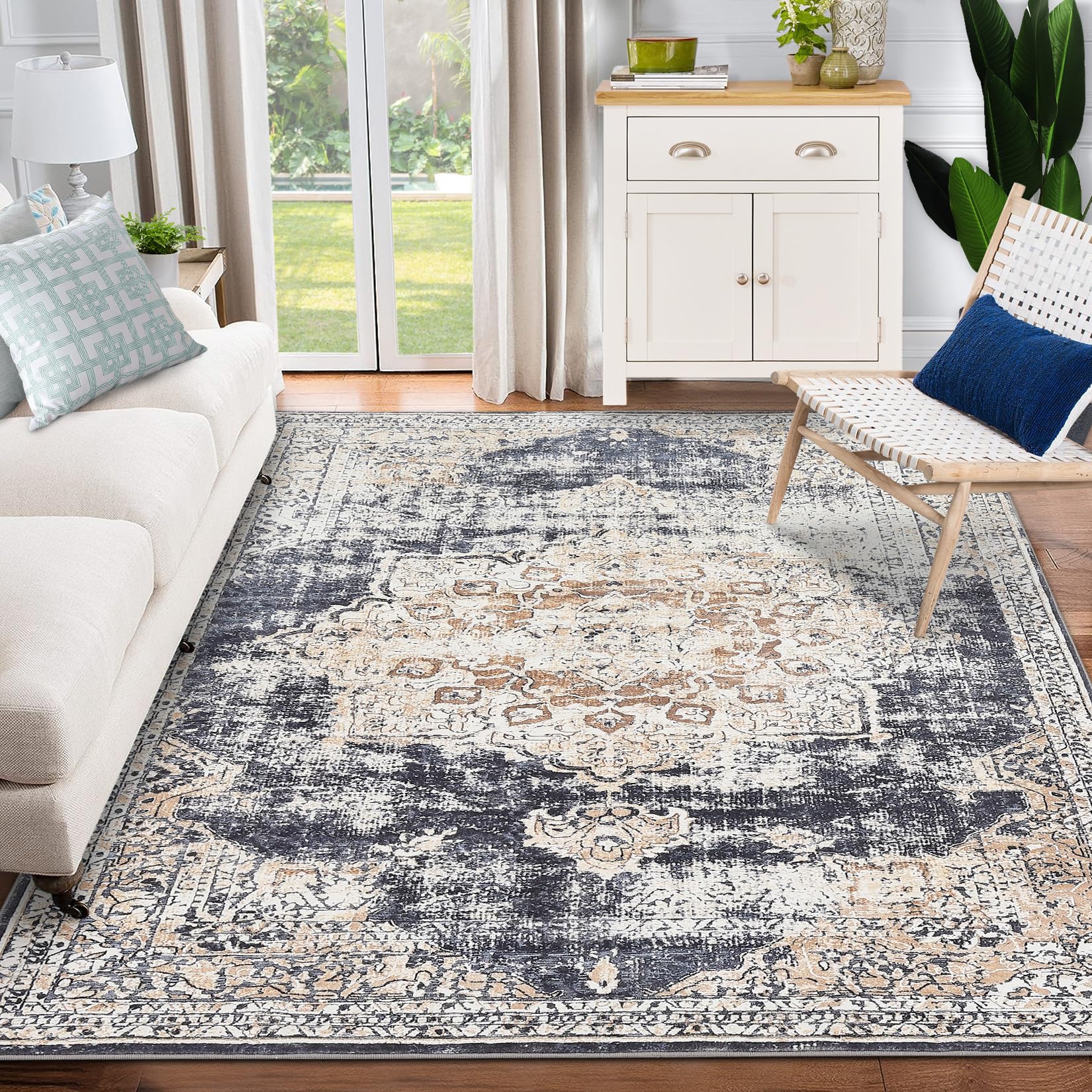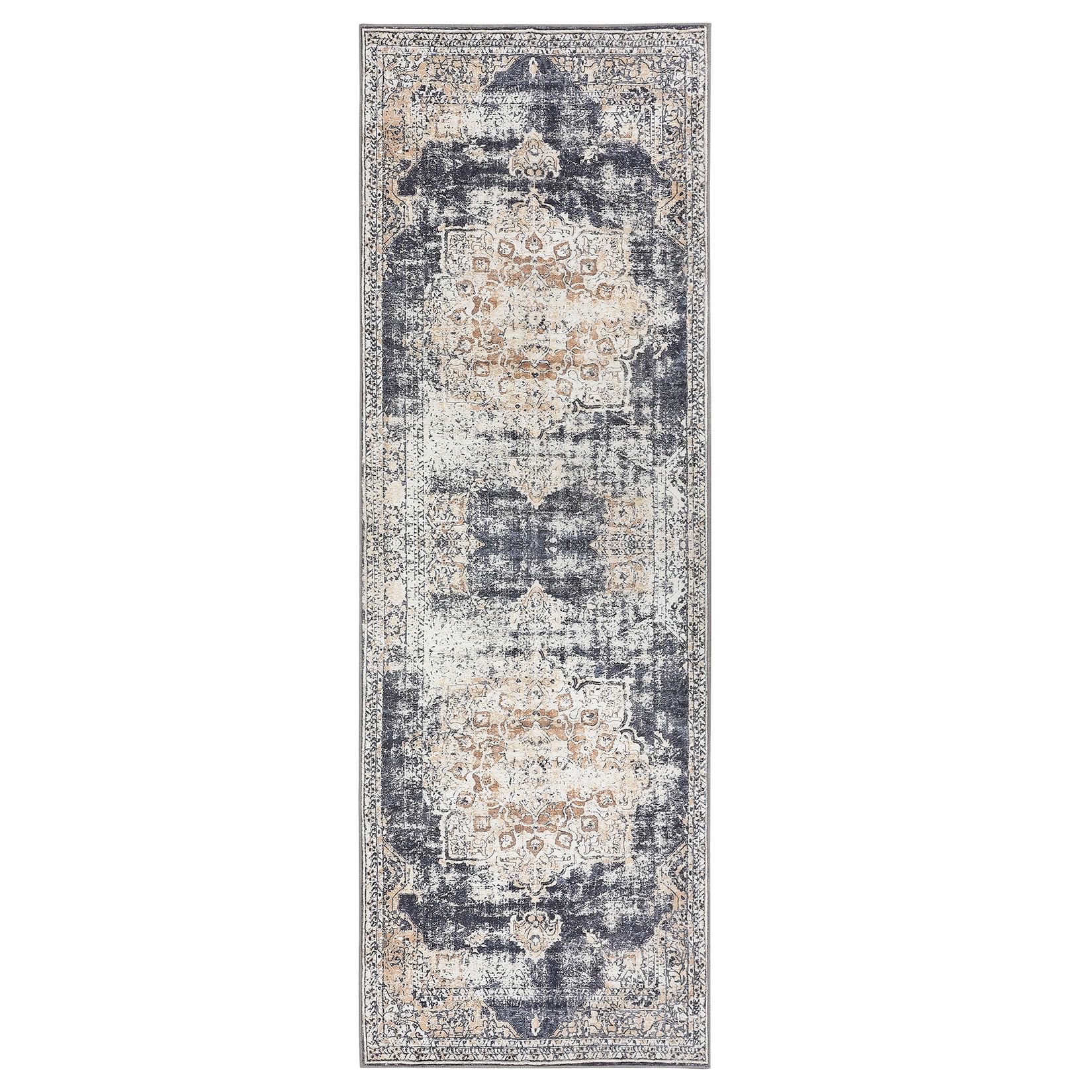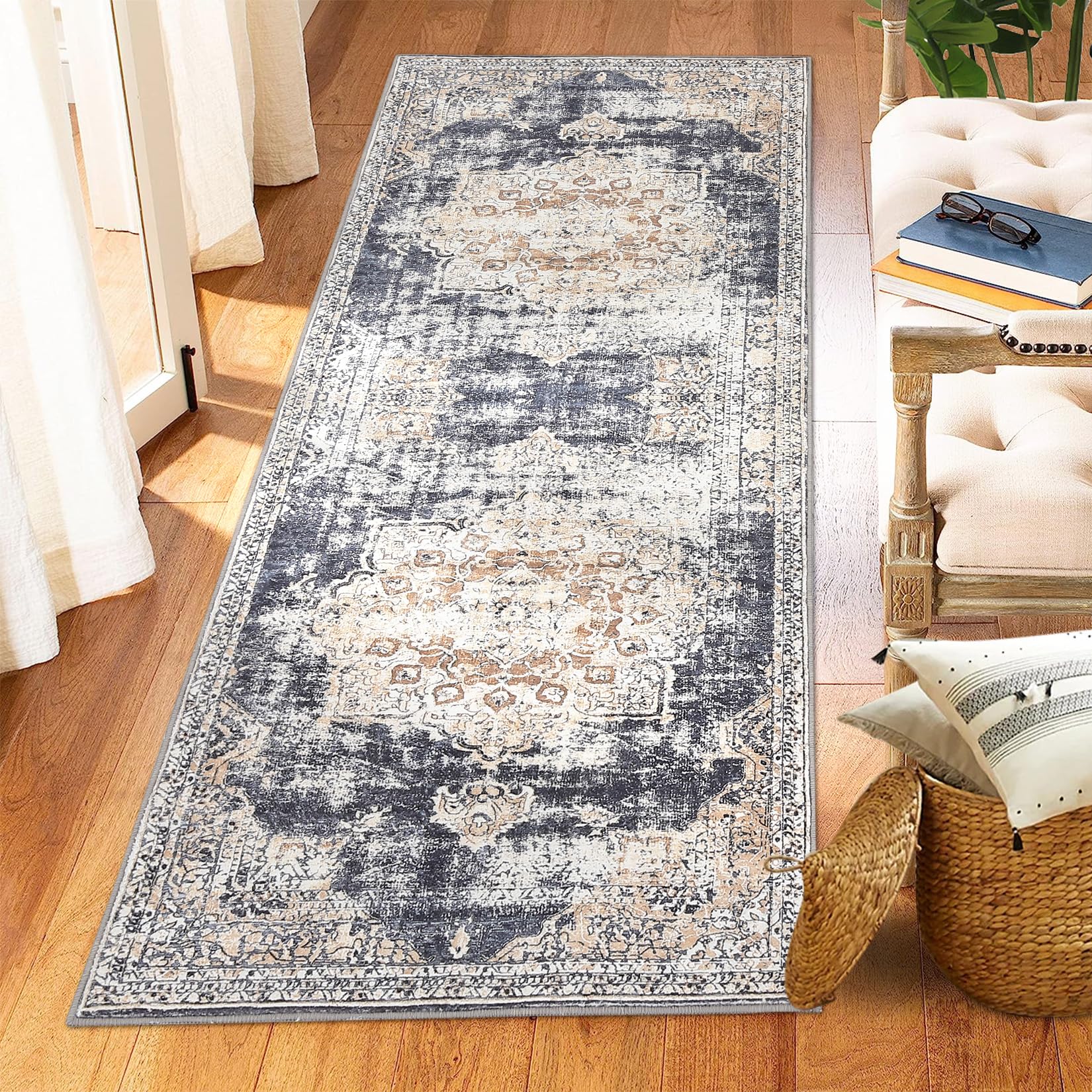
GARVEE 9×12 Large Living Room Rug for Bedroom Contemporary Non-Slip Non-Shedding Area Rugs Washable Mid-Century Minimalist Low-Pile Indoor Floor Carpet for Dining Room Nursery, Gray
Original price was: $115.99.$29.00Current price is: $29.00.
Description
GARVEE 9×12 Large Living Room Rug for Bedroom Contemporary Non-Slip Non-Shedding Area Rugs Washable Mid-Century Minimalist Low-Pile Indoor Floor Carpet for Dining Room Nursery, Gray
- – Sleek Contemporary Design: This modern abstract rug boasts a chic chevron pattern that effortlessly enhances your interior decor, bringing an air of sophistication to any space with its minimalist elegance
- – Reliable Non-Slip Backing: Featuring a robust non-slip TPR backing, this foldable rug stays securely in place, ensuring stability for playful kids and pets while protecting your flooring from slips and accidents
- – Easy Maintenance: Keep this machine washable rug looking pristine with ease; simply vacuum, spot clean, or toss it in the washing machine to maintain its eye-catching design and fresh appearance all year long
- – Premium Materials: Constructed from great quality polyester, this non-shedding floor carpet is built to last, providing cozy warmth in winter and a cool touch in summer, perfect for lounging or tummy time
- – Strong for High-Traffic Areas: Built to endure, this throw rug’s dense machine-made structure makes it ideal for busy spaces like living rooms, dining areas, and hallways, ensuring lasting beauty and functionality
Specifications
| Brand | GARVEE |
| Size | 12′ x 9′ (Rectangular) |
| Material | Polyester |
| Weave Type | Needle Punched |
| Item Weight | 27.6 pounds |
| Pile Height | Low Pile |
| Construction Type | Machine Made |
| Back Material Type | Thermoplastic Rubber (TPR) |
| Color | Gray Tone |
| Shape | Rectangular |
| Product Dimensions | 144″L x 108″W |
| Model Name | dbK0Humu_9oDN-7QzxOfxgPcq |
.aplus_module STANDARD_PRODUCT_ATTRIBUTES h3{
margin-bottom: 10px;
}
.responsive-table {
border-collapse: collapse;
width: 100%;
margin-bottom: 20px;
}
.responsive-table td {
border: 1px solid #ddd;
padding: 8px;
text-align: left;
}
.responsive-table tr:nth-child(odd) {
background-color: #F2F2F2;
}
.responsive-table tr:nth-child(even) {
background-color: #E6E6E6;
}
.responsive-table tr:hover {
background-color: #DDDDDD;
}
@media screen and (max-width: 800px) {
.responsive-table td {
box-sizing: border-box;
width: 100%;
text-align: left;
padding: 10px;
}
.responsive-table tr:nth-child(odd) td {
background-color: #F2F2F2;
}
.responsive-table tr:nth-child(even) td {
background-color: #E6E6E6;
}
.responsive-table tr:hover td {
background-color: #DDDDDD;
}
}
.aplus_module{
margin-bottom:24px;
}
.aplus_module img{
width:100%;
}
.aplus_module h1,h2,h3,h4,h5,h6{
margin:0 !important;
}
.count_imgs_wrap{
display:flex;
}
.count_imgs_wrap>div{
flex: 1;
margin-right: 30px;
}
.count_imgs_wrap>div:last-child {
margin-right: 0;
}
@media screen and (max-width:800px){
.count_imgs_wrap{
flex-direction: column;
}
.count_imgs_wrap>div{
margin-right: 0;
}
.count_imgs{
display:flex;
justify-content: center;
}
.count_imgs>img{
width:auto;
max-width:100%;
}
}
.img_floatleft{
display:flex;
justify-content:space-between;
}
.leftwrap{
flex:3;
display:flex;
}
.lefttext{
margin:0 30px;
}
.lefttext>ul{
padding:0;
}
.lefttext>ul>li{
padding-bottom:18px;
}
.rightwrap{
flex:1;
}
.rightwrap_inner{
border-left:1px solid #dddddd;
padding-left:30px;
}
.rightwrap_inner>ul{
background-color: white;
padding:18px 32px;
border-radius: 8px;
}
@media screen and (max-width:800px){
.img_floatleft{
flex-direction: column;
}
.leftwrap{
flex-direction: column;
flex: initial;
}
.leftimage{
display:flex;
justify-content: center;
}
.leftimage>img{
max-width:100%;
width:auto;
}
.lefttext{
margin:0;
}
.lefttext>ul{
padding-left:32px;
}
.rightwrap{
flex: initial;
}
.rightwrap_inner{
border-left:0;
padding-left:0;
}
.rightwrap_inner>ul{
padding-right:0;
}
}
Additional information
| Color | Gray tone |
|---|---|
| Size | 9' x 12' |
Related products
-
- Sale!
- GARVEE, Home & Kitchen > Rugs > Oriental Rugs
GARVEE – Alfombra clásico Lavable, con Estampado de medallón Oriental, con Respaldo de Goma de Perfil bajo, Ideal para Sala de Estar, Comedor, recámara, Oficina, Color Beige, 4 x 6 Pulgadas
- Original price was: $50.99.$15.30Current price is: $15.30.
- Select options This product has multiple variants. The options may be chosen on the product page
-
- Sale!
- Furniture > Living Room Furniture > Cabinets & Chests, GARVEE
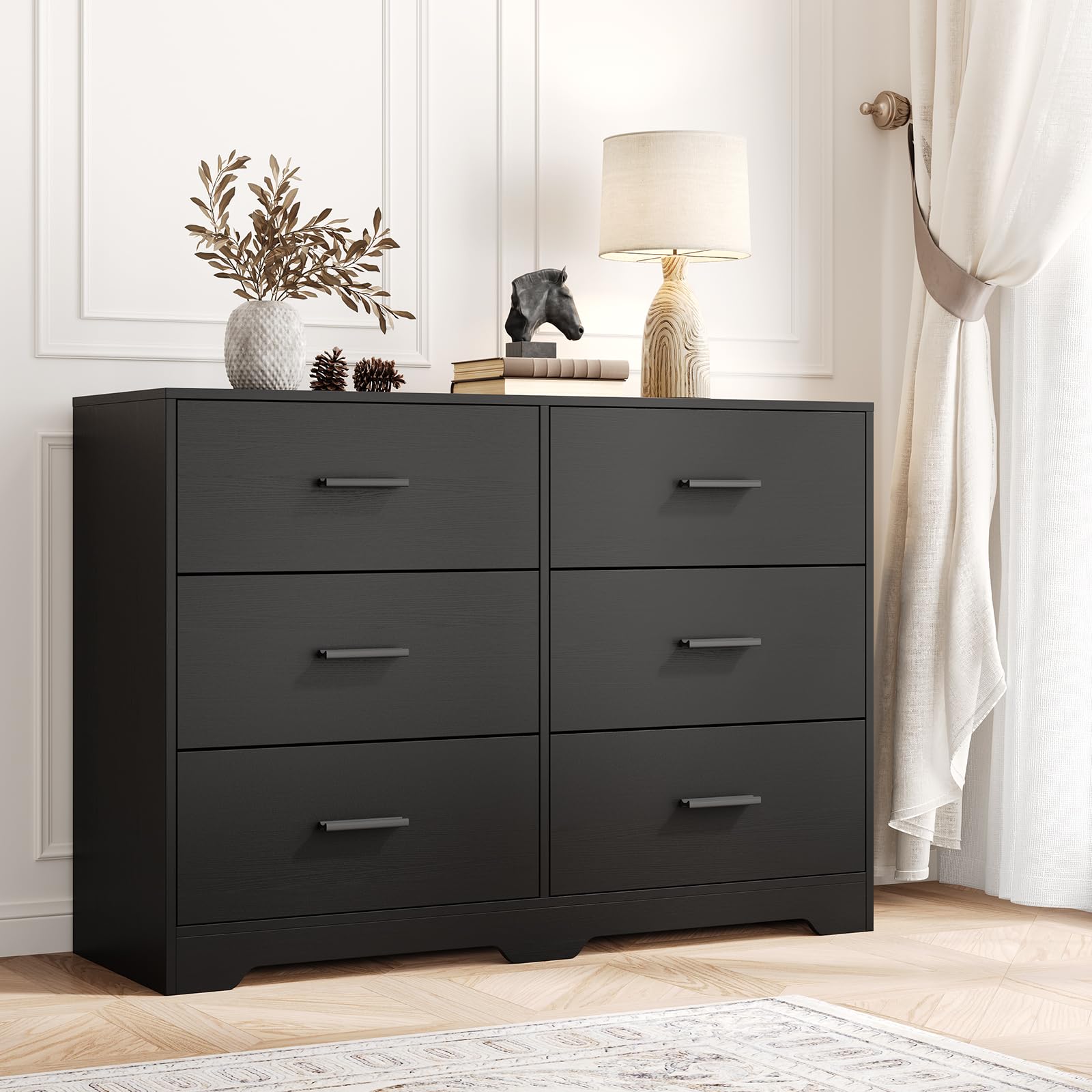
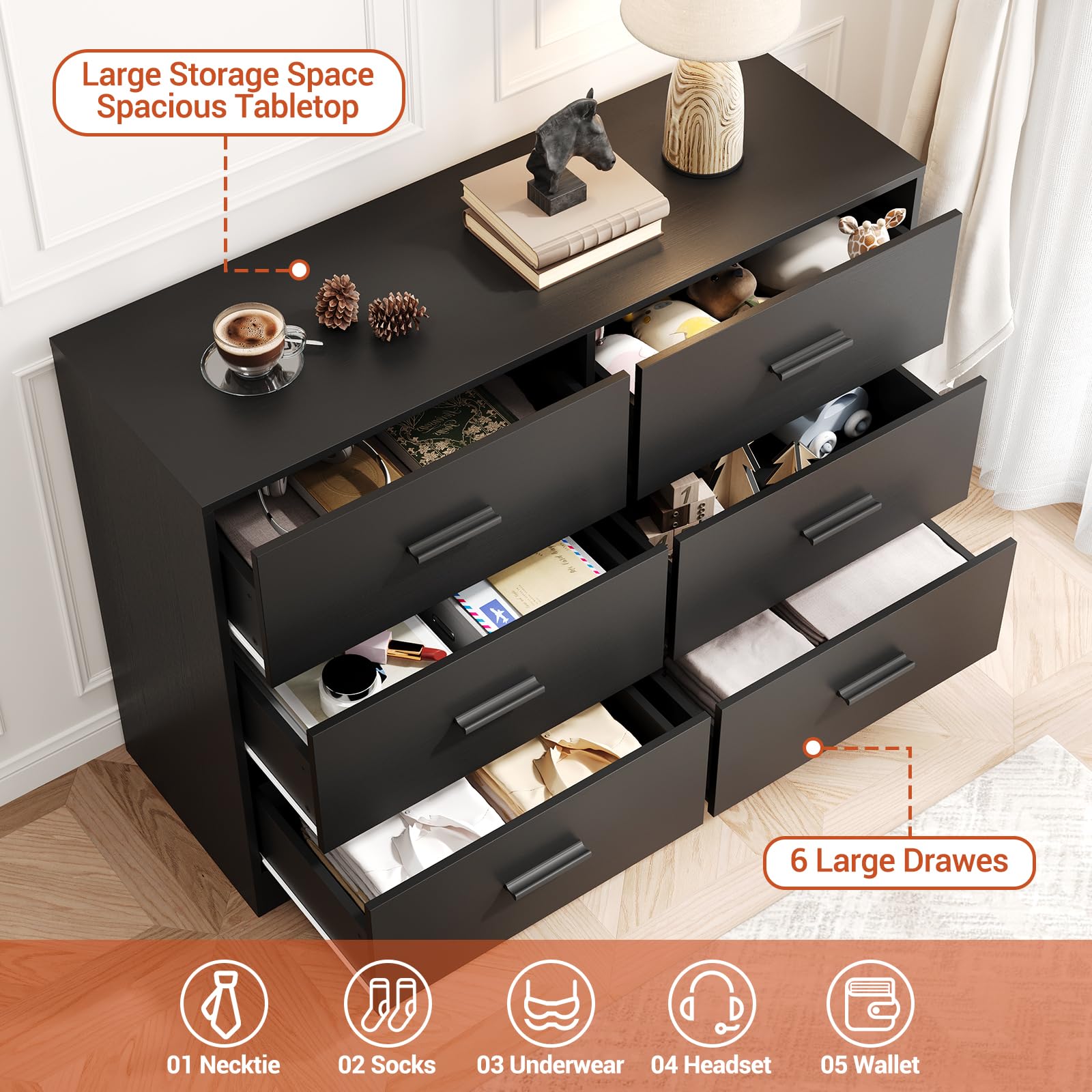
GARVEE Chest of Drawers with 6 Drawers, Modern Drawer Dresser Durable Structure with Deep Drawers,Anti-Tipping Device for Home,Office, Living Room In Black
- Original price was: $312.99.$62.60Current price is: $62.60.
- Select options This product has multiple variants. The options may be chosen on the product page
-
- Sale!
- GARVEE, Home & Kitchen > Rugs > Oriental Rugs
GARVEE – Alfombra clásico Lavable, de 2 x 6 Pulgadas, con diseño de medallón Oriental, Parte Trasera de Goma de Perfil bajo, Ideal para Sala de Estar, Comedor, recámara, Oficina, Color Beige
- Original price was: $38.99.$15.60Current price is: $15.60.
- Select options This product has multiple variants. The options may be chosen on the product page