GARVEE Air Fryer Toaster Oven 20QT 10-in-1 Digital Convection + Rotisserie + Dehydrator + 7 Accessories + 1800W + LED Screen + Countertop Cooking Supply
Original price was: $164.99.$41.25Current price is: $41.25.
Description
GARVEE Air Fryer Toaster Oven 20QT 10-in-1 Digital Convection + Rotisserie + Dehydrator + 7 Accessories + 1800W + LED Screen + Countertop Cooking
Say goodbye to your microwave oven, convection oven, pizza oven, roaster oven, Dehydrator and Toaster.
With this air fryer toaster oven, you can choose one of presets and click the power button directly to cook food. Or you can adjust the time and temperature after choosing the preset, then click the power button.
3 Rack-level
The air fryer oven allows to be cooked 3 racks simultaneously, making it much easier for you to achieve larger jobs or prepare many meals in 1 go. The inner is made of stainless steel
Double-layered Door
Cooking process can be watched through the double-layered window ( inside is glass and outside is PC) safely
Auto Shut-off
The 10 in 1 XL capacity countertop oven air fryer toaster oven combo can be shut off auto when the door is opened
Air Flow Skewers x 8 , Mesh Basket x 3, Chicken Fork x 1 , Rotating Basket x 1 , Rotisserie Basket x 1 , Drip Tray x 1 , Fetch Rack x 1
All of the tools are ETL certificated and dishwasher safe
Specifications
| Brand | GARVEE |
| Color | BLACK |
| Product Dimensions | 15″D x 13″W x 14″H |
| Capacity | 20 Quarts |
| Special Feature | Manual |
| Control Type | Touch Control |
| Included Components | AIR FRYER |
| Model Name | FT1 |
| Item Weight | 23 pounds |
.responsive-table {
border-collapse: collapse;
width: 100%;
margin-bottom: 20px;
}
.responsive-table td {
border: 1px solid #ddd;
padding: 8px;
text-align: left;
}
.responsive-table tr:nth-child(odd) {
background-color: #F2F2F2;
}
.responsive-table tr:nth-child(even) {
background-color: #E6E6E6;
}
.responsive-table tr:hover {
background-color: #DDDDDD;
}
@media screen and (max-width: 600px) {
.responsive-table td {
box-sizing: border-box;
display: block;
width: 100%;
text-align: left;
padding: 10px;
}
.responsive-table tr:nth-child(odd) td {
background-color: #F2F2F2;
}
.responsive-table tr:nth-child(even) td {
background-color: #E6E6E6;
}
.responsive-table tr:hover td {
background-color: #DDDDDD;
}
}
.aplus_module{
margin-bottom:24px;
}
.aplus_module img{
width:100%;
}
.aplus_module h1,h2,h3,h4,h5,h6{
margin:0 !important;
}
.count_imgs_wrap{
display:flex;
}
.count_imgs_wrap>div{
flex: 1;
margin-right: 30px;
}
.count_imgs_wrap>div:last-child {
margin-right: 0;
}
@media screen and (max-width:800px){
.count_imgs_wrap{
flex-direction: column;
}
.count_imgs_wrap>div{
margin-right: 0;
}
.count_imgs{
display:flex;
justify-content: center;
}
.count_imgs>img{
width:auto;
max-width:100%;
}
}
.img_floatleft{
display:flex;
justify-content:space-between;
}
.leftwrap{
flex:3;
display:flex;
}
.lefttext{
margin:0 30px;
}
.lefttext>ul{
padding:0;
}
.lefttext>ul>li{
padding-bottom:18px;
}
.rightwrap{
flex:1;
}
.rightwrap_inner{
border-left:1px solid #dddddd;
padding-left:30px;
}
.rightwrap_inner>ul{
background-color: white;
padding:18px 32px;
border-radius: 8px;
}
@media screen and (max-width:800px){
.img_floatleft{
flex-direction: column;
}
.leftwrap{
flex-direction: column;
flex: initial;
}
.leftimage{
display:flex;
justify-content: center;
}
.leftimage>img{
max-width:100%;
width:auto;
}
.lefttext{
margin:0;
}
.lefttext>ul{
padding-left:32px;
}
.rightwrap{
flex: initial;
}
.rightwrap_inner{
border-left:0;
padding-left:0;
}
.rightwrap_inner>ul{
padding-right:0;
}
}
Additional information
| Size | 20 Qt |
|---|
Related products
-
- Sale!
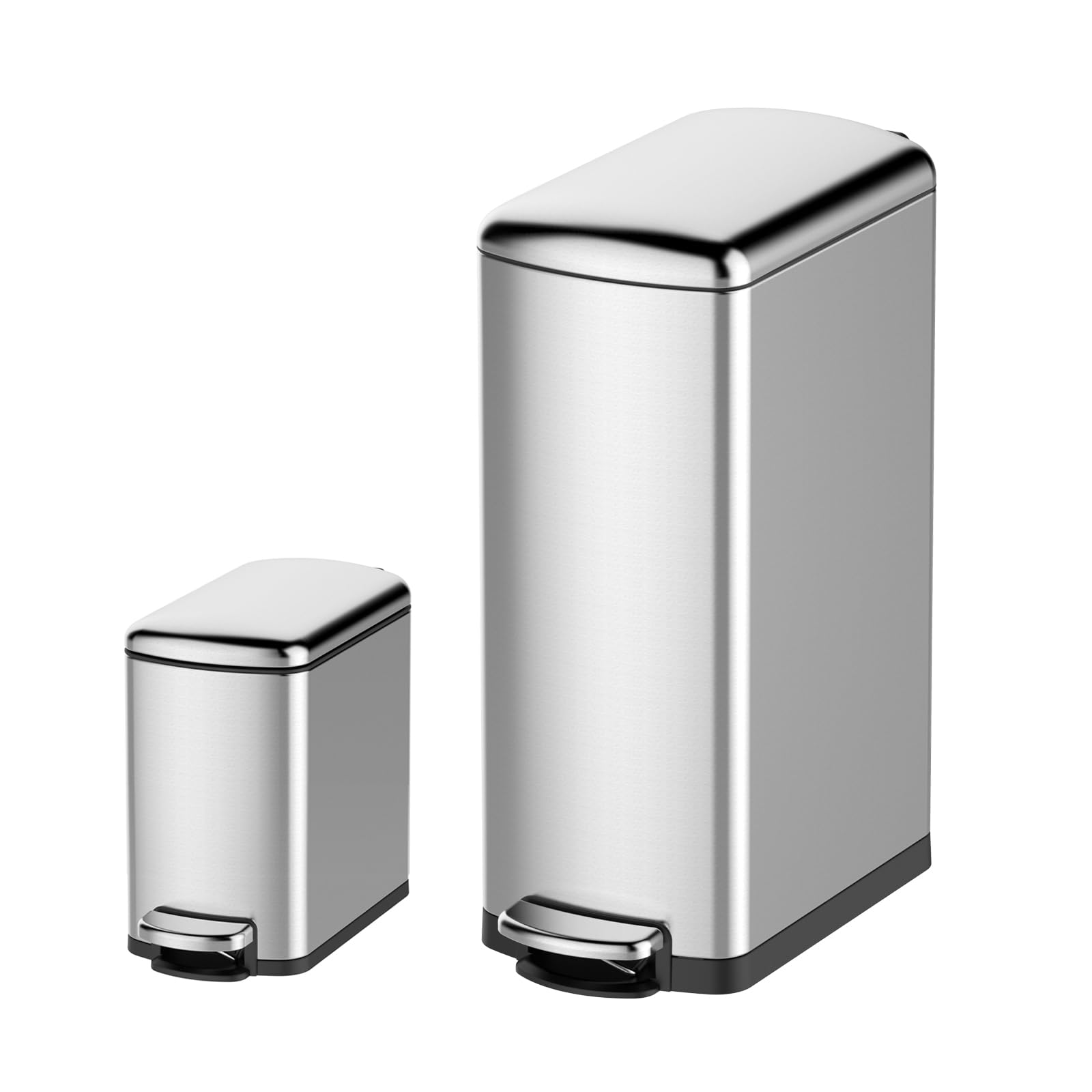
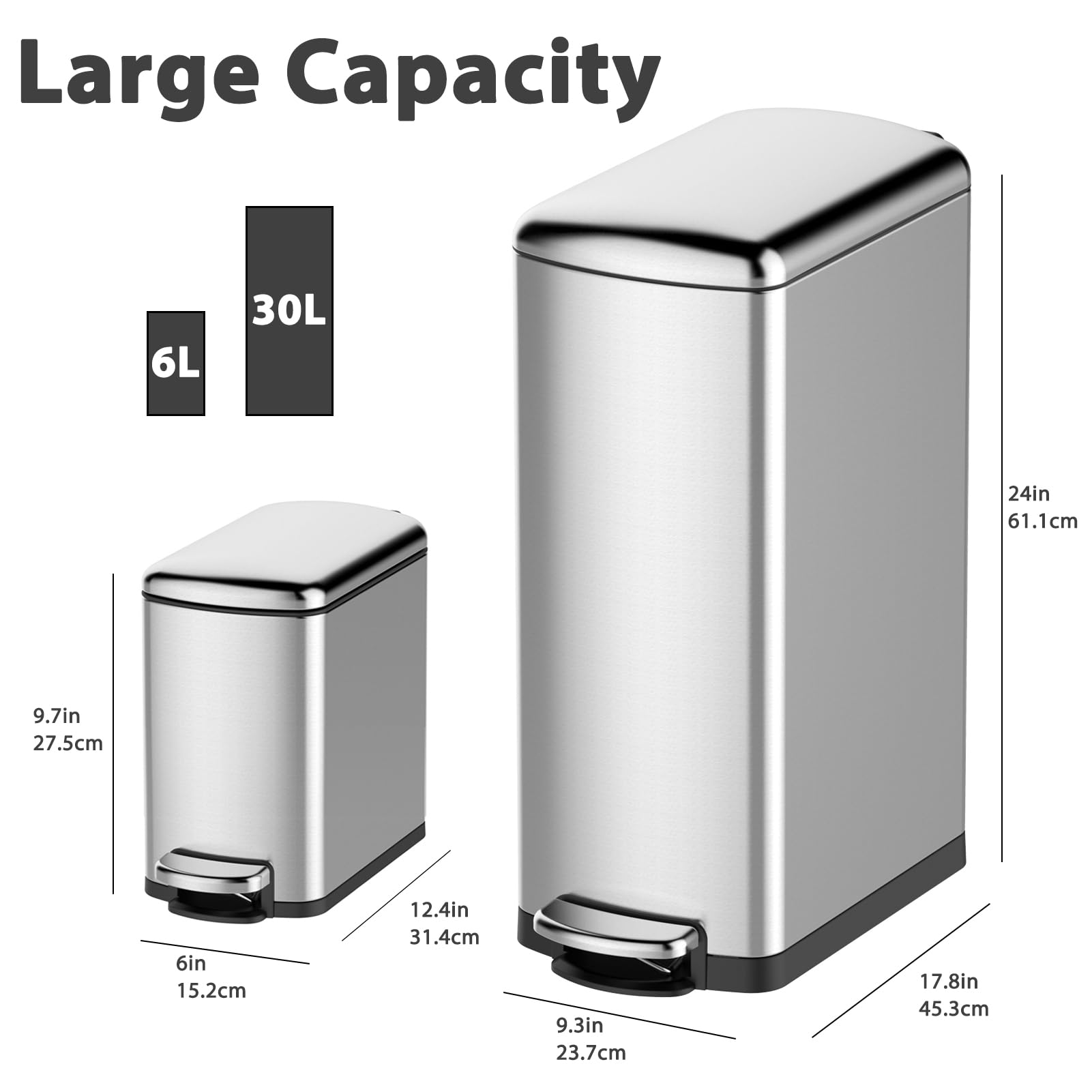
- Cleaning & Janitorial Supplies > Trash Cans & Wastebaskets > Pull Out Trash Cans, GARVEE
GARVEE Trash Can Combo Set, 8 Gallon and 1.6 Gallon Stainless Steel Step Trash Can for Office, Kitchen
- Original price was: $83.99.$25.20Current price is: $25.20.
- Select options This product has multiple variants. The options may be chosen on the product page
-
- Sale!
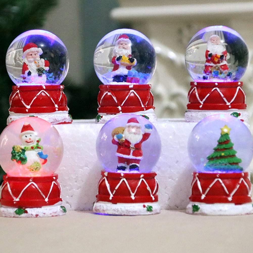
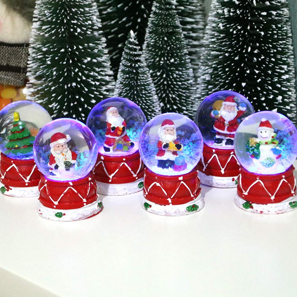
- GARVEE, Home & Kitchen > Seasonal Decor > Christmas Decorations
GARVEE – Bola de vidrio de plexiglás luminosa para decoración de mesa de Navidad
- Original price was: $24.99.$10.00Current price is: $10.00.
- Add to cart
-
- Sale!
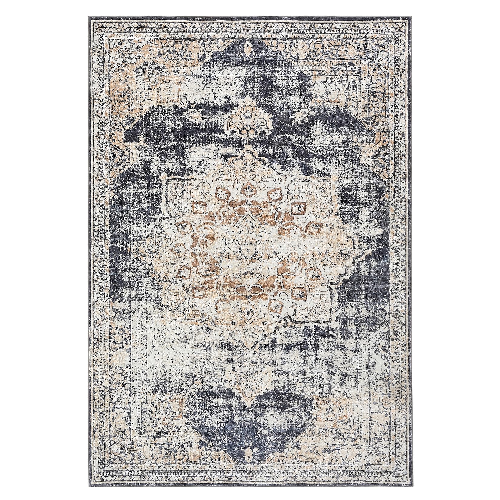
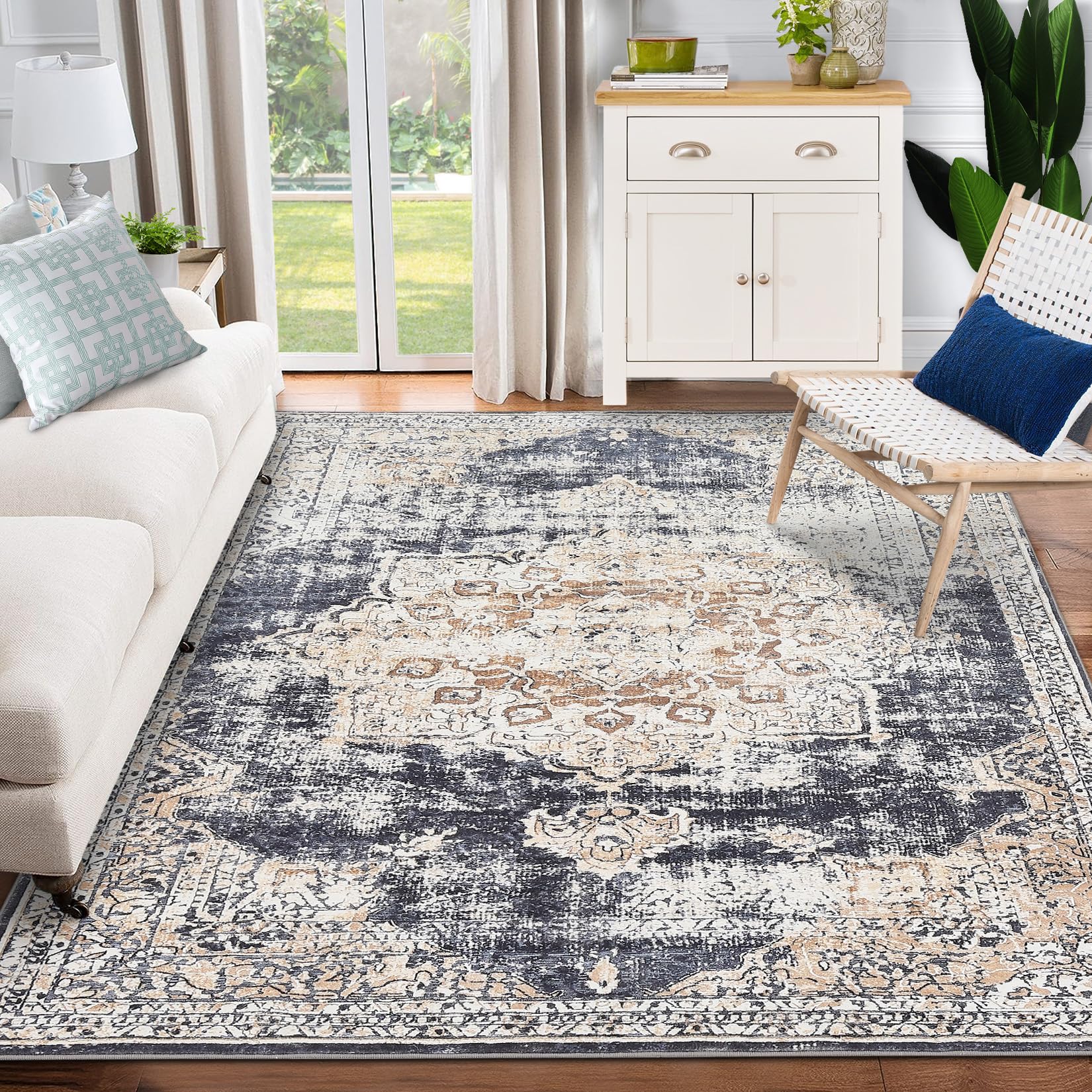
- GARVEE, Home & Kitchen > Rugs > Oriental Rugs
GARVEE – Alfombra clásico Lavable, con Estampado de medallón Oriental, con Respaldo de Goma de Perfil bajo, Ideal para Sala de Estar, Comedor, recámara, Oficina, Color Beige, 3 x 5 Pulgadas
- Original price was: $41.99.$16.80Current price is: $16.80.
- Select options This product has multiple variants. The options may be chosen on the product page