GARVEE Commercial Grease Trap – 20 LBS Carbon Steel Grease Interceptor, Side Inlet Interceptor, Under Sink Grease Trap, 10 Gpm Oil-Water Separator, for Restaurant Canteen Kitchen
Original price was: $113.99.$28.50Current price is: $28.50.
Description
GARVEE Commercial Grease Trap – 20 LBS Carbon Steel Grease Interceptor, Side Inlet Interceptor, Under Sink Grease Trap, 10 Gpm Oil-Water Separator, for Restaurant Canteen Kitchen
- EFFICIENT GREASE MANAGEMENT: This Side Inlet Grease Interceptor is designed for optimal grease separation, ensuring smooth kitchen operations in restaurants, canteens, and home kitchens.
- DURABLE CONSTRUCTION: Made with high-grade carbon steel, our Under Sink Grease Trap offers long-lasting durability and resistance to rust, providing a reliable solution for waste management.
- HIGH CAPACITY PERFORMANCE: With a 10 GPM oil-water separator, this grease trap efficiently handles waste water, reducing maintenance frequency and improving kitchen efficiency.
- VERSATILE APPLICATION: Perfect for commercial kitchens, this grease trap seamlessly fits under sinks, making it ideal for varied settings such as restaurants, canteens, and home kitchens.
- EASY INSTALLATION & MAINTENANCE: Designed for user-friendly installation, our grease trap comes with clear instructions and is easy to clean, ensuring hassle-free maintenance and prolonged use.
Specifications
| Part Number | -hTI9AJFHymPhKBZa0D8-A077 |
| Item Weight | 44.7 pounds |
| Product Dimensions | 25.39 x 15.94 x 18.23 inches |
| Size | 20 LBS |
| Color | Black |
| Material | carbon steel |
| Item Package Quantity | 1 |
| Included Components | Commercial Grease Trap |
| Batteries Required? | No |
.aplus_module STANDARD_PRODUCT_ATTRIBUTES h3{
margin-bottom: 10px;
}
.responsive-table {
border-collapse: collapse;
width: 100%;
margin-bottom: 20px;
}
.responsive-table td {
border: 1px solid #ddd;
padding: 8px;
text-align: left;
}
.responsive-table tr:nth-child(odd) {
background-color: #F2F2F2;
}
.responsive-table tr:nth-child(even) {
background-color: #E6E6E6;
}
.responsive-table tr:hover {
background-color: #DDDDDD;
}
@media screen and (max-width: 800px) {
.responsive-table td {
box-sizing: border-box;
width: 100%;
text-align: left;
padding: 10px;
}
.responsive-table tr:nth-child(odd) td {
background-color: #F2F2F2;
}
.responsive-table tr:nth-child(even) td {
background-color: #E6E6E6;
}
.responsive-table tr:hover td {
background-color: #DDDDDD;
}
}
.aplus_module{
margin-bottom:24px;
}
.aplus_module img{
width:100%;
}
.aplus_module h1,h2,h3,h4,h5,h6{
margin:0 !important;
}
.count_imgs_wrap{
display:flex;
}
.count_imgs_wrap>div{
flex: 1;
margin-right: 30px;
}
.count_imgs_wrap>div:last-child {
margin-right: 0;
}
@media screen and (max-width:800px){
.count_imgs_wrap{
flex-direction: column;
}
.count_imgs_wrap>div{
margin-right: 0;
}
.count_imgs{
display:flex;
justify-content: center;
}
.count_imgs>img{
width:auto;
max-width:100%;
}
}
.img_floatleft{
display:flex;
justify-content:space-between;
}
.leftwrap{
flex:3;
display:flex;
}
.lefttext{
margin:0 30px;
}
.lefttext>ul{
padding:0;
}
.lefttext>ul>li{
padding-bottom:18px;
}
.rightwrap{
flex:1;
}
.rightwrap_inner{
border-left:1px solid #dddddd;
padding-left:30px;
}
.rightwrap_inner>ul{
background-color: white;
padding:18px 32px;
border-radius: 8px;
}
@media screen and (max-width:800px){
.img_floatleft{
flex-direction: column;
}
.leftwrap{
flex-direction: column;
flex: initial;
}
.leftimage{
display:flex;
justify-content: center;
}
.leftimage>img{
max-width:100%;
width:auto;
}
.lefttext{
margin:0;
}
.lefttext>ul{
padding-left:32px;
}
.rightwrap{
flex: initial;
}
.rightwrap_inner{
border-left:0;
padding-left:0;
}
.rightwrap_inner>ul{
padding-right:0;
}
}
Additional information
| Size | 23.2*13.8*16.5 inch |
|---|
Related products
-
- Sale!
- GARVEE, Home & Kitchen > Rugs > Oriental Rugs
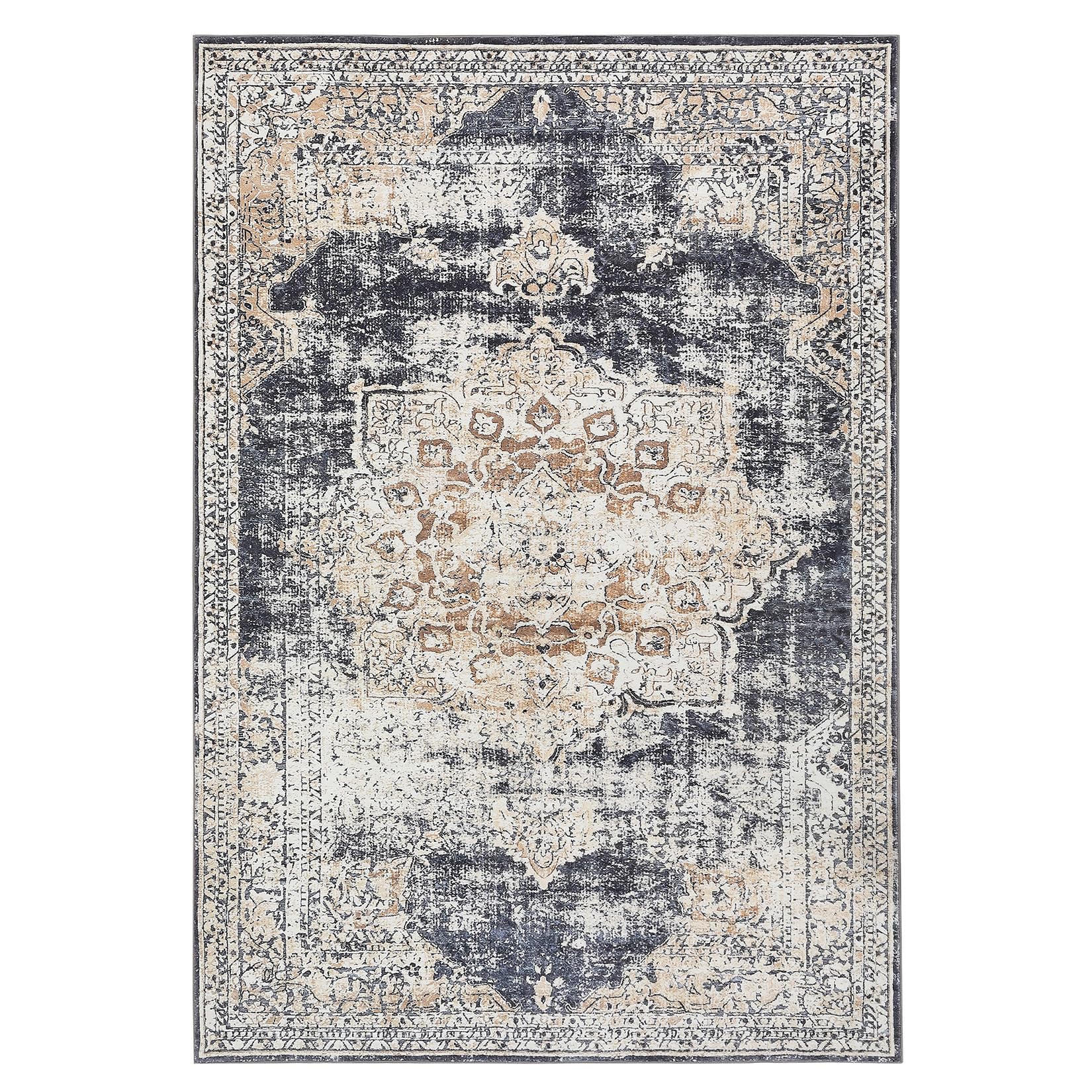
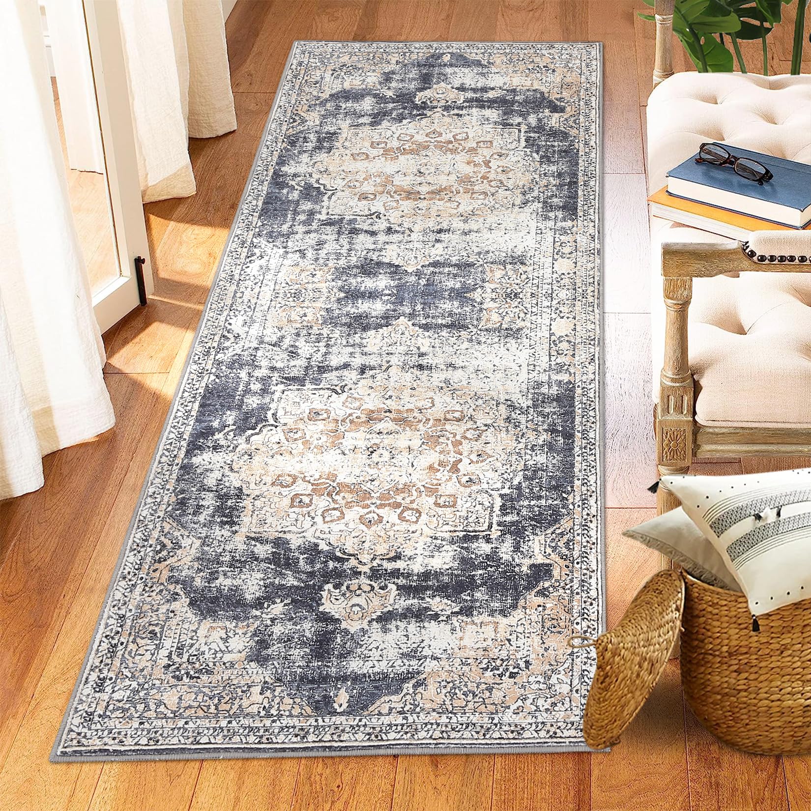
GARVEE – Alfombra clásico Lavable, con Estampado de medallón Oriental, con Respaldo de Goma de Perfil bajo, Ideal para Sala de Estar, Comedor, recámara, Oficina, Color Beige, 5 x 7 Pulgadas
- Original price was: $63.99.$19.20Current price is: $19.20.
- Select options This product has multiple variants. The options may be chosen on the product page
-
- Sale!
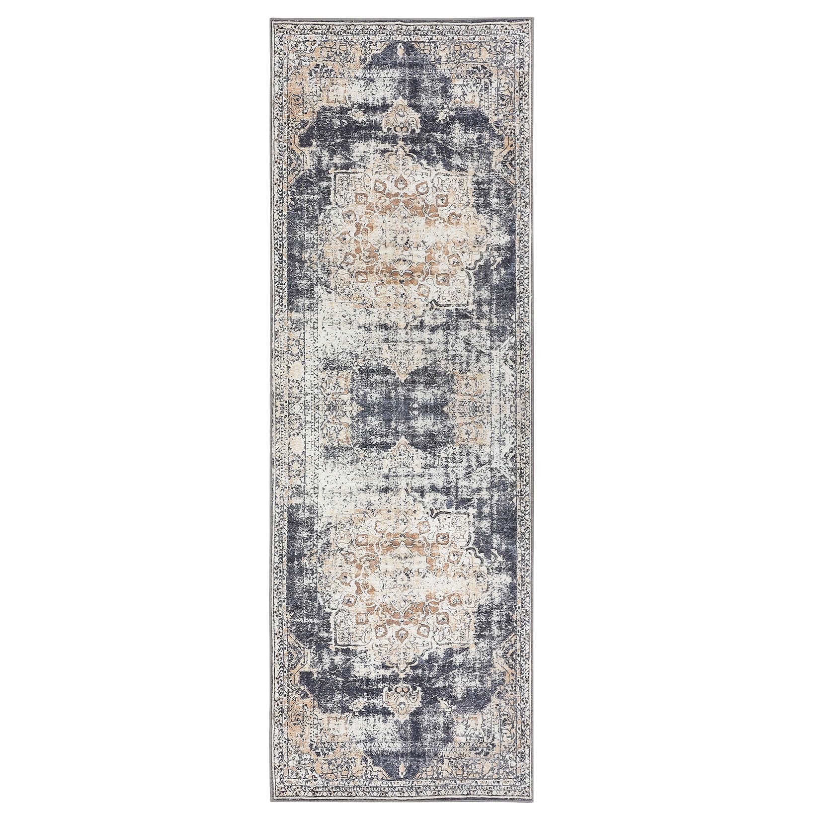
- GARVEE, Home & Kitchen > Rugs > Oriental Rugs
GARVEE – Alfombra clásico Lavable, de 2 x 6 Pulgadas, con diseño de medallón Oriental, Parte Trasera de Goma de Perfil bajo, Ideal para Sala de Estar, Comedor, recámara, Oficina, Color Beige
- Original price was: $38.99.$15.60Current price is: $15.60.
- Select options This product has multiple variants. The options may be chosen on the product page
-
- Sale!
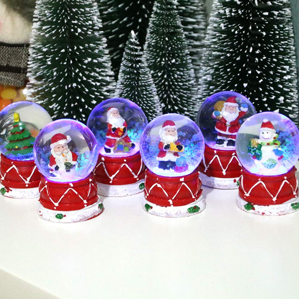
- GARVEE, Home & Kitchen > Seasonal Decor > Christmas Decorations
GARVEE – Bola de vidrio de plexiglás luminosa para decoración de mesa de Navidad
- Original price was: $24.99.$10.00Current price is: $10.00.
- Add to cart