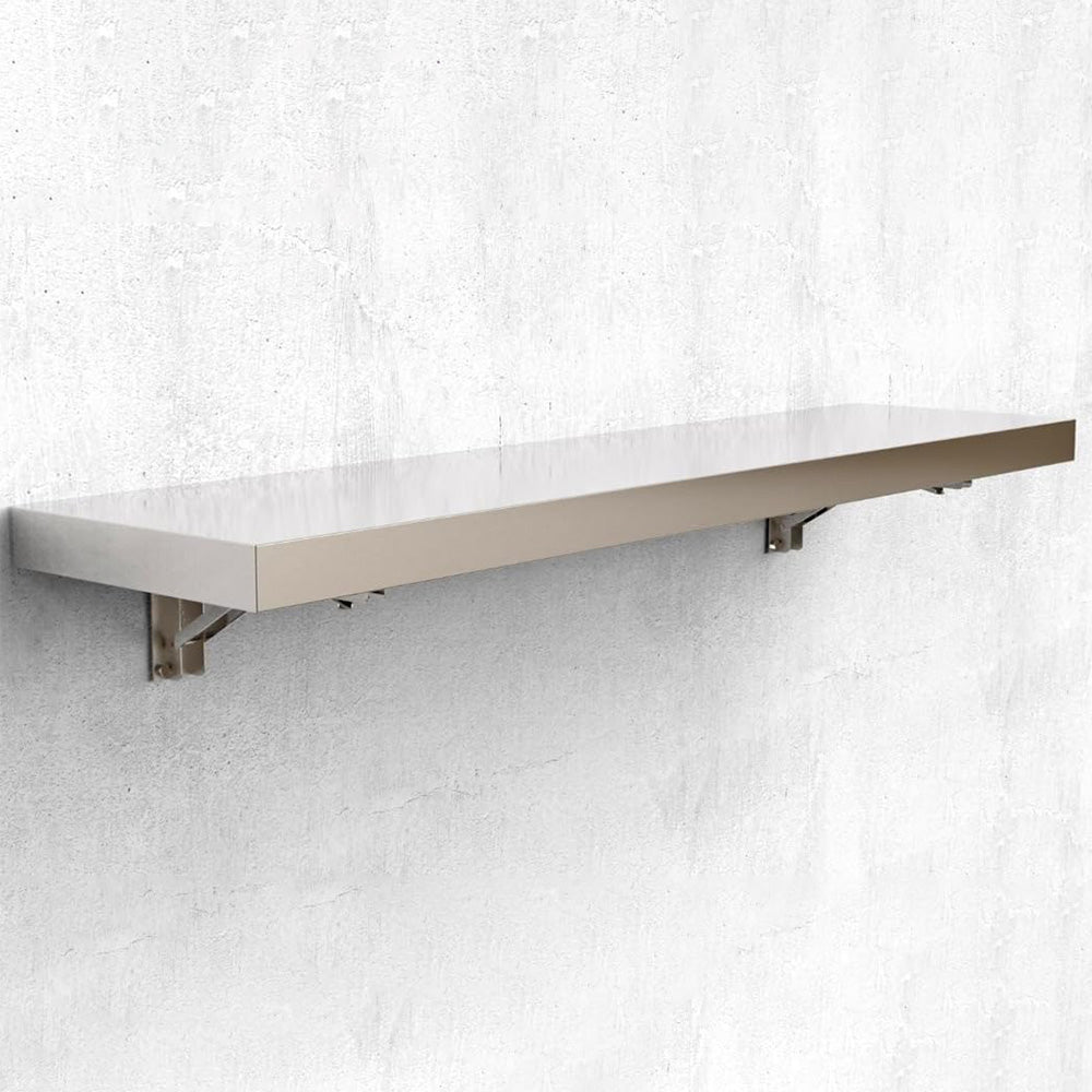


GARVEE Concession Shelf 48 * 12 * 3inch – Stainless Steel Drop Down Folding Serving Food Shelf, Stand Serving for Concession Trailer Serving Window, for Food Truck, Grill Area, Restaurant, Garage
Original price was: $140.99.$35.25Current price is: $35.25.
Description
GARVEE Concession Shelf 48 * 12 * 3inch – Stainless Steel Drop Down Folding Serving Food Shelf, Stand Serving for Concession Trailer Serving Window, for Food Truck, Grill Area, Restaurant, Garage
- SPACE-SAVING DESIGN: The stainless steel drop-down folding serving food shelf effortlessly folds down when not in use, creating a practical space-saving solution for any concession trailer or food truck.
- DURABLE CONSTRUCTION: Crafted from high-quality stainless steel, this 36L x 12W inch shelf is resistant to corrosion, ensuring long-lasting durability for both indoor and outdoor use.
- VERSATILE APPLICATIONS: Ideal for food trucks, grill areas, BBQ setups, restaurants, and more, this NSF-certified shelf provides additional storage and organization options in various settings.
- QUICK AND EASY INSTALLATION: Comes with all necessary hardware for a hassle-free setup, allowing you to securely attach the shelf to any wall surface with ease.
- EFFORTLESS MAINTENANCE: The smooth stainless steel surface ensures easy cleaning with just a damp cloth or sponge, maintaining a sleek and hygienic appearance.
Specifications
| Room Type | Garage |
| Number of Shelves | 1 |
| Special Feature | Foldable |
| Product Dimensions | 71.85″D x 12.01″W x 5.71″H |
| Age Range (Description) | Adult |
| Brand | GARVEE |
| Size | 71*11*3inch |
| Assembly Required | Yes |
| Number of Items | 1 |
| Included Components | Hardware |
| Model Name | Concession Shelf |
| Item Weight | 36.2 pounds |
.aplus_module STANDARD_PRODUCT_ATTRIBUTES h3{
margin-bottom: 10px;
}
.responsive-table {
border-collapse: collapse;
width: 100%;
margin-bottom: 20px;
}
.responsive-table td {
border: 1px solid #ddd;
padding: 8px;
text-align: left;
}
.responsive-table tr:nth-child(odd) {
background-color: #F2F2F2;
}
.responsive-table tr:nth-child(even) {
background-color: #E6E6E6;
}
.responsive-table tr:hover {
background-color: #DDDDDD;
}
@media screen and (max-width: 800px) {
.responsive-table td {
box-sizing: border-box;
width: 100%;
text-align: left;
padding: 10px;
}
.responsive-table tr:nth-child(odd) td {
background-color: #F2F2F2;
}
.responsive-table tr:nth-child(even) td {
background-color: #E6E6E6;
}
.responsive-table tr:hover td {
background-color: #DDDDDD;
}
}
.aplus_module{
margin-bottom:24px;
}
.aplus_module img{
width:100%;
}
.aplus_module h1,h2,h3,h4,h5,h6{
margin:0 !important;
}
.count_imgs_wrap{
display:flex;
}
.count_imgs_wrap>div{
flex: 1;
margin-right: 30px;
}
.count_imgs_wrap>div:last-child {
margin-right: 0;
}
@media screen and (max-width:800px){
.count_imgs_wrap{
flex-direction: column;
}
.count_imgs_wrap>div{
margin-right: 0;
}
.count_imgs{
display:flex;
justify-content: center;
}
.count_imgs>img{
width:auto;
max-width:100%;
}
}
.img_floatleft{
display:flex;
justify-content:space-between;
}
.leftwrap{
flex:3;
display:flex;
}
.lefttext{
margin:0 30px;
}
.lefttext>ul{
padding:0;
}
.lefttext>ul>li{
padding-bottom:18px;
}
.rightwrap{
flex:1;
}
.rightwrap_inner{
border-left:1px solid #dddddd;
padding-left:30px;
}
.rightwrap_inner>ul{
background-color: white;
padding:18px 32px;
border-radius: 8px;
}
@media screen and (max-width:800px){
.img_floatleft{
flex-direction: column;
}
.leftwrap{
flex-direction: column;
flex: initial;
}
.leftimage{
display:flex;
justify-content: center;
}
.leftimage>img{
max-width:100%;
width:auto;
}
.lefttext{
margin:0;
}
.lefttext>ul{
padding-left:32px;
}
.rightwrap{
flex: initial;
}
.rightwrap_inner{
border-left:0;
padding-left:0;
}
.rightwrap_inner>ul{
padding-right:0;
}
}
Additional information
| Size | 48*12*3inch |
|---|
Related products
-
- Sale!
- GARVEE, Home & Kitchen > Rugs > Oriental Rugs
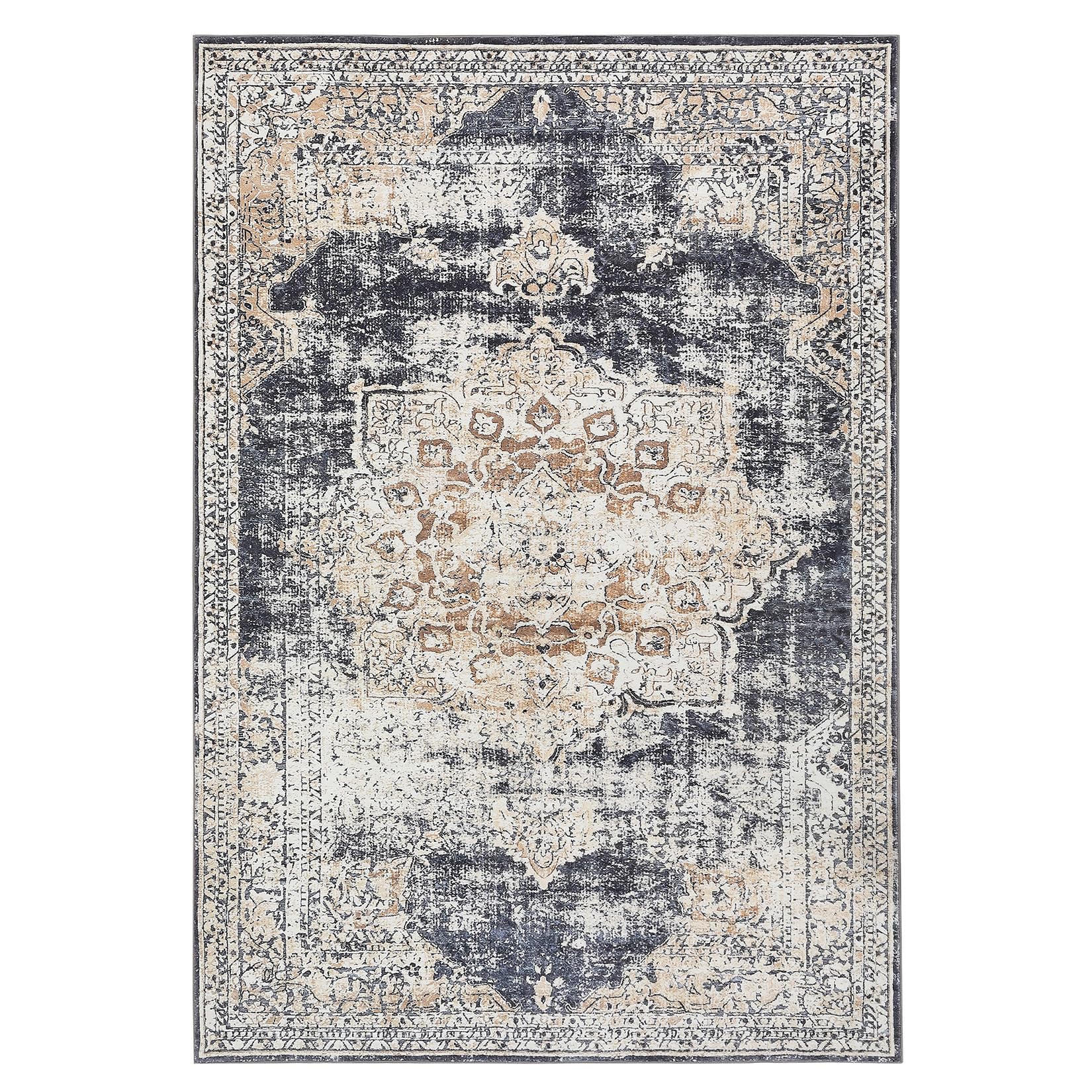
GARVEE – Alfombra clásico Lavable, con Estampado de medallón Oriental, con Respaldo de Goma de Perfil bajo, Ideal para Sala de Estar, Comedor, recámara, Oficina, Color Beige, 5 x 7 Pulgadas
- Original price was: $63.99.$19.20Current price is: $19.20.
- Select options This product has multiple variants. The options may be chosen on the product page
-
- Sale!
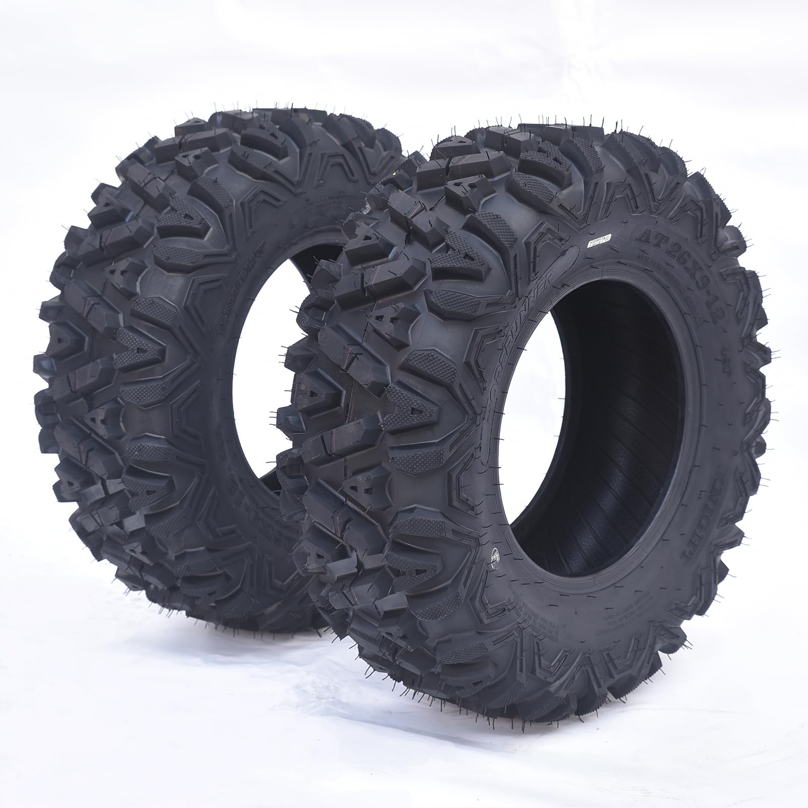
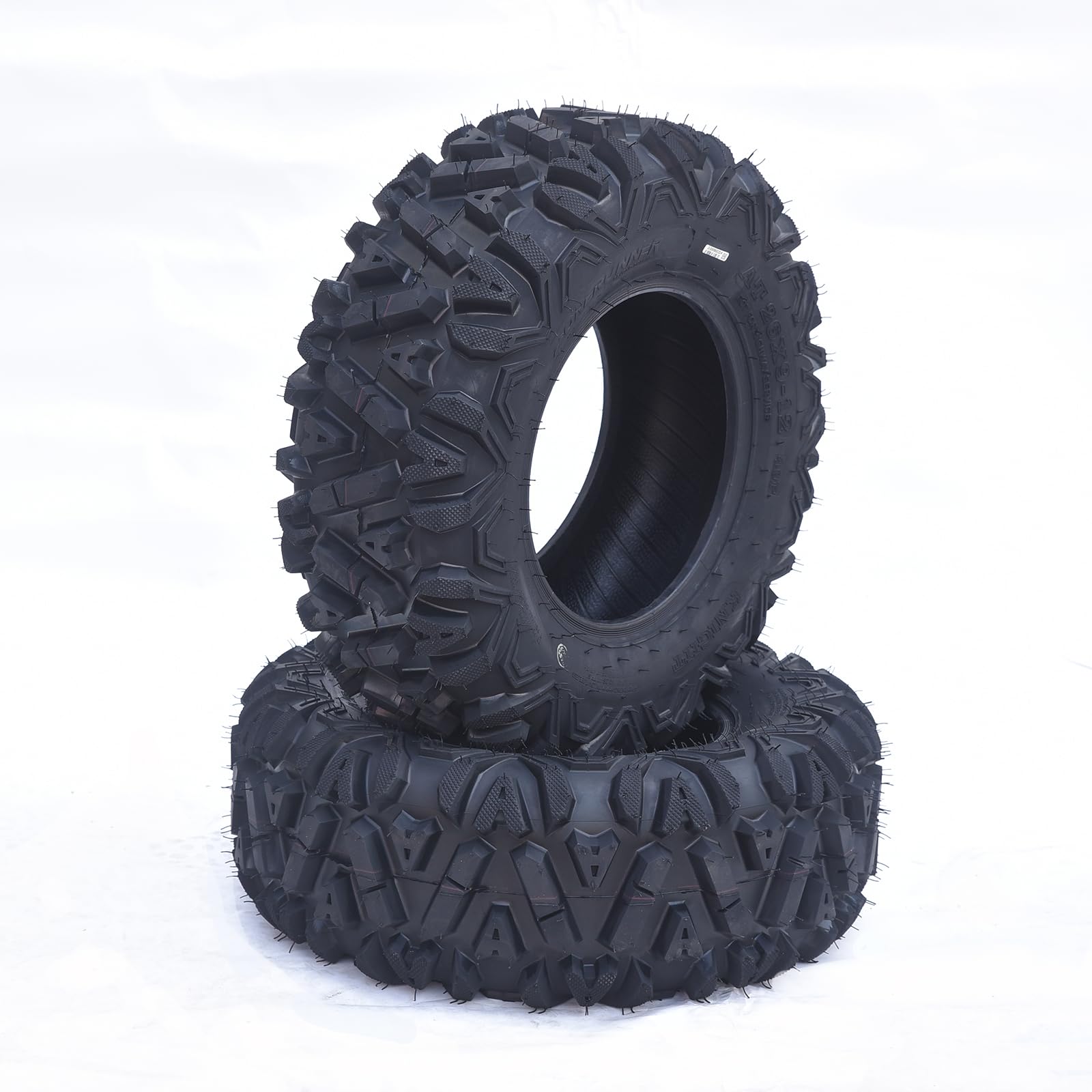
- Automotive > Tire & Wheel Tools > UTV & ATV Tires, GARVEE
GARVEE AT26x9-12-6PR TL KNIGHT Set of 2 ATV Trail Tires 6PR Knobby Sport Tires, Tubeless – AT26x9-12-6PR TL KNIGHT
- Original price was: $175.99.$44.00Current price is: $44.00.
- Select options This product has multiple variants. The options may be chosen on the product page
-
- Sale!
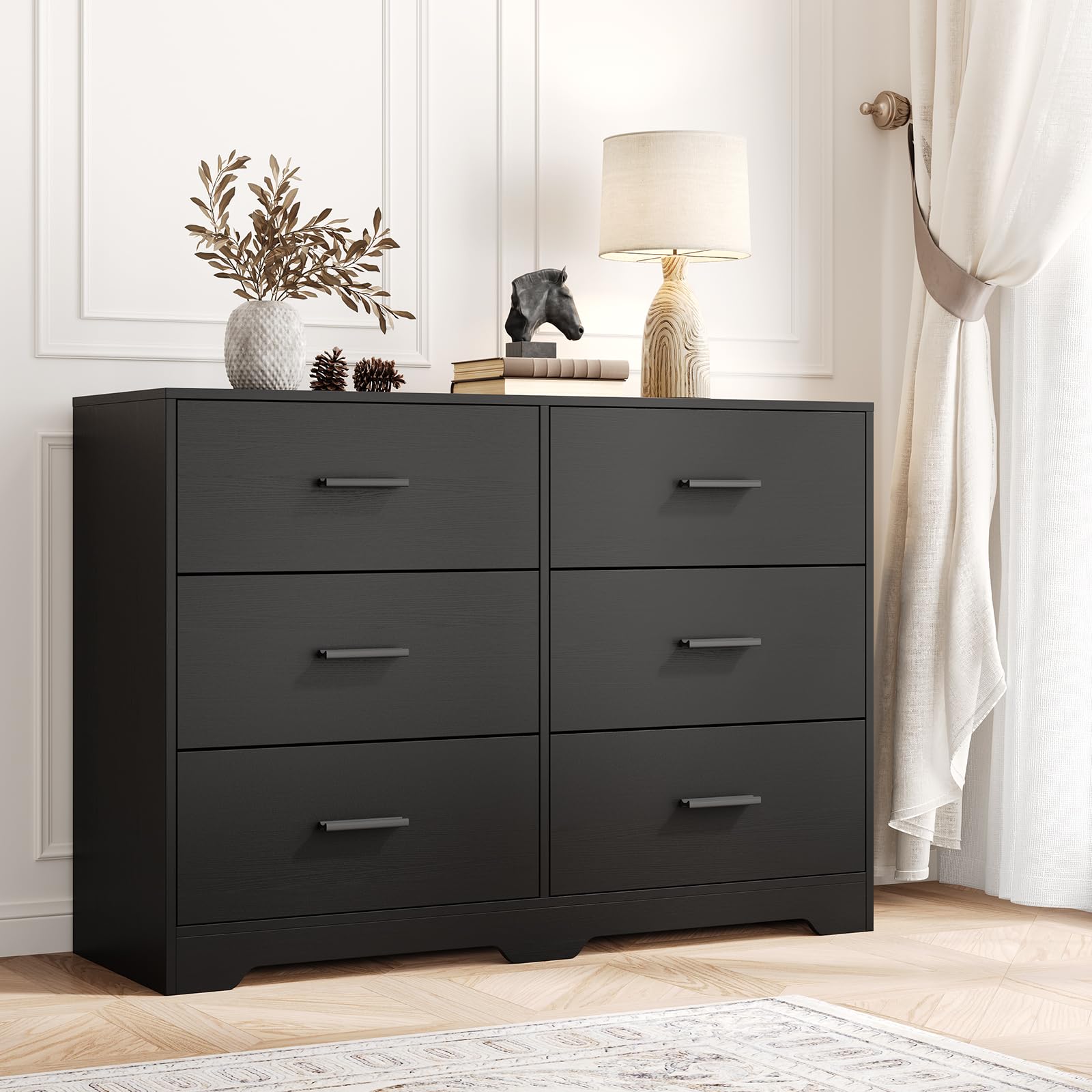
- Furniture > Living Room Furniture > Cabinets & Chests, GARVEE
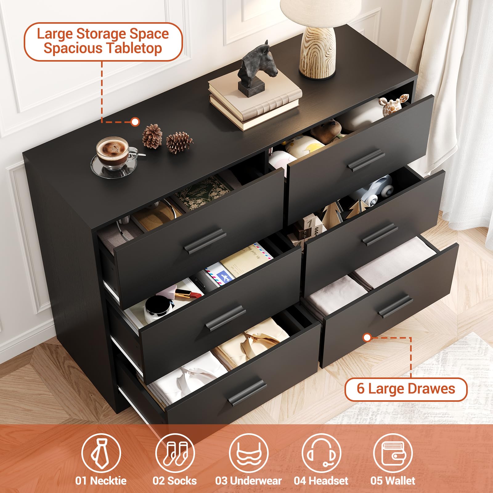
GARVEE Chest of Drawers with 6 Drawers, Modern Drawer Dresser Durable Structure with Deep Drawers,Anti-Tipping Device for Home,Office, Living Room In Black
- Original price was: $312.99.$62.60Current price is: $62.60.
- Select options This product has multiple variants. The options may be chosen on the product page