GARVEE Double Layer Large Bread Box, Bamboo Bread Box for Kitchen Counter, Bread Containerr, Bamboo Bread Storage Container with Acrylic Clear Door, Black
Original price was: $41.99.$16.80Current price is: $16.80.
Description
GARVEE Double Layer Large Bread Box, Bamboo Bread Box for Kitchen Counter, Bread Containerr, Bamboo Bread Storage Container with Acrylic Clear Door, Black
Kitchen Bread Box & Bread storage container
Stylish Design & Countertop Decor
- Our 2-layer black bread box looks traditional yet modern and will make a great accent on your countertop. Great choice for storing and displaying bread and other baked goods.
Feature
- Nature Bamboo Material
- Waterproof Surface
- Double Layer
- Visualization
- Magnetic lock
- Large capacity
.standard_single_image_specs_detail .rightwrap_inner>ul{
background-color: transparent;
padding:18px 20px;
border-radius: 0;
}
@media screen and (max-width:800px){
.standard_single_image_specs_detail .lefttext>ul{
padding-left:0;
}
}
Anti Drop
Anti drop fence prevent items from falling.
High-Foot Bottom
High-foot bottom design makes it easier to move.
Water Proof
Waterproof bamboo material, easy to clean
Specifications
| Recommended Uses For Product | Bread |
| Special Feature | Durable |
| Container Shape | Rectangular |
| Is Dishwasher Safe | No |
| Item Package Quantity | 1 |
| Product Care Instructions | Hand Wash Only |
| Unit Count | 1.0 Count |
| Item Form | Box |
| Specific Uses For Product | Inside; Professional |
| UPC | 198290018741 |
| Product Dimensions | 15.35 x 9.84 x 12.71 inches |
| Item Weight | 9.53 pounds |
| Fabric Type | bamboo |
| Batteries required | No |
| Included Components | Double Layer |
| Number of Sets | 1 |
.aplus_module STANDARD_PRODUCT_ATTRIBUTES h3{
margin-bottom: 10px;
}
.responsive-table {
border-collapse: collapse;
width: 100%;
margin-bottom: 20px;
}
.responsive-table td {
border: 1px solid #ddd;
padding: 8px;
text-align: left;
}
.responsive-table tr:nth-child(odd) {
background-color: #F2F2F2;
}
.responsive-table tr:nth-child(even) {
background-color: #E6E6E6;
}
.responsive-table tr:hover {
background-color: #DDDDDD;
}
@media screen and (max-width: 800px) {
.responsive-table td {
box-sizing: border-box;
width: 100%;
text-align: left;
padding: 10px;
}
.responsive-table tr:nth-child(odd) td {
background-color: #F2F2F2;
}
.responsive-table tr:nth-child(even) td {
background-color: #E6E6E6;
}
.responsive-table tr:hover td {
background-color: #DDDDDD;
}
}
.aplus_module{
margin-bottom:24px;
}
.aplus_module img{
width:100%;
}
.aplus_module h1,h2,h3,h4,h5,h6{
margin:0 !important;
}
.count_imgs_wrap{
display:flex;
}
.count_imgs_wrap>div{
flex: 1;
margin-right: 30px;
}
.count_imgs_wrap>div:last-child {
margin-right: 0;
}
@media screen and (max-width:800px){
.count_imgs_wrap{
flex-direction: column;
}
.count_imgs_wrap>div{
margin-right: 0;
}
.count_imgs{
display:flex;
justify-content: center;
}
.count_imgs>img{
width:auto;
max-width:100%;
}
}
.img_floatleft{
display:flex;
justify-content:space-between;
}
.leftwrap{
flex:3;
display:flex;
}
.lefttext{
margin:0 30px;
}
.lefttext>ul{
padding:0;
}
.lefttext>ul>li{
padding-bottom:18px;
}
.rightwrap{
flex:1;
}
.rightwrap_inner{
border-left:1px solid #dddddd;
padding-left:30px;
}
.rightwrap_inner>ul{
background-color: white;
padding:18px 32px;
border-radius: 8px;
}
@media screen and (max-width:800px){
.img_floatleft{
flex-direction: column;
}
.leftwrap{
flex-direction: column;
flex: initial;
}
.leftimage{
display:flex;
justify-content: center;
}
.leftimage>img{
max-width:100%;
width:auto;
}
.lefttext{
margin:0;
}
.lefttext>ul{
padding-left:32px;
}
.rightwrap{
flex: initial;
}
.rightwrap_inner{
border-left:0;
padding-left:0;
}
.rightwrap_inner>ul{
padding-right:0;
}
}
Additional information
| Color | black |
|---|
Related products
-
-
Sale!
- Furniture > Kids' Furniture > Kids' Tables & Chairs, GARVEE
GARVEE Kids Table and 4 Chairs Set with Graffiti Desktop, Height Adjustable Toddler Table and Chairs Set, 4 in 1 Activity Table Play Table for Reading, Drawing, Playing, Eating,Beige
- Original price was: $133.99.$33.50Current price is: $33.50.
- Select options This product has multiple variants. The options may be chosen on the product page
-
Sale!
-
- Sale!
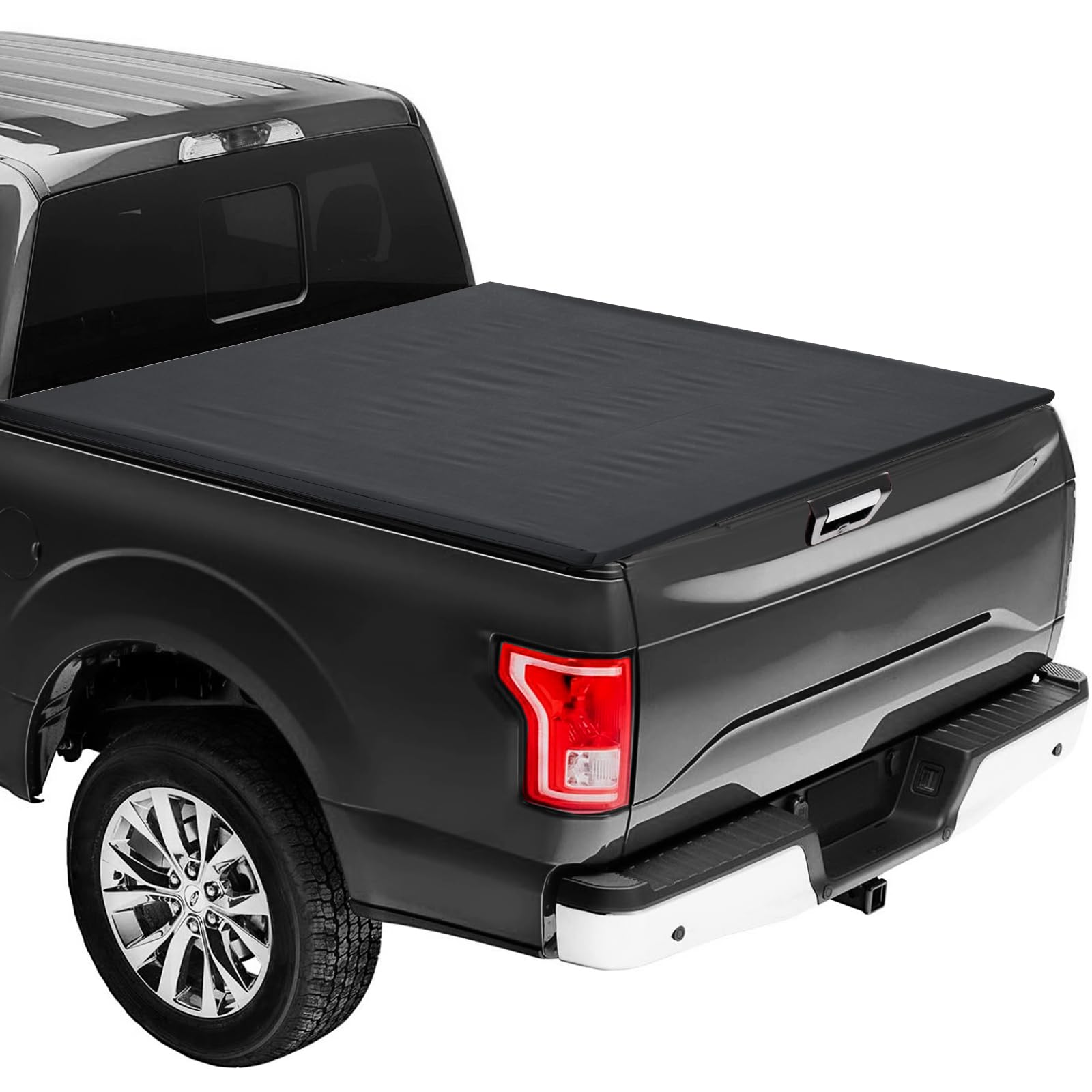
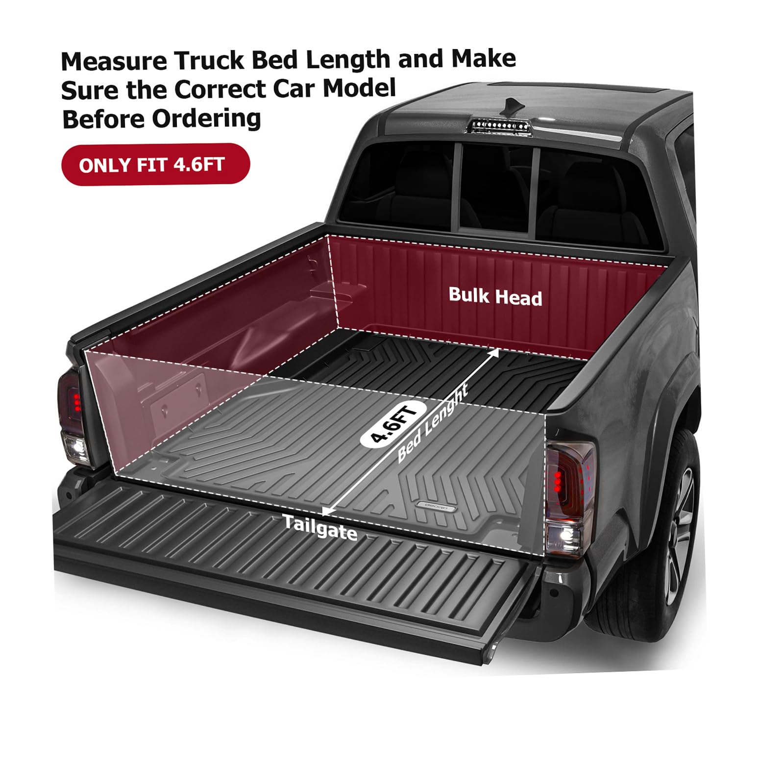
- Automotive > Automotive Accessories > Tonneau Cover, GARVEE
GARVEE Soft Roll-Up Tonneau Cover for 2022-2024 Ford Maverick 4.6ft bed- Black
- Original price was: $154.99.$38.75Current price is: $38.75.
- Select options This product has multiple variants. The options may be chosen on the product page
-
- Sale!
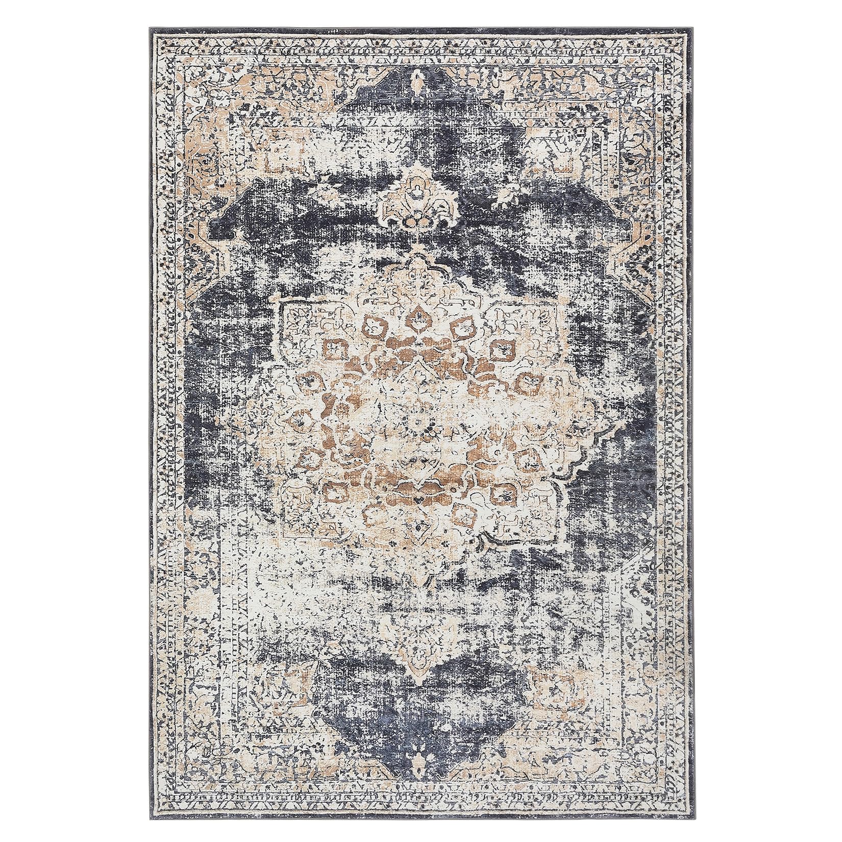
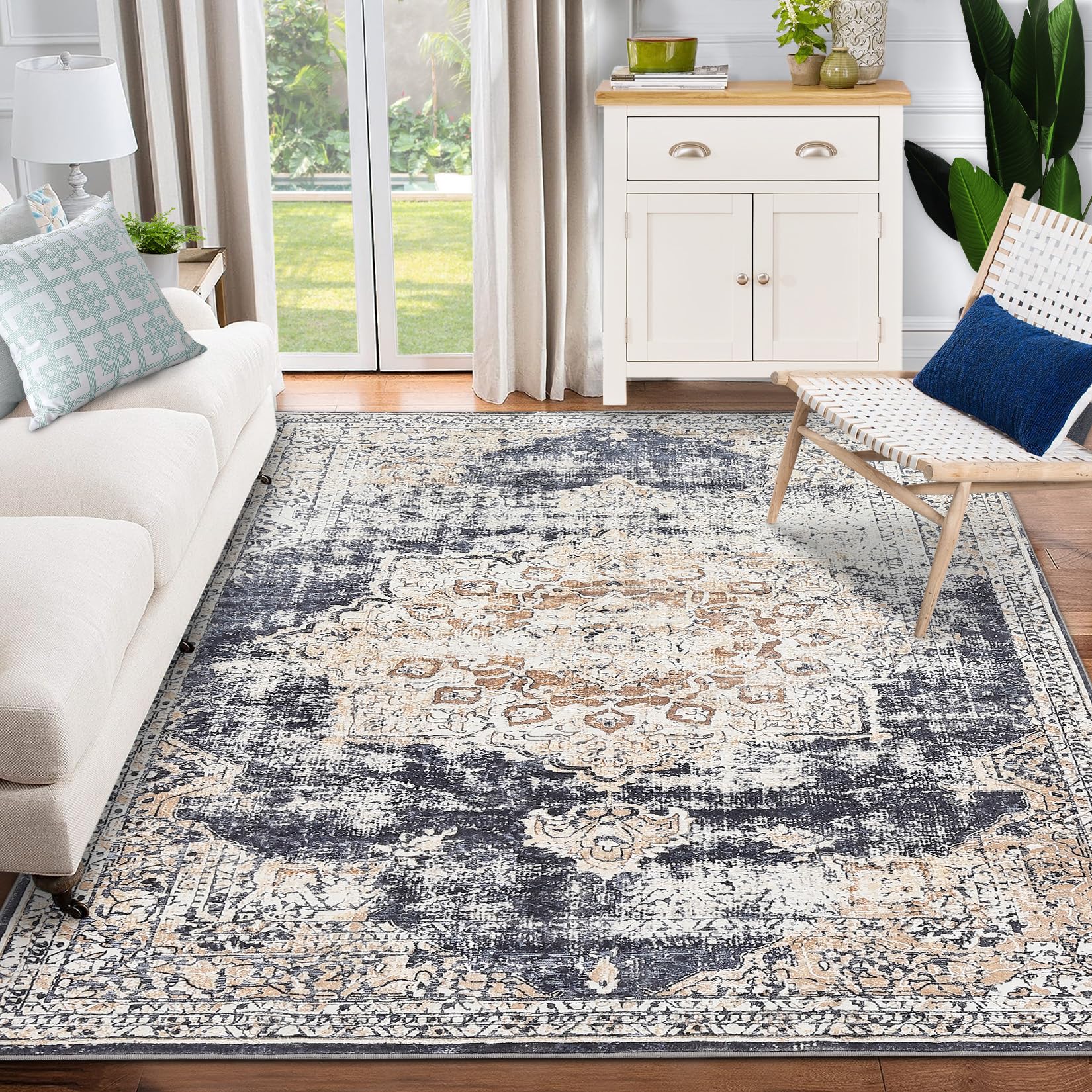
- GARVEE, Home & Kitchen > Rugs > Oriental Rugs
GARVEE – Alfombra clásico Lavable, con Estampado de medallón Oriental, con Respaldo de Goma de Perfil bajo, Ideal para Sala de Estar, Comedor, recámara, Oficina, Color Beige, 8 x 10 Pulgadas
- Original price was: $124.99.$31.25Current price is: $31.25.
- Select options This product has multiple variants. The options may be chosen on the product page