GARVEE Electric Meat Slicer – 800W Pure Copper Motor, Automatic Operation, Detachable Stainless Steel Blade, 3mm Adjustable Thickness, Commercial Kitchen & Restaurant
Original price was: $411.99.$82.40Current price is: $82.40.
Description
GARVEE Electric Meat Slicer – 800W Pure Copper Motor, Automatic Operation, Detachable Stainless Steel Blade, 3mm Adjustable Thickness, Commercial Kitchen & Restaurant
Key Features
POWERFUL PERFORMANCE: Equipped with an 800W pure copper motor, this meat slicer delivers high slicing power, ideal for commercial kitchens and restaurants.
AUTOMATIC OPERATION: Fully automatic design ensures consistent, even slices effortlessly, enhancing efficiency and productivity in busy kitchens.
ADJUSTABLE THICKNESS: Features a 3mm adjustable thickness setting for versatile slicing, from deli-thin cuts to thicker slices for roasts.
DETACHABLE STEEL BLADE: Stainless steel blade is detachable for easy cleaning and maintenance, ensuring rust resistance and long-lasting durability.
COMMERCIAL EFFICIENCY: Heavy-duty meat slicer with a cutting speed of 551lb/hour, perfect for high-volume slicing in professional kitchens.
Specifications
| Brand | GARVEE |
| Product Dimensions | 21.65″L x 14.57″W x 19.69″H |
| Material | Stainless Steel |
| Color | Silver |
| Special Feature | Powerful Motor |
| Product Care Instructions | Hand Wash Only |
| Blade Material | Stainless Steel |
| Item Weight | 75 pounds |
| Blade Shape | Round |
| Operation Mode | Automatic |
.aplus_module STANDARD_PRODUCT_ATTRIBUTES h3{
margin-bottom: 10px;
}
.responsive-table {
border-collapse: collapse;
width: 100%;
margin-bottom: 20px;
}
.responsive-table td {
border: 1px solid #ddd;
padding: 8px;
text-align: left;
}
.responsive-table tr:nth-child(odd) {
background-color: #F2F2F2;
}
.responsive-table tr:nth-child(even) {
background-color: #E6E6E6;
}
.responsive-table tr:hover {
background-color: #DDDDDD;
}
@media screen and (max-width: 800px) {
.responsive-table td {
box-sizing: border-box;
width: 100%;
text-align: left;
padding: 10px;
}
.responsive-table tr:nth-child(odd) td {
background-color: #F2F2F2;
}
.responsive-table tr:nth-child(even) td {
background-color: #E6E6E6;
}
.responsive-table tr:hover td {
background-color: #DDDDDD;
}
}
.aplus_module{
margin-bottom:24px;
}
.aplus_module img{
width:100%;
}
.aplus_module h1,h2,h3,h4,h5,h6{
margin:0 !important;
}
.count_imgs_wrap{
display:flex;
}
.count_imgs_wrap>div{
flex: 1;
margin-right: 30px;
}
.count_imgs_wrap>div:last-child {
margin-right: 0;
}
@media screen and (max-width:800px){
.count_imgs_wrap{
flex-direction: column;
}
.count_imgs_wrap>div{
margin-right: 0;
}
.count_imgs{
display:flex;
justify-content: center;
}
.count_imgs>img{
width:auto;
max-width:100%;
}
}
.img_floatleft{
display:flex;
justify-content:space-between;
}
.leftwrap{
flex:3;
display:flex;
}
.lefttext{
margin:0 30px;
}
.lefttext>ul{
padding:0;
}
.lefttext>ul>li{
padding-bottom:18px;
}
.rightwrap{
flex:1;
}
.rightwrap_inner{
border-left:1px solid #dddddd;
padding-left:30px;
}
.rightwrap_inner>ul{
background-color: white;
padding:18px 32px;
border-radius: 8px;
}
@media screen and (max-width:800px){
.img_floatleft{
flex-direction: column;
}
.leftwrap{
flex-direction: column;
flex: initial;
}
.leftimage{
display:flex;
justify-content: center;
}
.leftimage>img{
max-width:100%;
width:auto;
}
.lefttext{
margin:0;
}
.lefttext>ul{
padding-left:32px;
}
.rightwrap{
flex: initial;
}
.rightwrap_inner{
border-left:0;
padding-left:0;
}
.rightwrap_inner>ul{
padding-right:0;
}
}
Additional information
| Style | 800W |
|---|
Related products
-
- Sale!
- GARVEE, Home & Kitchen > Rugs > Oriental Rugs
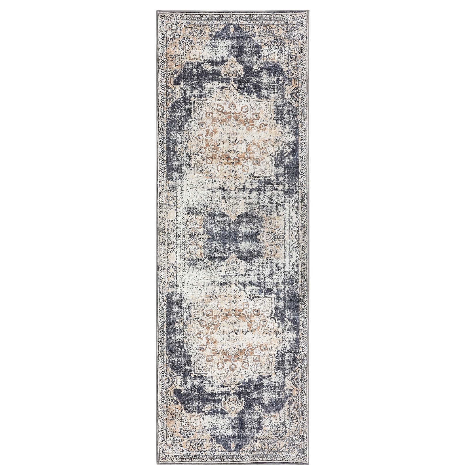
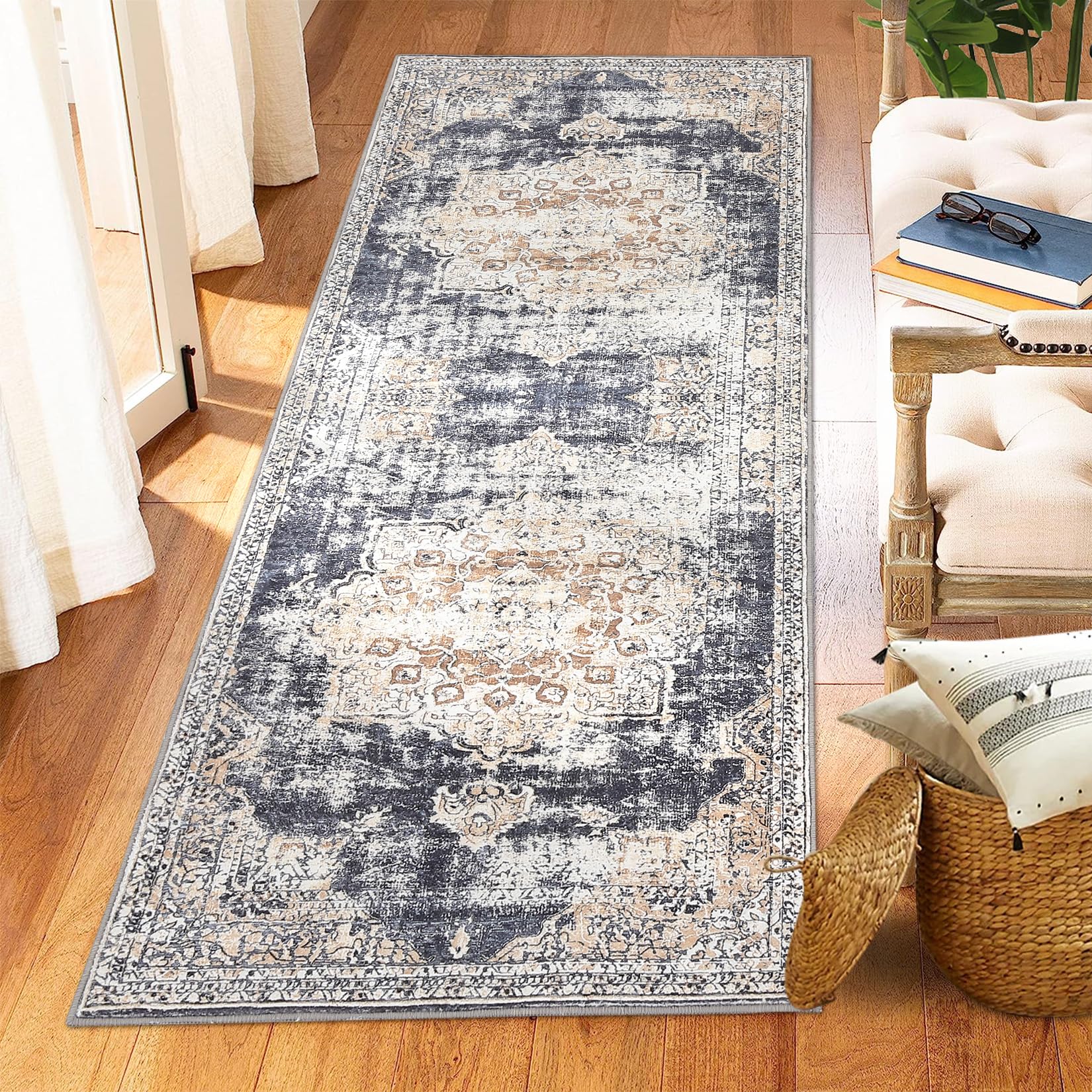
GARVEE – Alfombra clásico Lavable, de 2 x 6 Pulgadas, con diseño de medallón Oriental, Parte Trasera de Goma de Perfil bajo, Ideal para Sala de Estar, Comedor, recámara, Oficina, Color Beige
- Original price was: $38.99.$15.60Current price is: $15.60.
- Select options This product has multiple variants. The options may be chosen on the product page
-
- Sale!
- GARVEE, Home & Kitchen > Rugs > Oriental Rugs
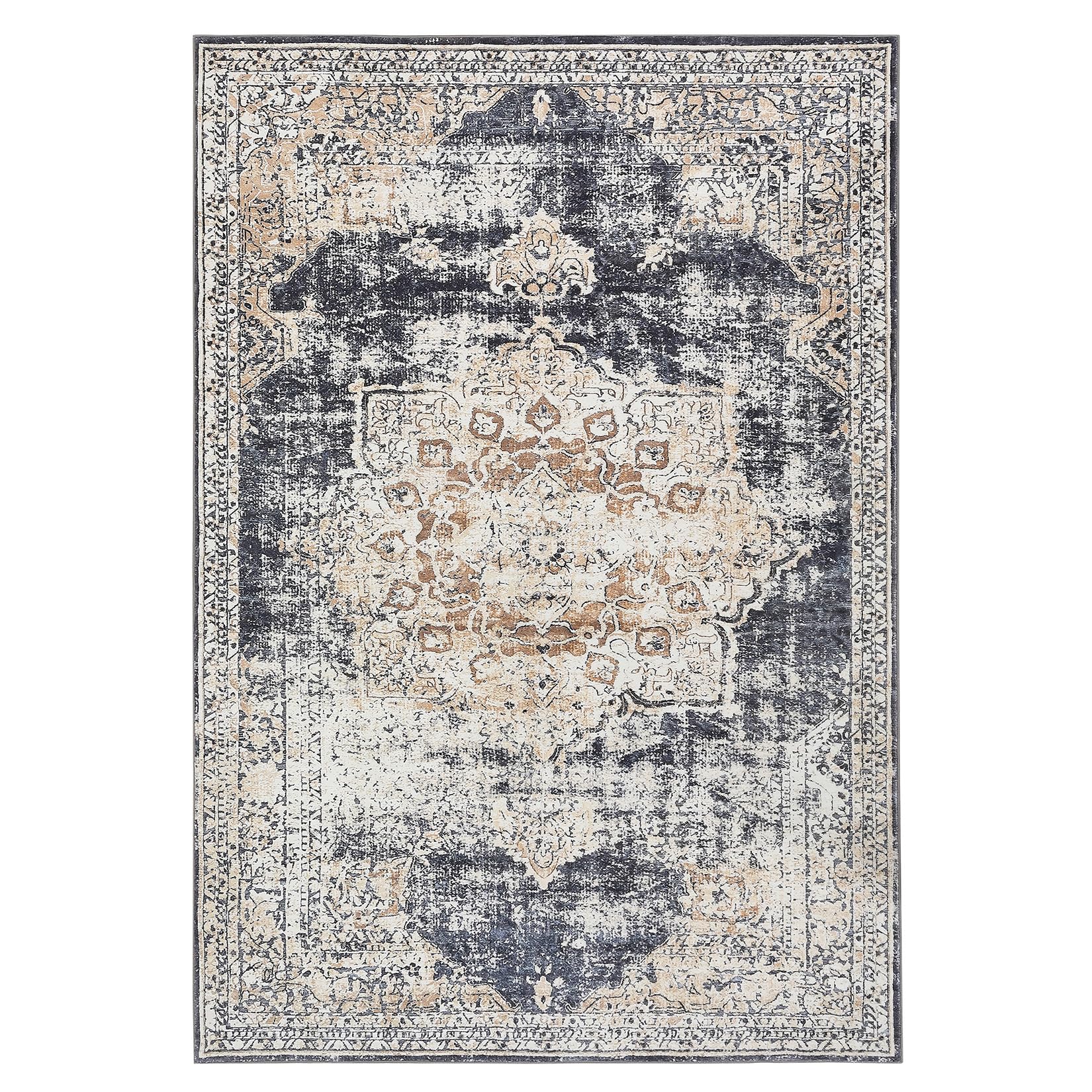
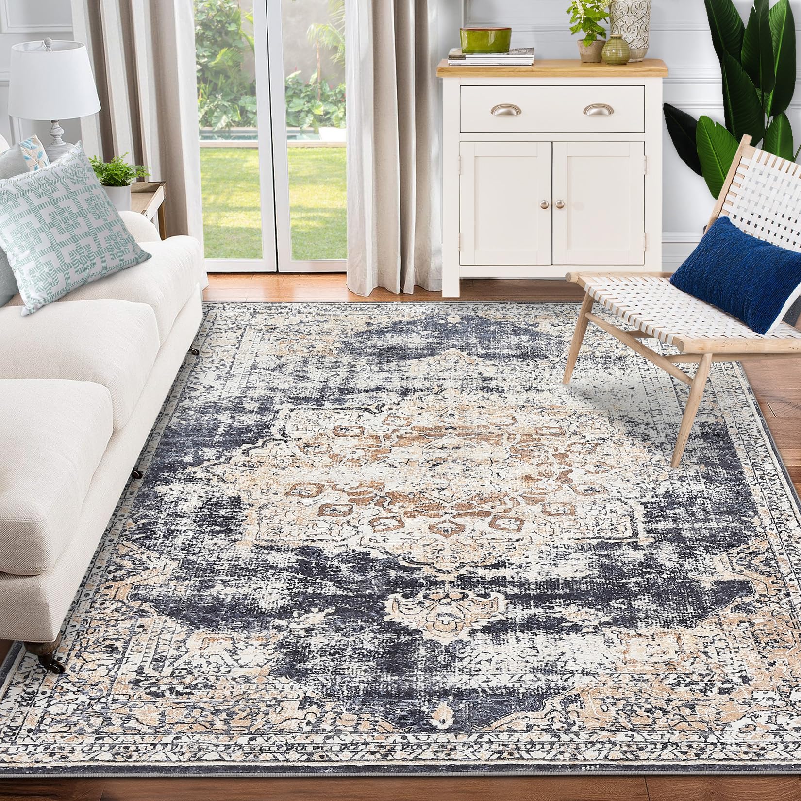
GARVEE – Alfombra clásico Lavable, con Estampado de medallón Oriental, con Respaldo de Goma de Perfil bajo, Ideal para Sala de Estar, Comedor, recámara, Oficina, Color Beige, 8 x 10 Pulgadas
- Original price was: $124.99.$31.25Current price is: $31.25.
- Select options This product has multiple variants. The options may be chosen on the product page
-
-
Sale!
- Furniture > Kids' Furniture > Kids' Tables & Chairs, GARVEE
GARVEE Kids Table and 4 Chairs Set with Graffiti Desktop, Height Adjustable Toddler Table and Chairs Set, 4 in 1 Activity Table Play Table for Reading, Drawing, Playing, Eating,Beige
- Original price was: $133.99.$33.50Current price is: $33.50.
- Select options This product has multiple variants. The options may be chosen on the product page
-
Sale!