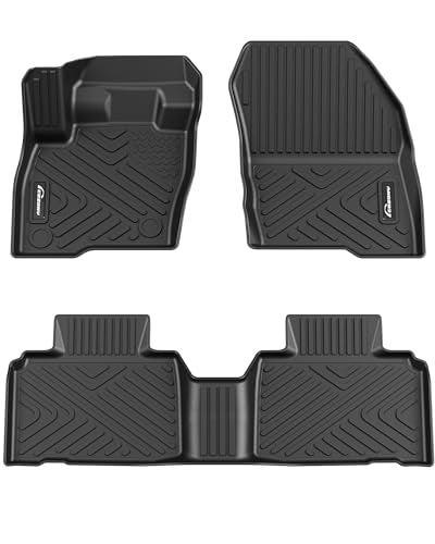


GARVEE Floor Mats for 2014-2019 Toyota Highlander (LE, LE Plus, Limited, XLE,Hybrid), TPE All Weather Custom Fit Front 1st & 2nd Row Highlander Floor Liner
Original price was: $72.99.$21.90Current price is: $21.90.
Description
GARVEE Floor Mats for 2014-2019 Toyota Highlander (LE, LE Plus, Limited, XLE,Hybrid), TPE All Weather Custom Fit Front 1st & 2nd Row Highlander Floor Liner
- CUSTOM FIT: GARVEE all weather highlander floor mats are compatible with 2014 2015 2016 2017 Hybrid Limited, LE, LE Plus, Limited, XLE – 2.7L L4 Gas, 3.5L V6 Electric/Gas, 3.5L V6 FULL HYBRID EV-GAS (FHEV), 3.5L V6 Gas; 2018 2019 Highlander Hybrid LE, Hybrid Limited, Hybrid XLE, LE, LE Plus, Limited, SE, XLE – 2.7L L4 Gas, 3.5L V6 Electric/Gas, 3.5L V6 FULL HYBRID EV-GAS (FHEV), 3.5L V6 Gas
- LASER MEASURED: With precision digital measurements obtained through the laser scanning, GARVEE automotive highlander floor mats liners conform to the unique and complex surfaces of your vehicle’s floorboard, providing the best possible fit for your highlander car.
- ALL WEATHER FLOOR MATS: All-Weather waterproof car floor mats liner provide good moisture protection for your highlander interior and will dry faster than any other mat would do.
- SOFT AND DURABLE TPE MATERIAL: The durable weather-resistant TPE material used to construct these highlander floor mats is odorless, Even when brand new, these mats don’t stink.
- RAISED RIB DESIGN: GARVEE highlander floor mats have deeply sculpted channels designed to trap water, debris, spills, mud and sand. Easily cleaned with mild soap and water.
Specifications
| Brand | GARVEE |
| Item Weight | 12.42 pounds |
| Product Dimensions | 22.3 x 28.5 x 6.5 inches |
| Special Features | waterproof, Odorless |
.aplus_module STANDARD_PRODUCT_ATTRIBUTES h3{
margin-bottom: 10px;
}
.responsive-table {
border-collapse: collapse;
width: 100%;
margin-bottom: 20px;
}
.responsive-table td {
border: 1px solid #ddd;
padding: 8px;
text-align: left;
}
.responsive-table tr:nth-child(odd) {
background-color: #F2F2F2;
}
.responsive-table tr:nth-child(even) {
background-color: #E6E6E6;
}
.responsive-table tr:hover {
background-color: #DDDDDD;
}
@media screen and (max-width: 800px) {
.responsive-table td {
box-sizing: border-box;
width: 100%;
text-align: left;
padding: 10px;
}
.responsive-table tr:nth-child(odd) td {
background-color: #F2F2F2;
}
.responsive-table tr:nth-child(even) td {
background-color: #E6E6E6;
}
.responsive-table tr:hover td {
background-color: #DDDDDD;
}
}
.aplus_module{
margin-bottom:24px;
}
.aplus_module img{
width:100%;
}
.aplus_module h1,h2,h3,h4,h5,h6{
margin:0 !important;
}
.count_imgs_wrap{
display:flex;
}
.count_imgs_wrap>div{
flex: 1;
margin-right: 30px;
}
.count_imgs_wrap>div:last-child {
margin-right: 0;
}
@media screen and (max-width:800px){
.count_imgs_wrap{
flex-direction: column;
}
.count_imgs_wrap>div{
margin-right: 0;
}
.count_imgs{
display:flex;
justify-content: center;
}
.count_imgs>img{
width:auto;
max-width:100%;
}
}
.img_floatleft{
display:flex;
justify-content:space-between;
}
.leftwrap{
flex:3;
display:flex;
}
.lefttext{
margin:0 30px;
}
.lefttext>ul{
padding:0;
}
.lefttext>ul>li{
padding-bottom:18px;
}
.rightwrap{
flex:1;
}
.rightwrap_inner{
border-left:1px solid #dddddd;
padding-left:30px;
}
.rightwrap_inner>ul{
background-color: white;
padding:18px 32px;
border-radius: 8px;
}
@media screen and (max-width:800px){
.img_floatleft{
flex-direction: column;
}
.leftwrap{
flex-direction: column;
flex: initial;
}
.leftimage{
display:flex;
justify-content: center;
}
.leftimage>img{
max-width:100%;
width:auto;
}
.lefttext{
margin:0;
}
.lefttext>ul{
padding-left:32px;
}
.rightwrap{
flex: initial;
}
.rightwrap_inner{
border-left:0;
padding-left:0;
}
.rightwrap_inner>ul{
padding-right:0;
}
}
Additional information
| Color | Black |
|---|
Related products
-
- Sale!
- Cleaning & Janitorial Supplies > Trash Cans & Wastebaskets > Pull Out Trash Cans, GARVEE
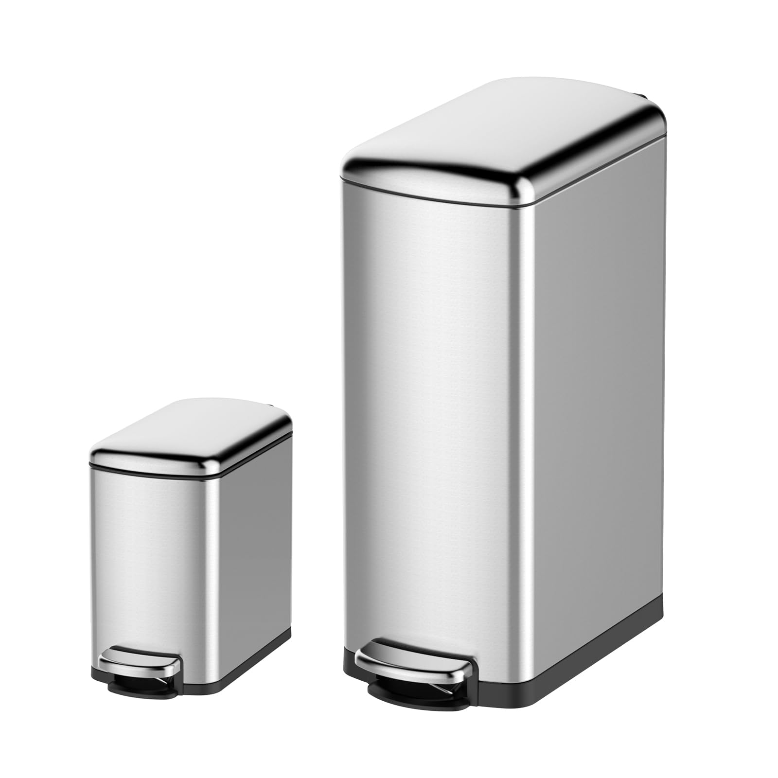
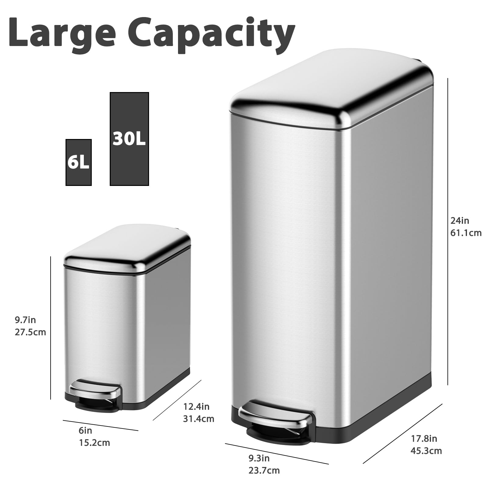
GARVEE Trash Can Combo Set, 8 Gallon and 1.6 Gallon Stainless Steel Step Trash Can for Office, Kitchen
- Original price was: $83.99.$25.20Current price is: $25.20.
- Select options This product has multiple variants. The options may be chosen on the product page
-
- Sale!
- GARVEE, Home & Kitchen > Seasonal Decor > Christmas Decorations
GARVEE – Cinta de Bronce para decoración de árbol de Navidad, 2 m, diseño de Pentagrama, Dorado Online
- Original price was: $23.99.$9.60Current price is: $9.60.
- Select options This product has multiple variants. The options may be chosen on the product page
-
- Sale!
- GARVEE, Home & Kitchen > Rugs > Oriental Rugs
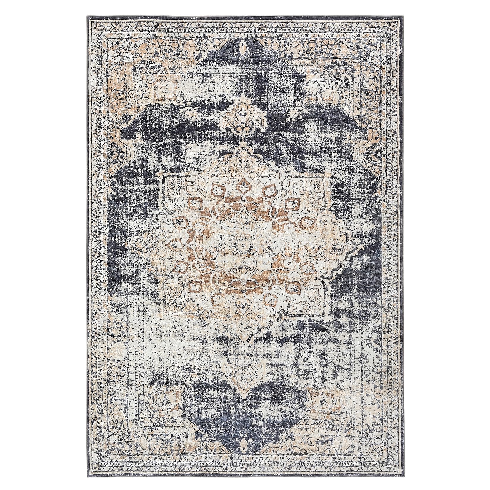
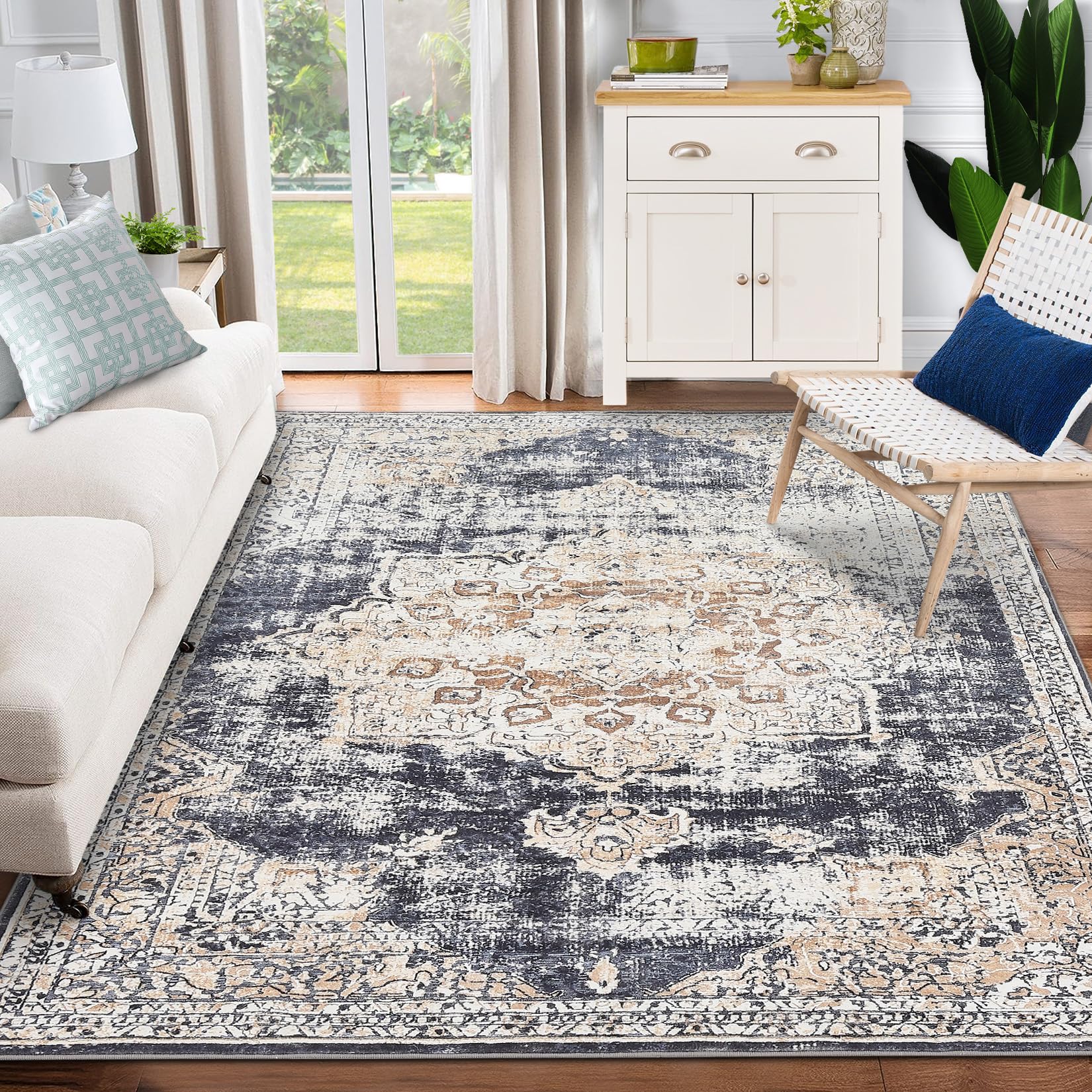
GARVEE – Alfombra clásico Lavable, con Estampado de medallón Oriental, con Respaldo de Goma de Perfil bajo, Ideal para Sala de Estar, Comedor, recámara, Oficina, Color Beige, 3 x 5 Pulgadas
- Original price was: $41.99.$16.80Current price is: $16.80.
- Select options This product has multiple variants. The options may be chosen on the product page