GARVEE Floor Mats for Toyota RAV4 2019-2024 (Including Hybrid), TPE All Weather Custom Fit Front 1st & 2nd Row Floor Liner, Black
Original price was: $67.99.$20.40Current price is: $20.40.
Description
GARVEE Floor Mats for Toyota RAV4 2019-2024 (Including Hybrid), TPE All Weather Custom Fit Front 1st & 2nd Row Floor Liner, Black
- CUSTOM FIT: GARVEE all weather floor mats are compatible with 2019 2020 2021 2022 2023 2024 toyota rav4 (including Hybrid).
- LASER MEASURED: With precision digital measurements obtained through the laser scanning, GARVEE automotive RAV 4 floor mats liners conform to the unique and complex surfaces of your vehicle’s floorboard, providing the best possible fit for your rav4 car.
- ALL WEATHER FLOOR MATS: All-Weather waterproof car floor mats liner provide good moisture protection for your interior and will dry faster than any other mat would do.
- SOFT AND DURABLE TPE MATERIAL: The durable weather-resistant TPE material used to construct these rav4 floor mats is odorless, Even when brand new, these mats don’t stink.
- RAISED RIB DESIGN: GARVEE RAV4 floor mats have deeply sculpted channels designed to trap water, debris, spills, mud and sand. Easily cleaned with mild soap and water.
Specifications
| Brand | GARVEE |
| Item Weight | 12 pounds |
| Product Dimensions | 22 x 29 x 6.5 inches |
| Special Features | waterproof, Odorless |
.aplus_module STANDARD_PRODUCT_ATTRIBUTES h3{
margin-bottom: 10px;
}
.responsive-table {
border-collapse: collapse;
width: 100%;
margin-bottom: 20px;
}
.responsive-table td {
border: 1px solid #ddd;
padding: 8px;
text-align: left;
}
.responsive-table tr:nth-child(odd) {
background-color: #F2F2F2;
}
.responsive-table tr:nth-child(even) {
background-color: #E6E6E6;
}
.responsive-table tr:hover {
background-color: #DDDDDD;
}
@media screen and (max-width: 800px) {
.responsive-table td {
box-sizing: border-box;
width: 100%;
text-align: left;
padding: 10px;
}
.responsive-table tr:nth-child(odd) td {
background-color: #F2F2F2;
}
.responsive-table tr:nth-child(even) td {
background-color: #E6E6E6;
}
.responsive-table tr:hover td {
background-color: #DDDDDD;
}
}
.aplus_module{
margin-bottom:24px;
}
.aplus_module img{
width:100%;
}
.aplus_module h1,h2,h3,h4,h5,h6{
margin:0 !important;
}
.count_imgs_wrap{
display:flex;
}
.count_imgs_wrap>div{
flex: 1;
margin-right: 30px;
}
.count_imgs_wrap>div:last-child {
margin-right: 0;
}
@media screen and (max-width:800px){
.count_imgs_wrap{
flex-direction: column;
}
.count_imgs_wrap>div{
margin-right: 0;
}
.count_imgs{
display:flex;
justify-content: center;
}
.count_imgs>img{
width:auto;
max-width:100%;
}
}
.img_floatleft{
display:flex;
justify-content:space-between;
}
.leftwrap{
flex:3;
display:flex;
}
.lefttext{
margin:0 30px;
}
.lefttext>ul{
padding:0;
}
.lefttext>ul>li{
padding-bottom:18px;
}
.rightwrap{
flex:1;
}
.rightwrap_inner{
border-left:1px solid #dddddd;
padding-left:30px;
}
.rightwrap_inner>ul{
background-color: white;
padding:18px 32px;
border-radius: 8px;
}
@media screen and (max-width:800px){
.img_floatleft{
flex-direction: column;
}
.leftwrap{
flex-direction: column;
flex: initial;
}
.leftimage{
display:flex;
justify-content: center;
}
.leftimage>img{
max-width:100%;
width:auto;
}
.lefttext{
margin:0;
}
.lefttext>ul{
padding-left:32px;
}
.rightwrap{
flex: initial;
}
.rightwrap_inner{
border-left:0;
padding-left:0;
}
.rightwrap_inner>ul{
padding-right:0;
}
}
Additional information
| Color | Black |
|---|
Related products
-
- Sale!
- GARVEE, Restaurant & Food Service > Cooking Equipment > Range Hood
430 Stainless Steel Commercial Baffle Grease Filter | 5FT UL Listed Restaurant Hood Filter | NSF Certified
- Original price was: $489.98.$98.00Current price is: $98.00.
- Select options This product has multiple variants. The options may be chosen on the product page
-
- Sale!
- Automotive > Tire & Wheel Tools > UTV & ATV Tires, GARVEE
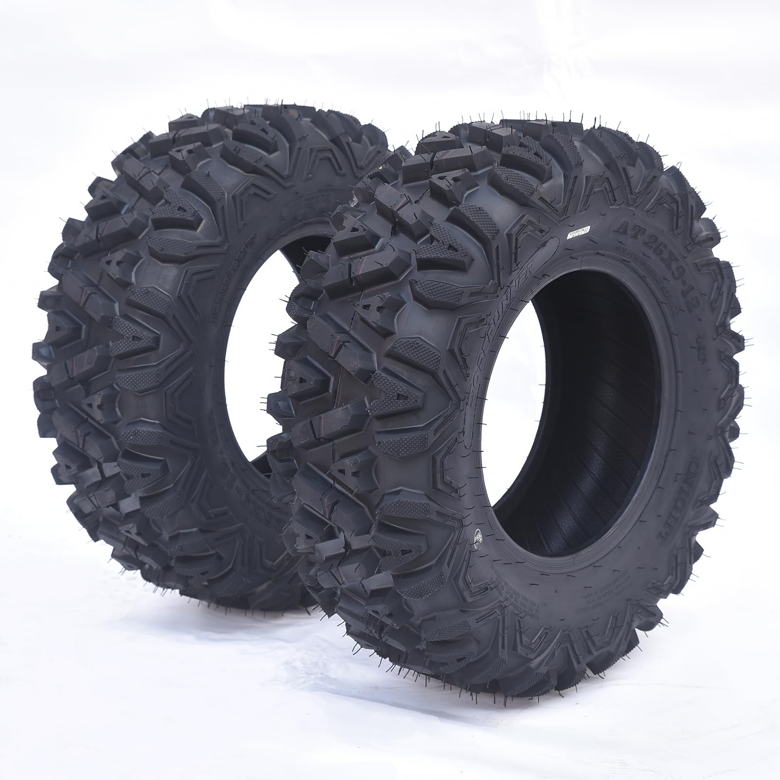
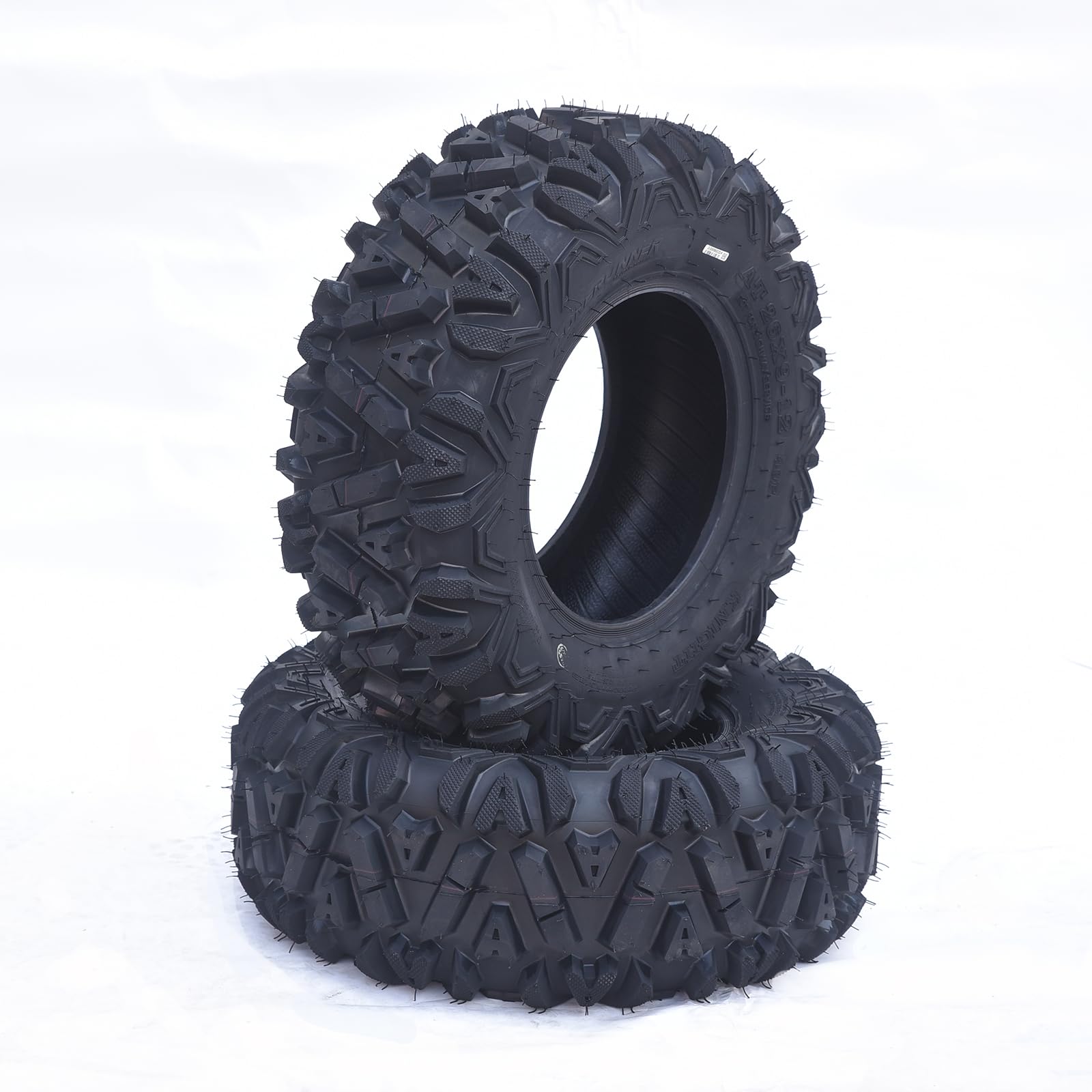
GARVEE AT26x9-12-6PR TL KNIGHT Set of 2 ATV Trail Tires 6PR Knobby Sport Tires, Tubeless – AT26x9-12-6PR TL KNIGHT
- Original price was: $175.99.$44.00Current price is: $44.00.
- Select options This product has multiple variants. The options may be chosen on the product page
-
- Sale!
- Automotive > Automotive Accessories > Tonneau Cover, GARVEE
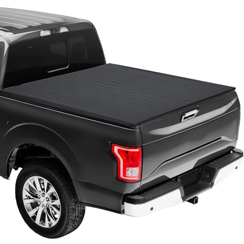
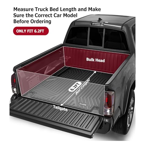
GARVEE ’15-’23 Colorado 6.2ft Soft Roll-Up Tonneau Cover Online Hot Sale
- Original price was: $164.99.$41.25Current price is: $41.25.
- Select options This product has multiple variants. The options may be chosen on the product page