GARVEE Folding Table, 27.9 Inch Tall Folding Card Table, Portable Square Folding Table with PU Soft Cushion, Grey Metal Foldable Table Suitable for Living Room, Office, Camping
Original price was: $75.99.$22.80Current price is: $22.80.
Description
GARVEE Folding Table, 27.9 Inch Tall Folding Card Table, Portable Square Folding Table with PU Soft Cushion, Grey Metal Foldable Table Suitable for Living Room, Office, Camping
- Foldable Design: No assembly is required, When not in use, they can be easily folded and stored, saving valuable space. The portable folding table is designed so that you can easily transport them wherever you need them.
- Plenty of Space: Our square folding card table is 33.6 feet long, a large desktop space giving you a wide space to play and enjoy card games.
- Sturdy and Stable: The table frame is made of high-quality metal, and there is a lock switch at each folding table corner. Additionally, each folding table leg comes with anti-slip foot covers to protect your floors.
- Comfortable and Durable: Our black folding table features a high-quality PU material, providing excellent durability and a comfortable touch.
- Versatility: This portable table folding is versatile, not only suitable as a camping table, or work table but also a great choice as a card table.
Specifications
| Brand | GARVEE |
| Shape | Square |
| Room Type | Bedroom, Living Room |
| Included Components | Assembly Guide |
| Color | Grey |
| Model Name | FC001 |
| Model Number | FC001 |
| Base Type | Leg |
| Product Dimensions | 33.6″D x 33.6″W x 27.9″H |
| Item Weight | 15.4 Pounds |
| Number of Items | 1 |
| Frame Material | Metal |
| Top Material Type | Leather |
| Table design | Dining Table |
| Pattern | Solid |
| Assembly Required | No |
| Assembly Instructions | Already Assembled |
.aplus_module STANDARD_PRODUCT_ATTRIBUTES h3{
margin-bottom: 10px;
}
.responsive-table {
border-collapse: collapse;
width: 100%;
margin-bottom: 20px;
}
.responsive-table td {
border: 1px solid #ddd;
padding: 8px;
text-align: left;
}
.responsive-table tr:nth-child(odd) {
background-color: #F2F2F2;
}
.responsive-table tr:nth-child(even) {
background-color: #E6E6E6;
}
.responsive-table tr:hover {
background-color: #DDDDDD;
}
@media screen and (max-width: 800px) {
.responsive-table td {
box-sizing: border-box;
width: 100%;
text-align: left;
padding: 10px;
}
.responsive-table tr:nth-child(odd) td {
background-color: #F2F2F2;
}
.responsive-table tr:nth-child(even) td {
background-color: #E6E6E6;
}
.responsive-table tr:hover td {
background-color: #DDDDDD;
}
}
.aplus_module{
margin-bottom:24px;
}
.aplus_module img{
width:100%;
}
.aplus_module h1,h2,h3,h4,h5,h6{
margin:0 !important;
}
.count_imgs_wrap{
display:flex;
}
.count_imgs_wrap>div{
flex: 1;
margin-right: 30px;
}
.count_imgs_wrap>div:last-child {
margin-right: 0;
}
@media screen and (max-width:800px){
.count_imgs_wrap{
flex-direction: column;
}
.count_imgs_wrap>div{
margin-right: 0;
}
.count_imgs{
display:flex;
justify-content: center;
}
.count_imgs>img{
width:auto;
max-width:100%;
}
}
.img_floatleft{
display:flex;
justify-content:space-between;
}
.leftwrap{
flex:3;
display:flex;
}
.lefttext{
margin:0 30px;
}
.lefttext>ul{
padding:0;
}
.lefttext>ul>li{
padding-bottom:18px;
}
.rightwrap{
flex:1;
}
.rightwrap_inner{
border-left:1px solid #dddddd;
padding-left:30px;
}
.rightwrap_inner>ul{
background-color: white;
padding:18px 32px;
border-radius: 8px;
}
@media screen and (max-width:800px){
.img_floatleft{
flex-direction: column;
}
.leftwrap{
flex-direction: column;
flex: initial;
}
.leftimage{
display:flex;
justify-content: center;
}
.leftimage>img{
max-width:100%;
width:auto;
}
.lefttext{
margin:0;
}
.lefttext>ul{
padding-left:32px;
}
.rightwrap{
flex: initial;
}
.rightwrap_inner{
border-left:0;
padding-left:0;
}
.rightwrap_inner>ul{
padding-right:0;
}
}
Additional information
| Color | Grey |
|---|
Related products
-
- Sale!
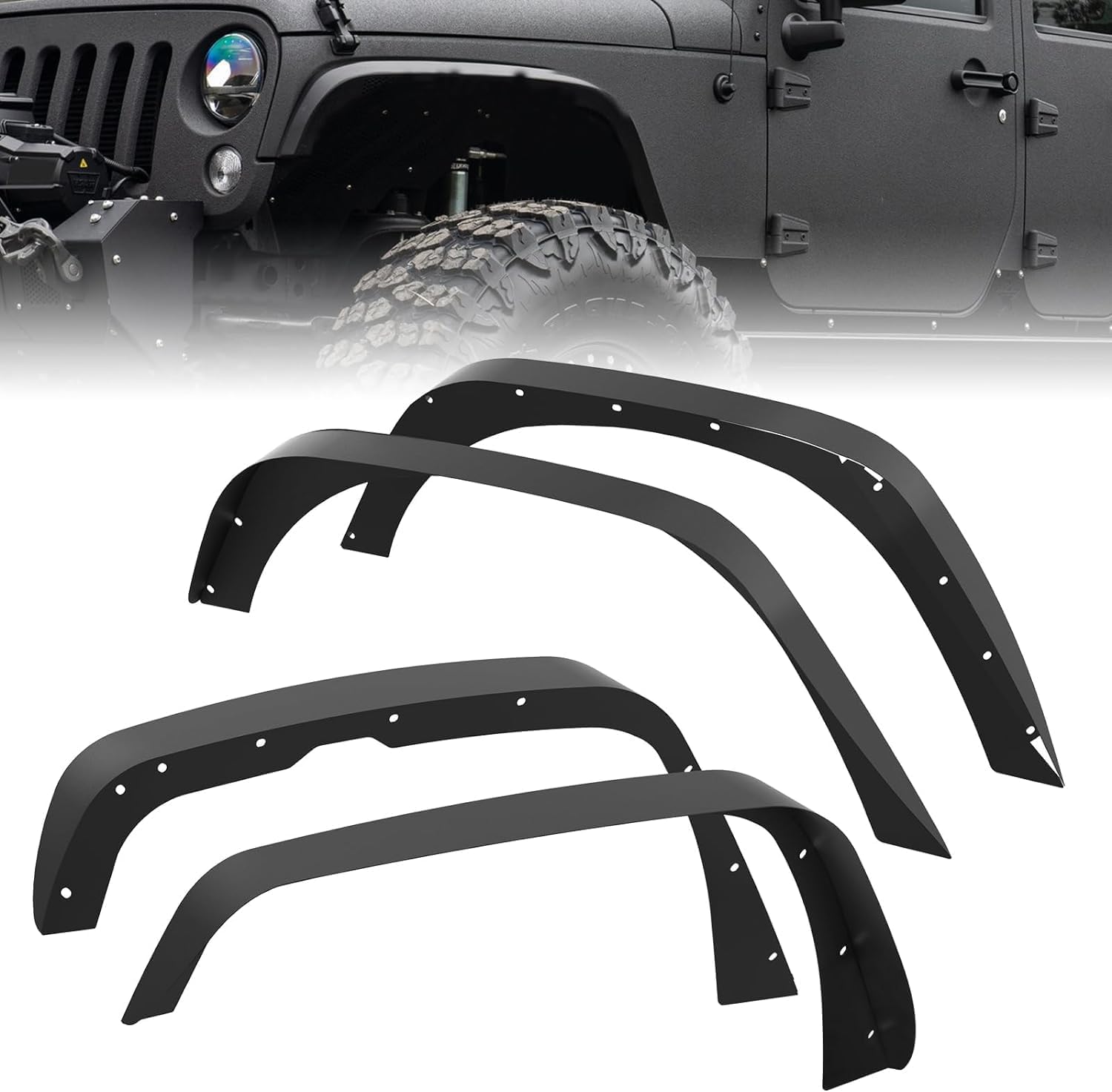
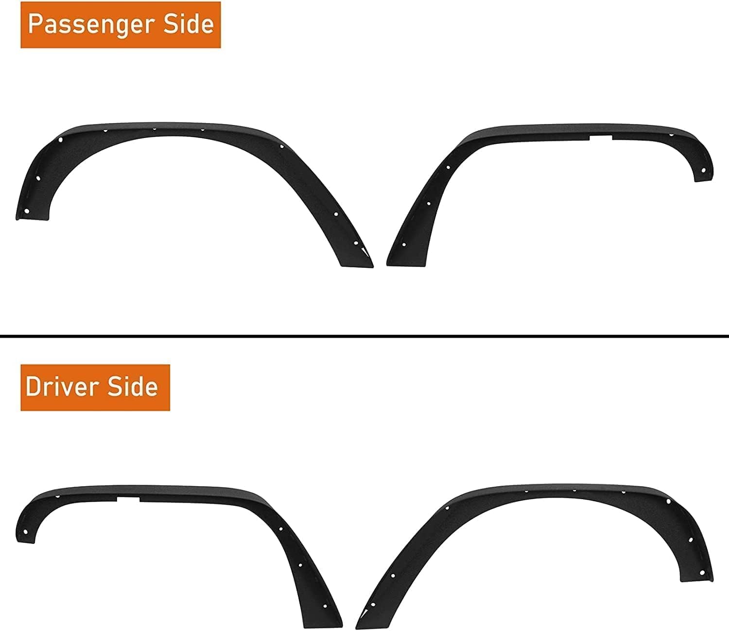
- Automotive > Replacement Parts > Engine Parts, GARVEE
GARVEE ’18-’24 Wrangler JL Thick Solid Steel Front & Rear Fender Flares
- Original price was: $133.99.$33.50Current price is: $33.50.
- Select options This product has multiple variants. The options may be chosen on the product page
-
- Sale!
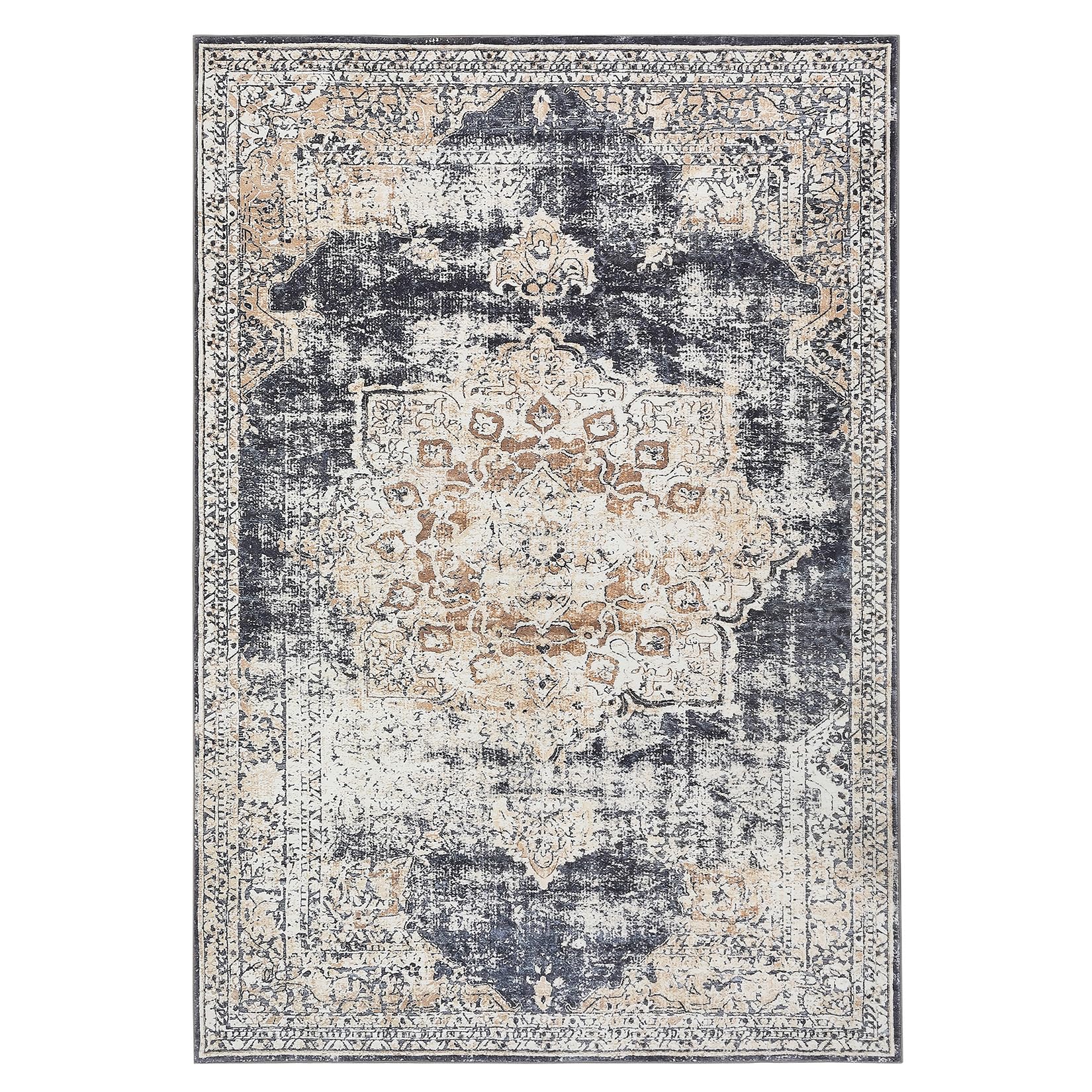
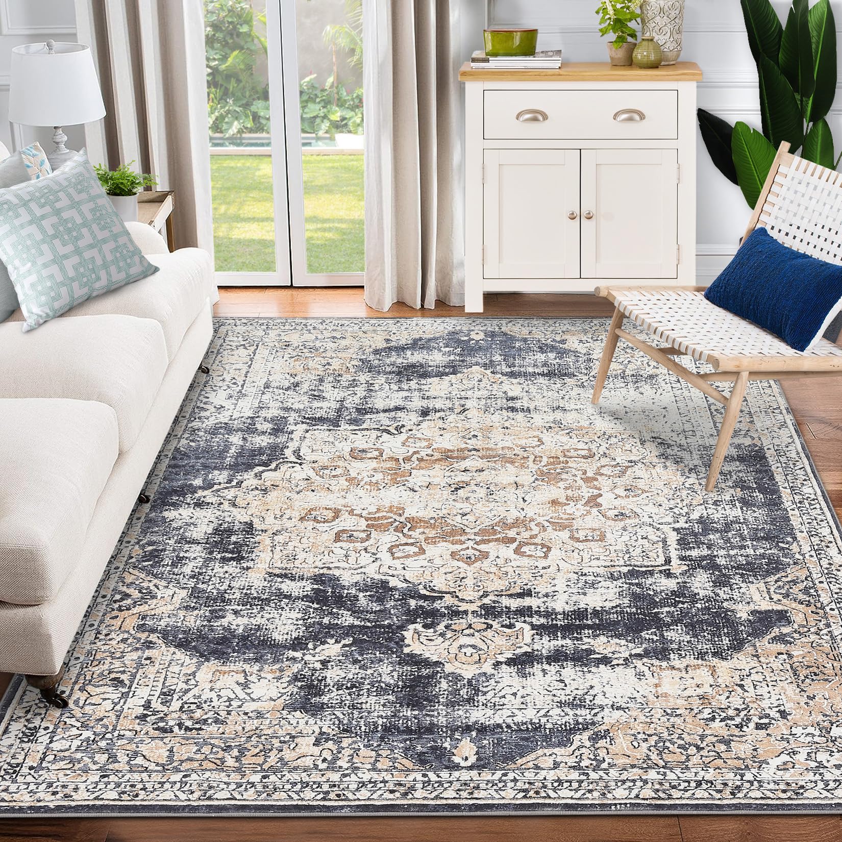
- GARVEE, Home & Kitchen > Rugs > Oriental Rugs
GARVEE – Alfombra clásico Lavable, con Estampado de medallón Oriental, con Respaldo de Goma de Perfil bajo, Ideal para Sala de Estar, Comedor, recámara, Oficina, Color Beige, 4 x 6 Pulgadas
- Original price was: $50.99.$15.30Current price is: $15.30.
- Select options This product has multiple variants. The options may be chosen on the product page
-
- Sale!
- GARVEE, Home & Kitchen > Rugs > Oriental Rugs
GARVEE – Alfombra clásico Lavable, con Estampado de medallón Oriental, con Respaldo de Goma de Perfil bajo, Ideal para Sala de Estar, Comedor, recámara, Oficina, Color Beige, 3 x 5 Pulgadas
- Original price was: $41.99.$16.80Current price is: $16.80.
- Select options This product has multiple variants. The options may be chosen on the product page