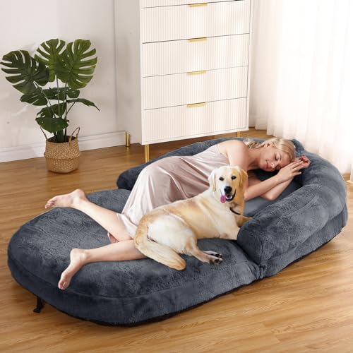
GARVEE Hoyer Lifts for Home Use, Electric Patient Lift Transfer Chair,Hydraulic Patient Lift Transfer Chair, Bathroom Wheelchair with 180° Split Seat and Potty, Portable Elderly Lift
Original price was: $699.98.$140.00Current price is: $140.00.
Description
GARVEE Hoyer Lifts for Home Use, Electric Patient Lift Transfer Chair,Hydraulic Patient Lift Transfer Chair, Bathroom Wheelchair with 180° Split Seat and Potty, Portable Elderly Lift
Key Features
UPGRADE-ELECTRIC OF MIND: Electrically controlled, heavy-duty steel, 330lbs capacity. High-strength carbon steel, waterproof & corrosion-resistant.
SUITABLE FOR NEEDS: Toilet wheelchairs with 2 cushion types, quality materials, reliable, super load-bearing.
FREELY ADJUSTABLE: Hydraulic lift, height 17.32-27.5 inches, reduces waist damage, easy for one person.
SAFE TRANSFERS: 180° split seat, silent casters with lock, safe for immobile patients.
MULTIFUNCTIONAL: 4-in-1, for home care, travel, various places, tool-free disassembly.
IMPORTANT NOTE: This transfer lift has a fixed base width of 19.6 inches. The base width is NOT adjustable. Please check your wheelchair dimensions before purchasing to ensure compatibility.
IMPORTANT: User Suitability Information
Suitable For
- Users who can maintain their seated position independently
- Individuals with moderate mobility limitations who have good upper body strength
- People recovering from surgery or injury requiring temporary assistance
- Seniors who need bathing and toileting support but can support themselves while seated
Not Recommended For
- Users with paralysis or severe mobility limitations
- Individuals who cannot maintain their seated position without assistance
- People who tend to slide forward in seats
- Users requiring specialized positioning supports or restraints
Specifications
| Brand | GARVEE |
| Armrest Height Lift Range | 33.4-47.2in |
| Seat Height Lift Range | 15.7-33.5in |
| Base Width | NOT adjustable |
| Item Weight | 61.7 Pounds |
| Product Dimensions | 24.8 x 16.93 x 31.5 inches |
| User Suitability | For users who can maintain seated position independently; not suitable for paralyzed individuals |
.aplus_module STANDARD_PRODUCT_ATTRIBUTES h3{
margin-bottom: 10px;
}
.responsive-table {
border-collapse: collapse;
width: 100%;
margin-bottom: 20px;
}
.responsive-table td {
border: 1px solid #ddd;
padding: 8px;
text-align: left;
}
.responsive-table tr:nth-child(odd) {
background-color: #F2F2F2;
}
.responsive-table tr:nth-child(even) {
background-color: #E6E6E6;
}
.responsive-table tr:hover {
background-color: #DDDDDD;
}
.important-notice {
background-color: #FFF4E5;
border-left: 4px solid #FF9900;
padding: 15px;
margin: 15px 0;
font-weight: 500;
}
/* New styles for user suitability warning */
.user-suitability-warning {
margin: 30px 0;
border: 2px solid #d32f2f;
border-radius: 8px;
padding: 20px;
background-color: #fff;
}
.warning-heading {
color: #d32f2f !important;
font-size: 20px;
margin-bottom: 15px !important;
text-align: center;
border-bottom: 2px solid #d32f2f;
padding-bottom: 8px;
}
.suitability-container {
display: flex;
gap: 20px;
}
.suitability-column {
flex: 1;
padding: 15px;
border-radius: 8px;
}
.suitable-for {
background-color: #e8f5e9;
border: 1px solid #a5d6a7;
}
.not-suitable-for {
background-color: #ffebee;
border: 1px solid #ef9a9a;
}
.suitability-column h4 {
margin-top: 0 !important;
margin-bottom: 10px !important;
text-align: center;
font-size: 16px;
}
.suitability-column ul {
padding-left: 20px;
margin-bottom: 0;
}
.suitability-column li {
margin-bottom: 8px;
}
.warning-text {
font-weight: bold;
color: #d32f2f;
}
.warning-note {
font-style: italic;
margin-top: 15px;
padding: 10px;
background-color: #fffde7;
border-left: 4px solid #fbc02d;
font-size: 14px;
}
@media screen and (max-width: 800px) {
.responsive-table td {
box-sizing: border-box;
width: 100%;
text-align: left;
padding: 10px;
}
.responsive-table tr:nth-child(odd) td {
background-color: #F2F2F2;
}
.responsive-table tr:nth-child(even) td {
background-color: #E6E6E6;
}
.responsive-table tr:hover td {
background-color: #DDDDDD;
}
.suitability-container {
flex-direction: column;
}
}
.aplus_module{
margin-bottom:24px;
}
.aplus_module img{
width:100%;
}
.aplus_module h1,h2,h3,h4,h5,h6{
margin:0 !important;
}
.count_imgs_wrap{
display:flex;
}
.count_imgs_wrap>div{
flex: 1;
margin-right: 30px;
}
.count_imgs_wrap>div:last-child {
margin-right: 0;
}
@media screen and (max-width:800px){
.count_imgs_wrap{
flex-direction: column;
}
.count_imgs_wrap>div{
margin-right: 0;
}
.count_imgs{
display:flex;
justify-content: center;
}
.count_imgs>img{
width:auto;
max-width:100%;
}
}
.img_floatleft{
display:flex;
justify-content:space-between;
}
.leftwrap{
flex:3;
display:flex;
}
.lefttext{
margin:0 30px;
}
.lefttext>ul{
padding:0;
}
.lefttext>ul>li{
padding-bottom:18px;
}
.rightwrap{
flex:1;
}
.rightwrap_inner{
border-left:1px solid #dddddd;
padding-left:30px;
}
.rightwrap_inner>ul{
background-color: white;
padding:18px 32px;
border-radius: 8px;
}
@media screen and (max-width:800px){
.img_floatleft{
flex-direction: column;
}
.leftwrap{
flex-direction: column;
flex: initial;
}
.leftimage{
display:flex;
justify-content: center;
}
.leftimage>img{
max-width:100%;
width:auto;
}
.lefttext{
margin:0;
}
.lefttext>ul{
padding-left:32px;
}
.rightwrap{
flex: initial;
}
.rightwrap_inner{
border-left:0;
padding-left:0;
}
.rightwrap_inner>ul{
padding-right:0;
}
}
Additional information
| Style | Electric |
|---|
Related products
-
- Sale!
- GARVEE, Home & Kitchen > Rugs > Oriental Rugs
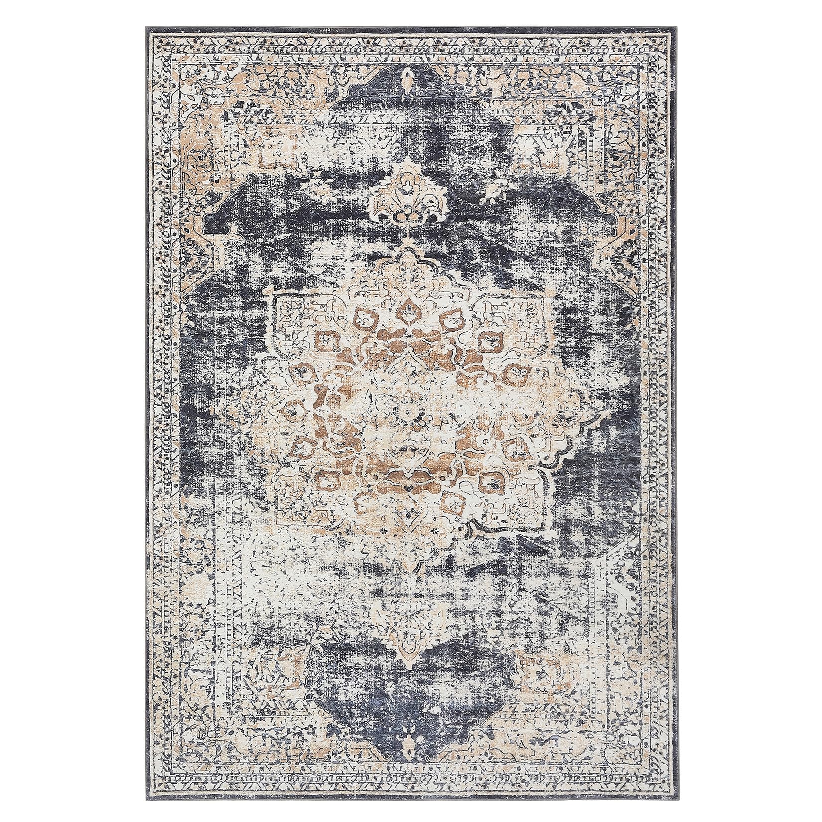
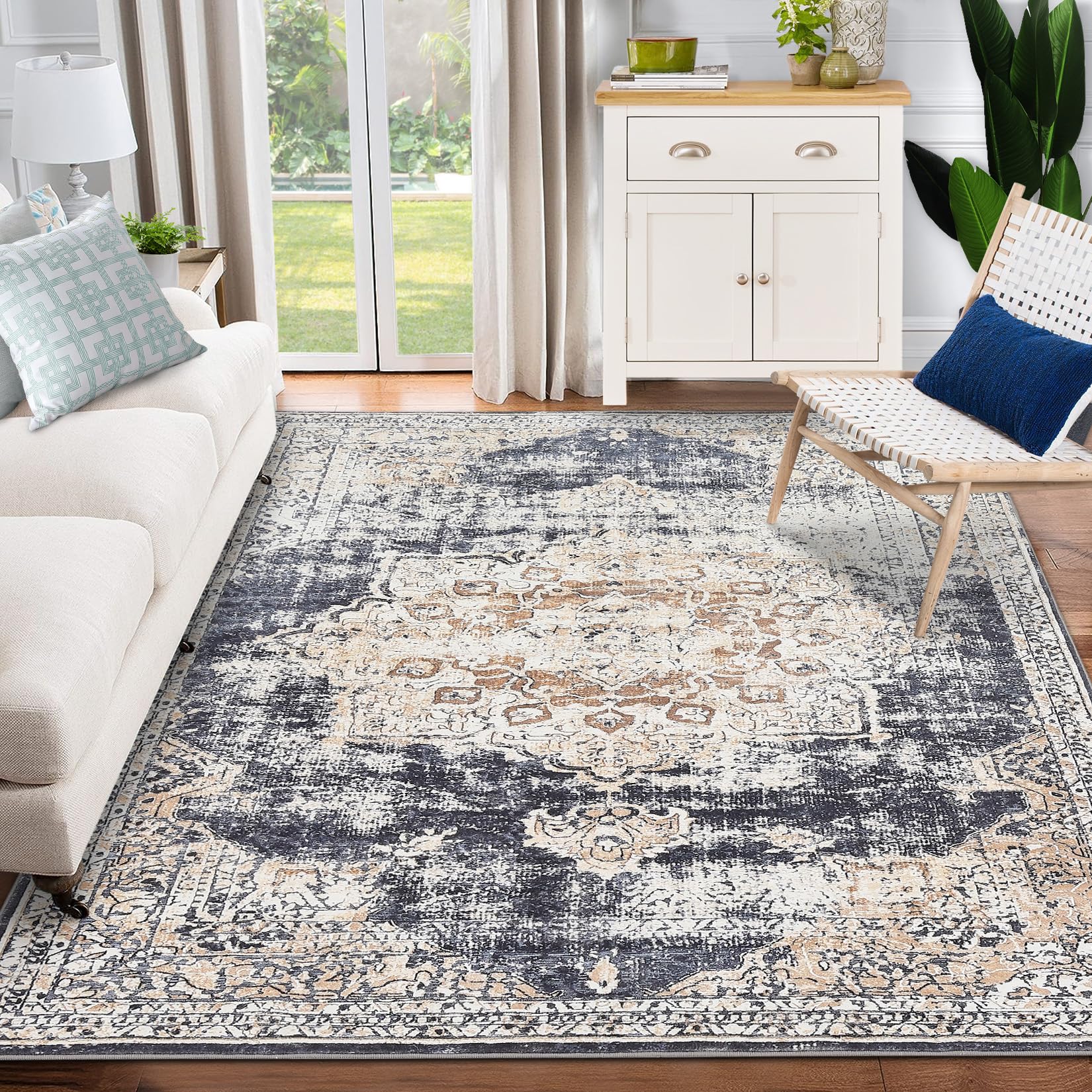
GARVEE – Alfombra clásico Lavable, con Estampado de medallón Oriental, con Respaldo de Goma de Perfil bajo, Ideal para Sala de Estar, Comedor, recámara, Oficina, Color Beige, 3 x 5 Pulgadas
- Original price was: $41.99.$16.80Current price is: $16.80.
- Select options This product has multiple variants. The options may be chosen on the product page
-
- Sale!
- Automotive > Tire & Wheel Tools > UTV & ATV Tires, GARVEE
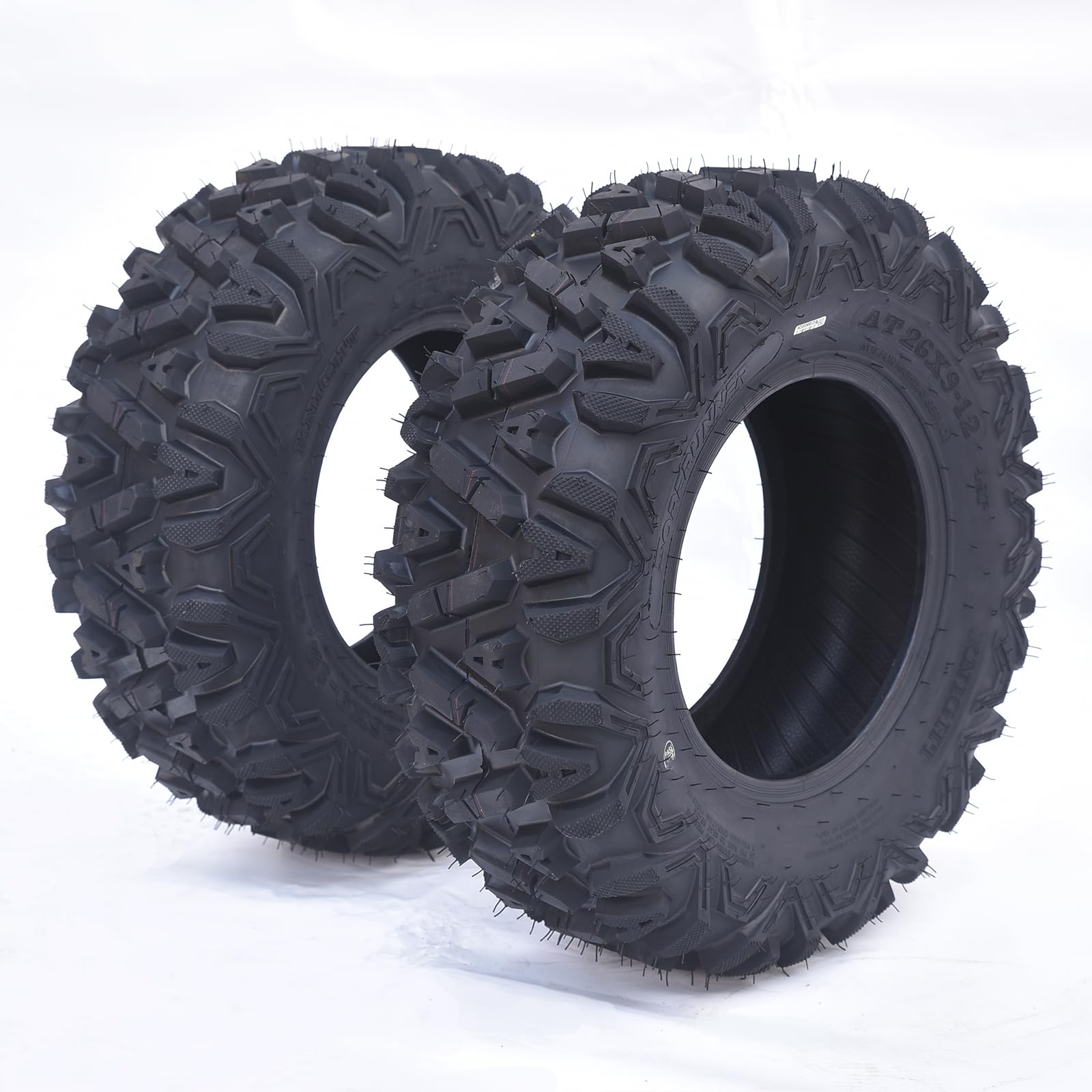
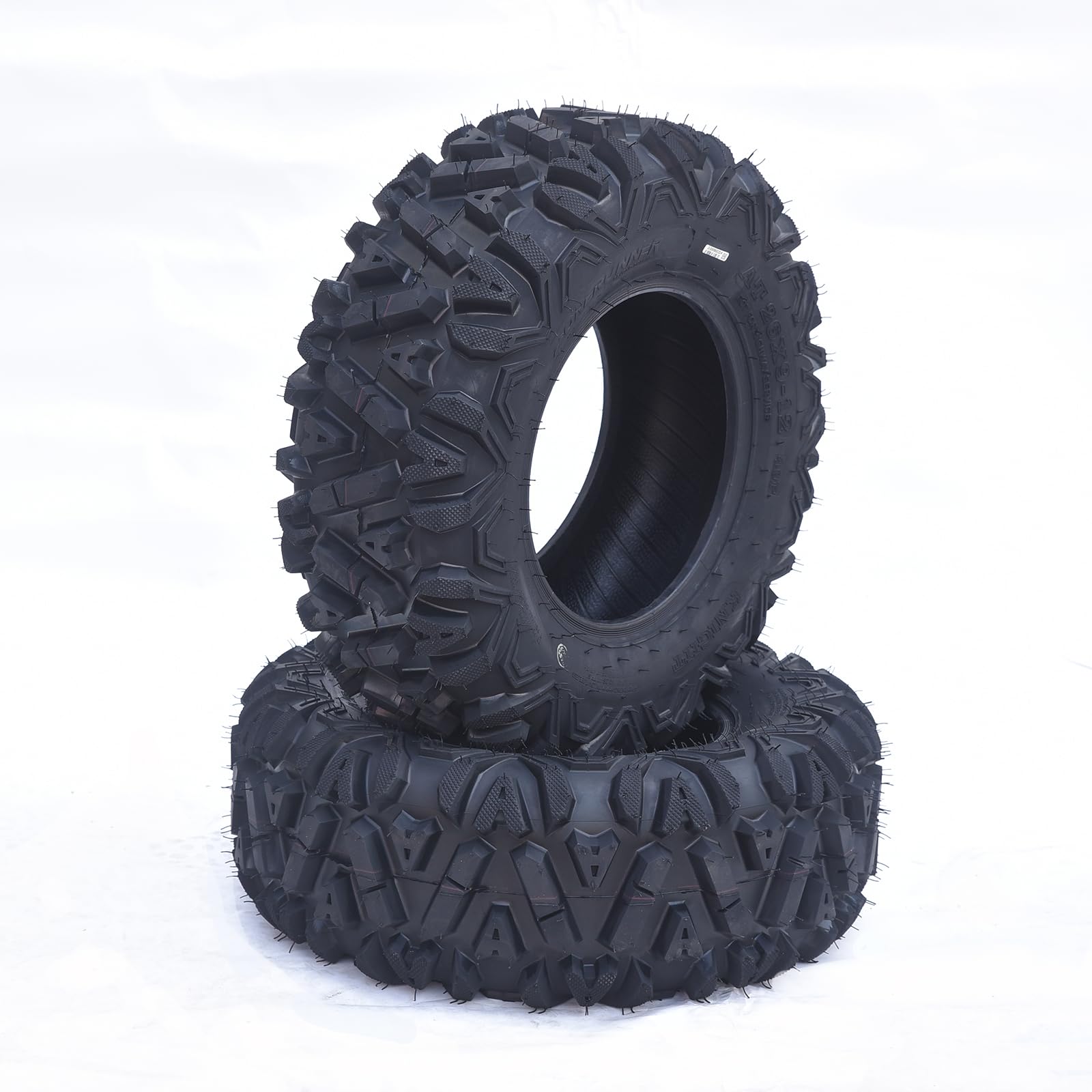
GARVEE AT26x9-12-6PR TL KNIGHT Set of 2 ATV Trail Tires 6PR Knobby Sport Tires, Tubeless – AT26x9-12-6PR TL KNIGHT
- Original price was: $175.99.$44.00Current price is: $44.00.
- Select options This product has multiple variants. The options may be chosen on the product page
-
- Sale!
- GARVEE, Home & Kitchen > Seasonal Decor > Christmas Decorations
GARVEE – Cinta de Bronce para decoración de árbol de Navidad, 2 m, diseño de Pentagrama, Dorado Online
- Original price was: $23.99.$9.60Current price is: $9.60.
- Select options This product has multiple variants. The options may be chosen on the product page