


GARVEE Kitchen Pantry Cabinet with Microwave Stand, 71”Freestanding Tall Kitchen Cabinet with Doors and Shelves, Hutch Cabinet for Kitchen, Dining Room, White
Original price was: $322.99.$64.60Current price is: $64.60.
Description
GARVEE Kitchen Pantry Cabinet with Microwave Stand, 71”Freestanding Tall Kitchen Cabinet with Doors and Shelves, Hutch Cabinet for Kitchen, Dining Room, White
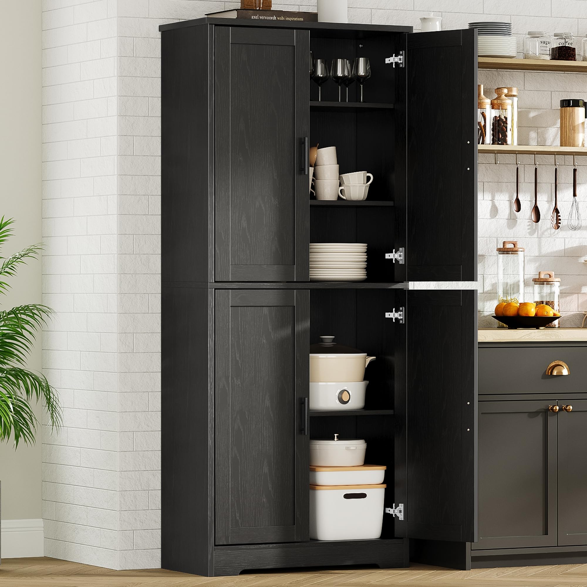
GARVEE Kitchen Pantry Storage Cabinet
Except being used as a pantry cabinet in kitchen, this hutch cabinet also works well as a buffet cabinet in dining room or as bar cabinet in living room – It’s the perfect pick that any family will love to fill their home
Glass Door Design
The upper cabinet door is made of glass, and the transparent design allows you to easily view the contents.
Adjustable Shelf
The adjustable shelves inside the cabinets allow you to customize the storage space
according to your specific needs.
Power Cable Hole
Spacious countertop for small appliances, with holes in the backsplash for easy plugging in
Premium Hinge
Maximum door opening angle is 90 degrees.
71″ Tall Food Pantry Cabinet with Microwave Stand
GARVEE Pantry Cabinets combination
If your kitchen storage space is large enough, you can try placing multiple cabinets in the kitchen. Our pantrys can meet any storage needs and effectively organize to make the entire kitchen look clean and tidy.
Specifications
| Brand | GARVEE |
| Color | White |
| Product Dimensions | 15.7″D x 29.5″W x 70.9″H |
| Special Feature | Shatterproof |
| Mounting Type | Floor Mount |
| Room Type | Dining Room |
| Door Style | Glass Front |
| Included Components | Shelves |
| Assembly Required | Yes |
| UPC | 199108968050 |
| Item Weight | 92.1 pounds |
.aplus_module STANDARD_PRODUCT_ATTRIBUTES h3{
margin-bottom: 10px;
}
.responsive-table {
border-collapse: collapse;
width: 100%;
margin-bottom: 20px;
}
.responsive-table td {
border: 1px solid #ddd;
padding: 8px;
text-align: left;
}
.responsive-table tr:nth-child(odd) {
background-color: #F2F2F2;
}
.responsive-table tr:nth-child(even) {
background-color: #E6E6E6;
}
.responsive-table tr:hover {
background-color: #DDDDDD;
}
@media screen and (max-width: 800px) {
.responsive-table td {
box-sizing: border-box;
width: 100%;
text-align: left;
padding: 10px;
}
.responsive-table tr:nth-child(odd) td {
background-color: #F2F2F2;
}
.responsive-table tr:nth-child(even) td {
background-color: #E6E6E6;
}
.responsive-table tr:hover td {
background-color: #DDDDDD;
}
}
.aplus_module{
margin-bottom:24px;
}
.aplus_module img{
width:100%;
}
.aplus_module h1,h2,h3,h4,h5,h6{
margin:0 !important;
}
.count_imgs_wrap{
display:flex;
}
.count_imgs_wrap>div{
flex: 1;
margin-right: 30px;
}
.count_imgs_wrap>div:last-child {
margin-right: 0;
}
@media screen and (max-width:800px){
.count_imgs_wrap{
flex-direction: column;
}
.count_imgs_wrap>div{
margin-right: 0;
}
.count_imgs{
display:flex;
justify-content: center;
}
.count_imgs>img{
width:auto;
max-width:100%;
}
}
.img_floatleft{
display:flex;
justify-content:space-between;
}
.leftwrap{
flex:3;
display:flex;
}
.lefttext{
margin:0 30px;
}
.lefttext>ul{
padding:0;
}
.lefttext>ul>li{
padding-bottom:18px;
}
.rightwrap{
flex:1;
}
.rightwrap_inner{
border-left:1px solid #dddddd;
padding-left:30px;
}
.rightwrap_inner>ul{
background-color: white;
padding:18px 32px;
border-radius: 8px;
}
@media screen and (max-width:800px){
.img_floatleft{
flex-direction: column;
}
.leftwrap{
flex-direction: column;
flex: initial;
}
.leftimage{
display:flex;
justify-content: center;
}
.leftimage>img{
max-width:100%;
width:auto;
}
.lefttext{
margin:0;
}
.lefttext>ul{
padding-left:32px;
}
.rightwrap{
flex: initial;
}
.rightwrap_inner{
border-left:0;
padding-left:0;
}
.rightwrap_inner>ul{
padding-right:0;
}
}
Additional information
| Color | White |
|---|
Related products
-
- Sale!
- GARVEE, Home & Kitchen > Rugs > Oriental Rugs
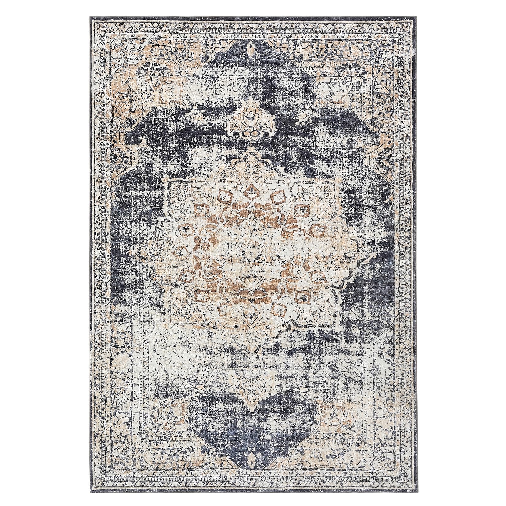
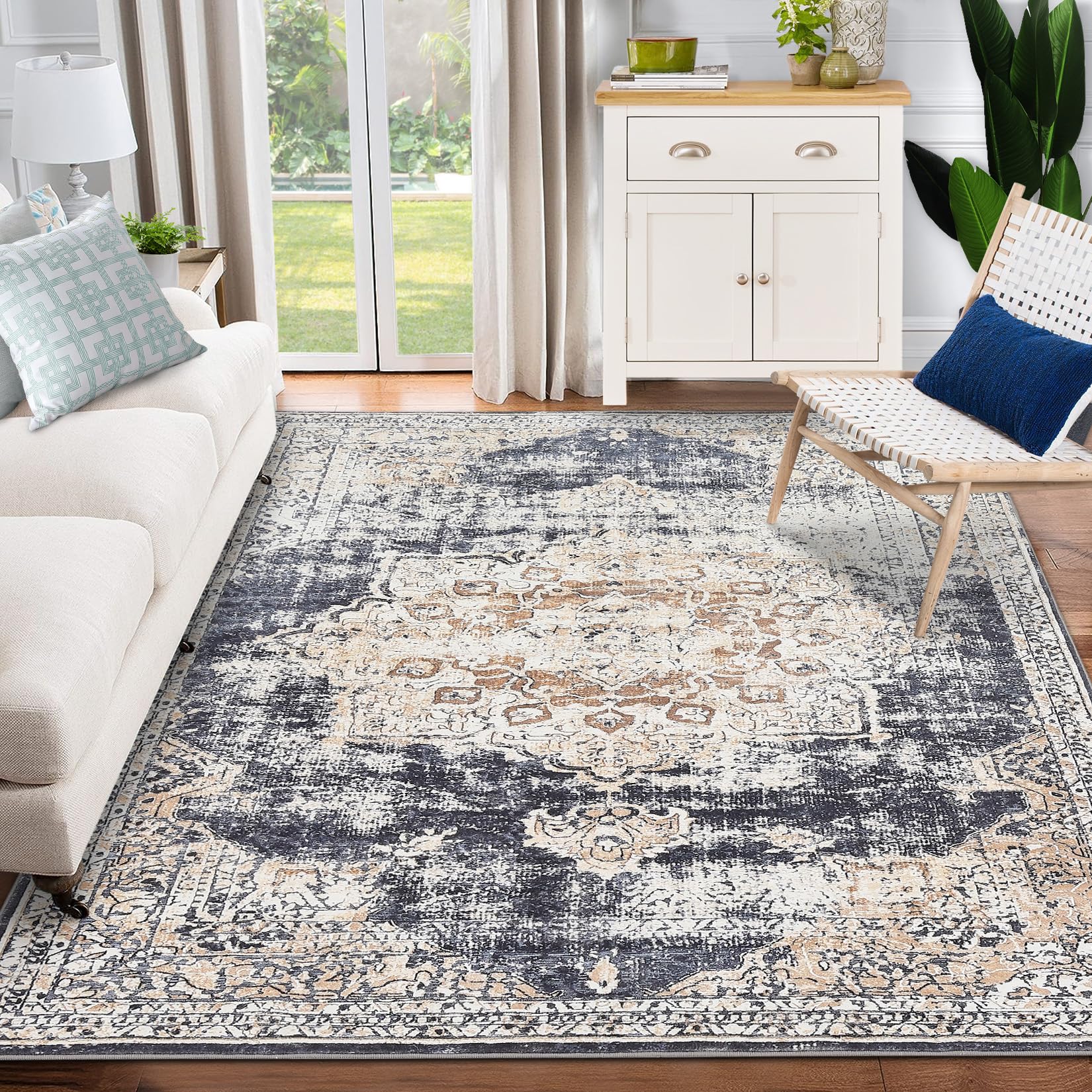
GARVEE – Alfombra clásico Lavable, con Estampado de medallón Oriental, con Respaldo de Goma de Perfil bajo, Ideal para Sala de Estar, Comedor, recámara, Oficina, Color Beige, 3 x 5 Pulgadas
- Original price was: $41.99.$16.80Current price is: $16.80.
- Select options This product has multiple variants. The options may be chosen on the product page
-
- Sale!
- GARVEE, Restaurant & Food Service > Restaurant Furniture > Stainless Steel Work Table
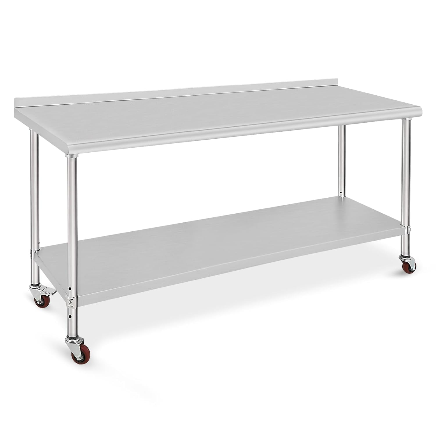
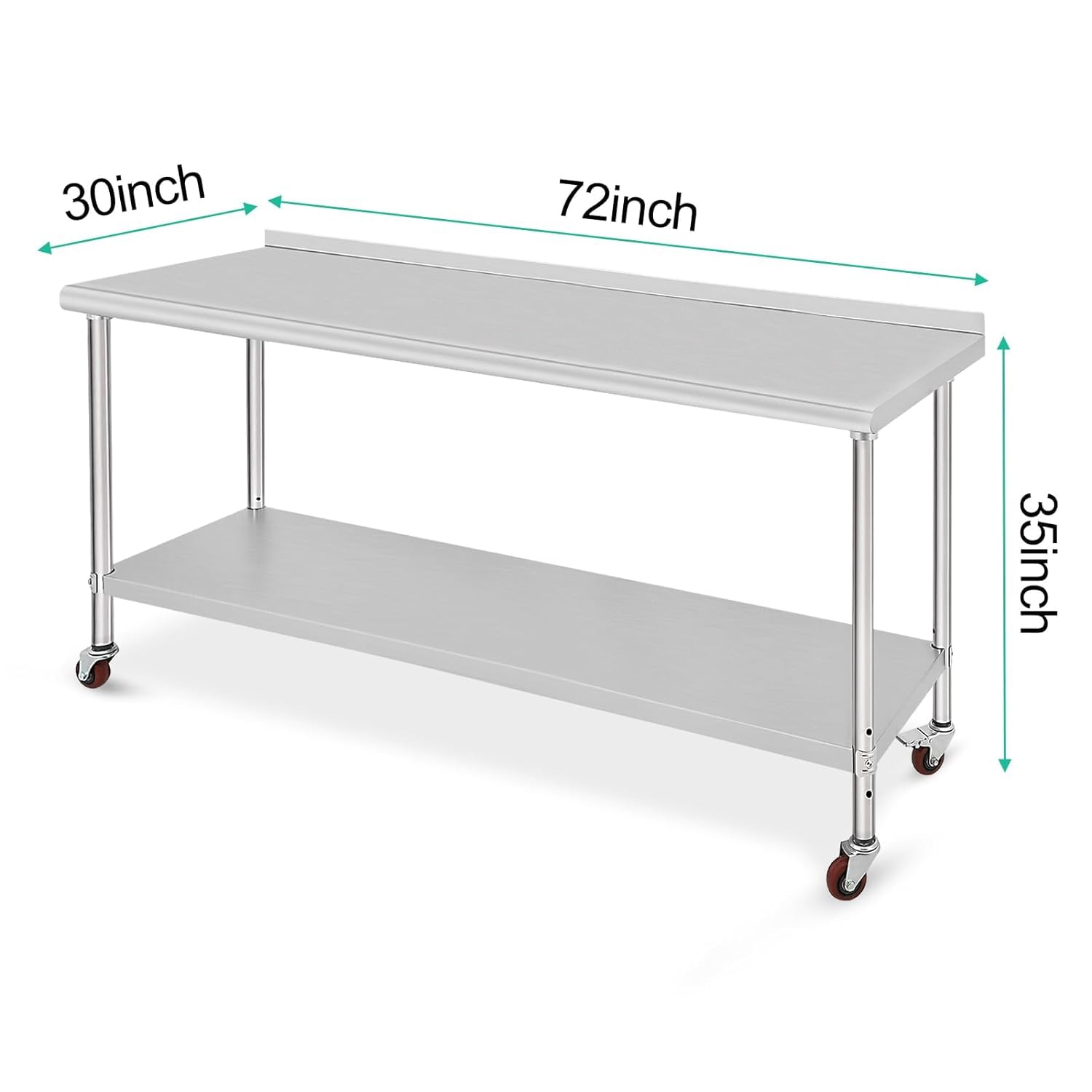
GARVEE 72x30x35 inch Stainless Steel Table Heavy Duty Double Tier Worktable Ideal for Food Prep Kitchen Restaurant and Commercial Workstation
- Original price was: $454.99.$91.00Current price is: $91.00.
- Select options This product has multiple variants. The options may be chosen on the product page
-
- Sale!
- GARVEE, Restaurant & Food Service > Cooking Equipment > Range Hood
430 Stainless Steel Commercial Baffle Grease Filter | 5FT UL Listed Restaurant Hood Filter | NSF Certified
- Original price was: $489.98.$98.00Current price is: $98.00.
- Select options This product has multiple variants. The options may be chosen on the product page