GARVEE Large Moroccan Area Rug, 9×12 Super Soft Ultra-Thin Boho Indoor Floor Carpet, Anti-Slip Foldable Machine Washable Geometric Rug for Living Room Under Dining Table Home Office House Decor, Grey
Original price was: $133.99.$33.50Current price is: $33.50.
Description
GARVEE Large Moroccan Area Rug, 9×12 Super Soft Ultra-Thin Boho Indoor Floor Carpet, Anti-Slip Foldable Machine Washable Geometric Rug for Living Room Under Dining Table Home Office House Decor, Grey
- 【Super Soft Comfort】Experience unparalleled softness and comfort with our Large Moroccan Area Rug. Perfect for families, it provides a cozy and safe play area for kids and pets, enhancing relaxation in your living room, dining area, or home office.
- 【Anti-Slip Backing】Our Ultra-Thin Boho Indoor Floor Carpet features a durable TPE rubber backing, ensuring excellent adhesion to the floor. This Anti-Slip design minimizes the risk of tripping, making it ideal for high-traffic areas.
- 【Machine Washable Convenience】Enjoy hassle-free maintenance with our Machine Washable Rug. Simply toss it in the washing machine with cold water and air dry. It’s perfect for busy households, keeping your space clean and fresh with minimal effort.
- 【Stylish Moroccan Design】Elevate your home decor with the Geometric Moroccan Abstract Design of our rug. Its intricate patterns and vibrant colors brighten any room, making it a stunning centerpiece for your living room, bedroom, or office.
- 【Foldable & Durable】This Foldable rug is lightweight, stain-resistant, and durable. Its easy-to-clean material ensures longevity, while its foldable design allows for convenient storage and portability.
Specifications
| Brand | GARVEE |
| Size | 9 x 12 Feet |
| Material | Polyester |
| Weave Type | Tufted |
| Item Weight | 28.5 pounds |
| Pile Height | Low Pile |
| Construction Type | Machine Made |
| Back Material Type | Rubber |
| Color | Grey |
| Shape | Rectangular |
| Product Dimensions | 144″L x 108″W |
| Model Name | wq-GMOZFU3 |
| UPC | 198290534296 |
.aplus_module STANDARD_PRODUCT_ATTRIBUTES h3{
margin-bottom: 10px;
}
.responsive-table {
border-collapse: collapse;
width: 100%;
margin-bottom: 20px;
}
.responsive-table td {
border: 1px solid #ddd;
padding: 8px;
text-align: left;
}
.responsive-table tr:nth-child(odd) {
background-color: #F2F2F2;
}
.responsive-table tr:nth-child(even) {
background-color: #E6E6E6;
}
.responsive-table tr:hover {
background-color: #DDDDDD;
}
@media screen and (max-width: 800px) {
.responsive-table td {
box-sizing: border-box;
width: 100%;
text-align: left;
padding: 10px;
}
.responsive-table tr:nth-child(odd) td {
background-color: #F2F2F2;
}
.responsive-table tr:nth-child(even) td {
background-color: #E6E6E6;
}
.responsive-table tr:hover td {
background-color: #DDDDDD;
}
}
.aplus_module{
margin-bottom:24px;
}
.aplus_module img{
width:100%;
}
.aplus_module h1,h2,h3,h4,h5,h6{
margin:0 !important;
}
.count_imgs_wrap{
display:flex;
}
.count_imgs_wrap>div{
flex: 1;
margin-right: 30px;
}
.count_imgs_wrap>div:last-child {
margin-right: 0;
}
@media screen and (max-width:800px){
.count_imgs_wrap{
flex-direction: column;
}
.count_imgs_wrap>div{
margin-right: 0;
}
.count_imgs{
display:flex;
justify-content: center;
}
.count_imgs>img{
width:auto;
max-width:100%;
}
}
.img_floatleft{
display:flex;
justify-content:space-between;
}
.leftwrap{
flex:3;
display:flex;
}
.lefttext{
margin:0 30px;
}
.lefttext>ul{
padding:0;
}
.lefttext>ul>li{
padding-bottom:18px;
}
.rightwrap{
flex:1;
}
.rightwrap_inner{
border-left:1px solid #dddddd;
padding-left:30px;
}
.rightwrap_inner>ul{
background-color: white;
padding:18px 32px;
border-radius: 8px;
}
@media screen and (max-width:800px){
.img_floatleft{
flex-direction: column;
}
.leftwrap{
flex-direction: column;
flex: initial;
}
.leftimage{
display:flex;
justify-content: center;
}
.leftimage>img{
max-width:100%;
width:auto;
}
.lefttext{
margin:0;
}
.lefttext>ul{
padding-left:32px;
}
.rightwrap{
flex: initial;
}
.rightwrap_inner{
border-left:0;
padding-left:0;
}
.rightwrap_inner>ul{
padding-right:0;
}
}
Additional information
| Color | Grey |
|---|---|
| Size | 9' X 12' |
Related products
-
- Sale!
- Automotive > Replacement Parts > Engine Parts, GARVEE
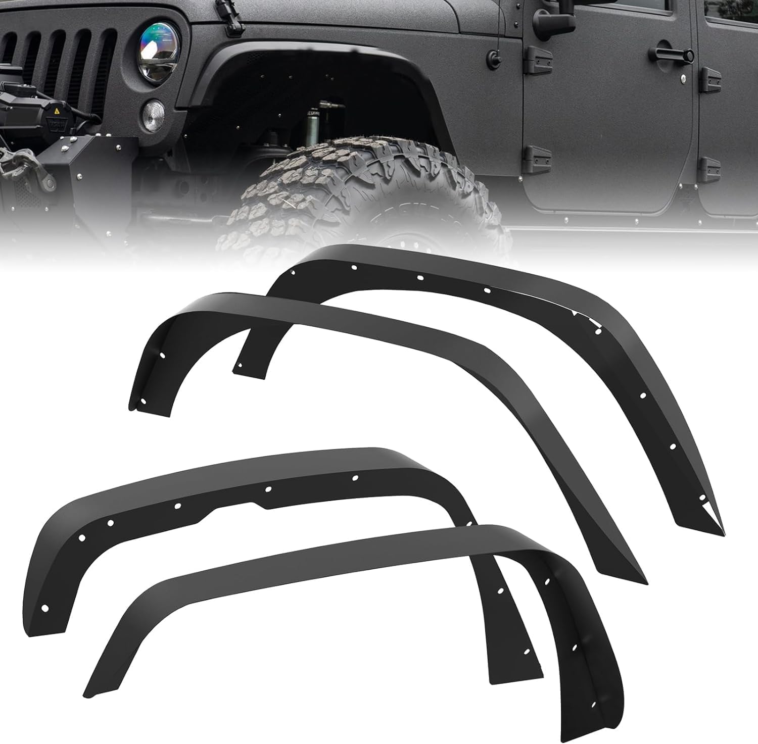
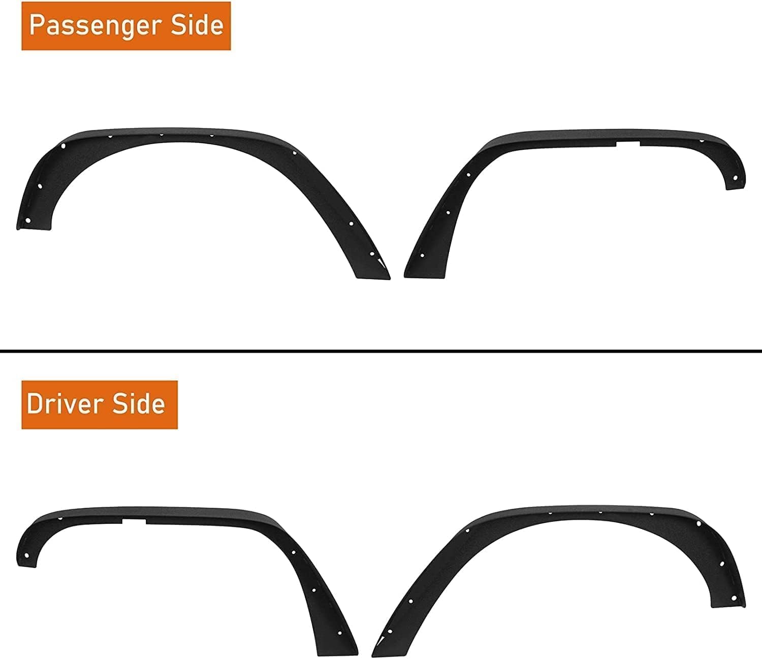
GARVEE ’18-’24 Wrangler JL Thick Solid Steel Front & Rear Fender Flares
- Original price was: $133.99.$33.50Current price is: $33.50.
- Select options This product has multiple variants. The options may be chosen on the product page
-
- Sale!
- Automotive > Automotive Accessories > Tonneau Cover, GARVEE
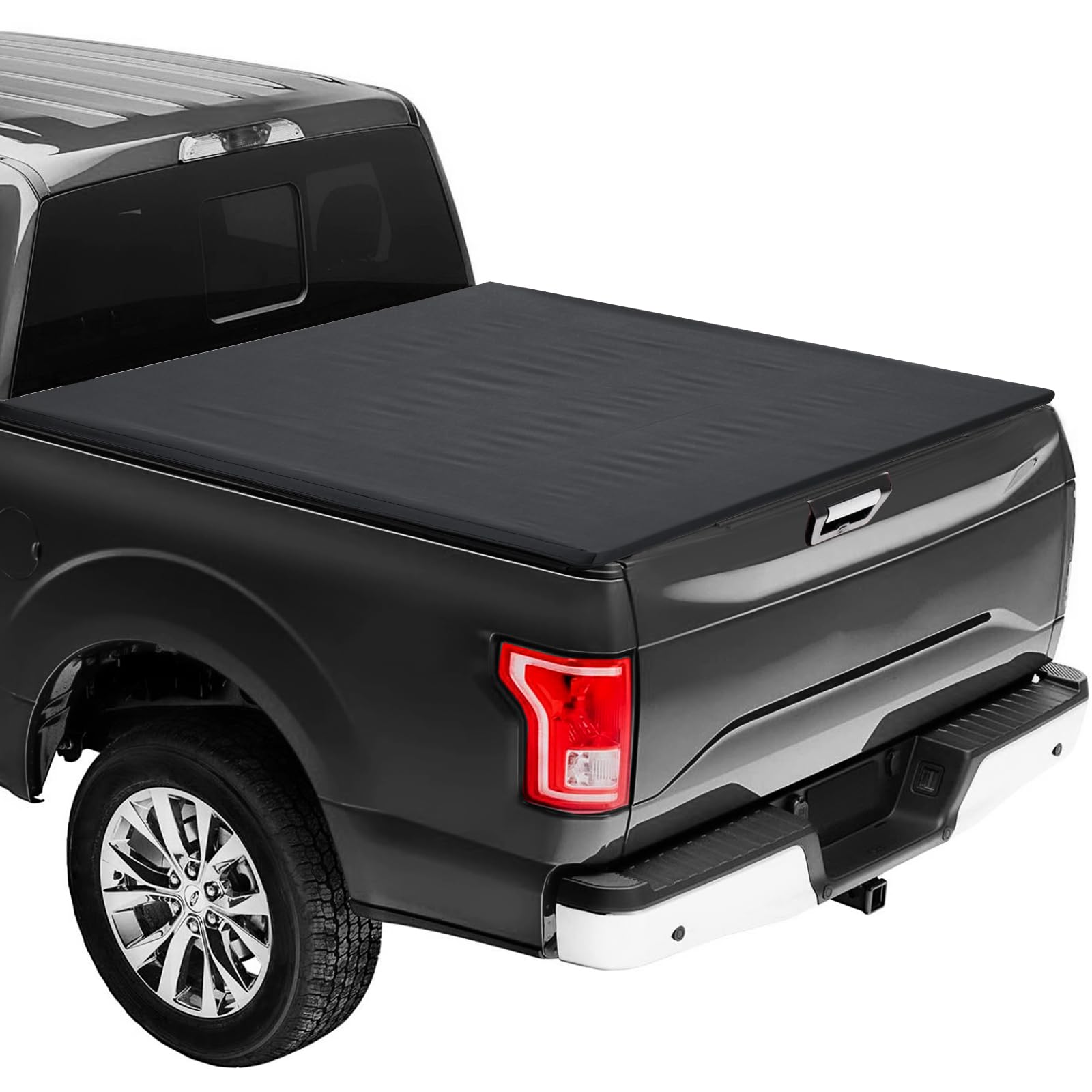
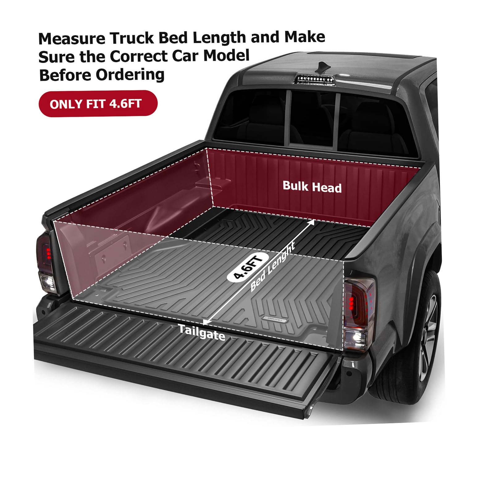
GARVEE Soft Roll-Up Tonneau Cover for 2022-2024 Ford Maverick 4.6ft bed- Black
- Original price was: $154.99.$38.75Current price is: $38.75.
- Select options This product has multiple variants. The options may be chosen on the product page
-
- Sale!
- GARVEE, Home & Kitchen > Seasonal Decor > Christmas Decorations
GARVEE – Cinta de Bronce para decoración de árbol de Navidad (2 m), Color Rojo
- Original price was: $23.99.$9.60Current price is: $9.60.
- Select options This product has multiple variants. The options may be chosen on the product page