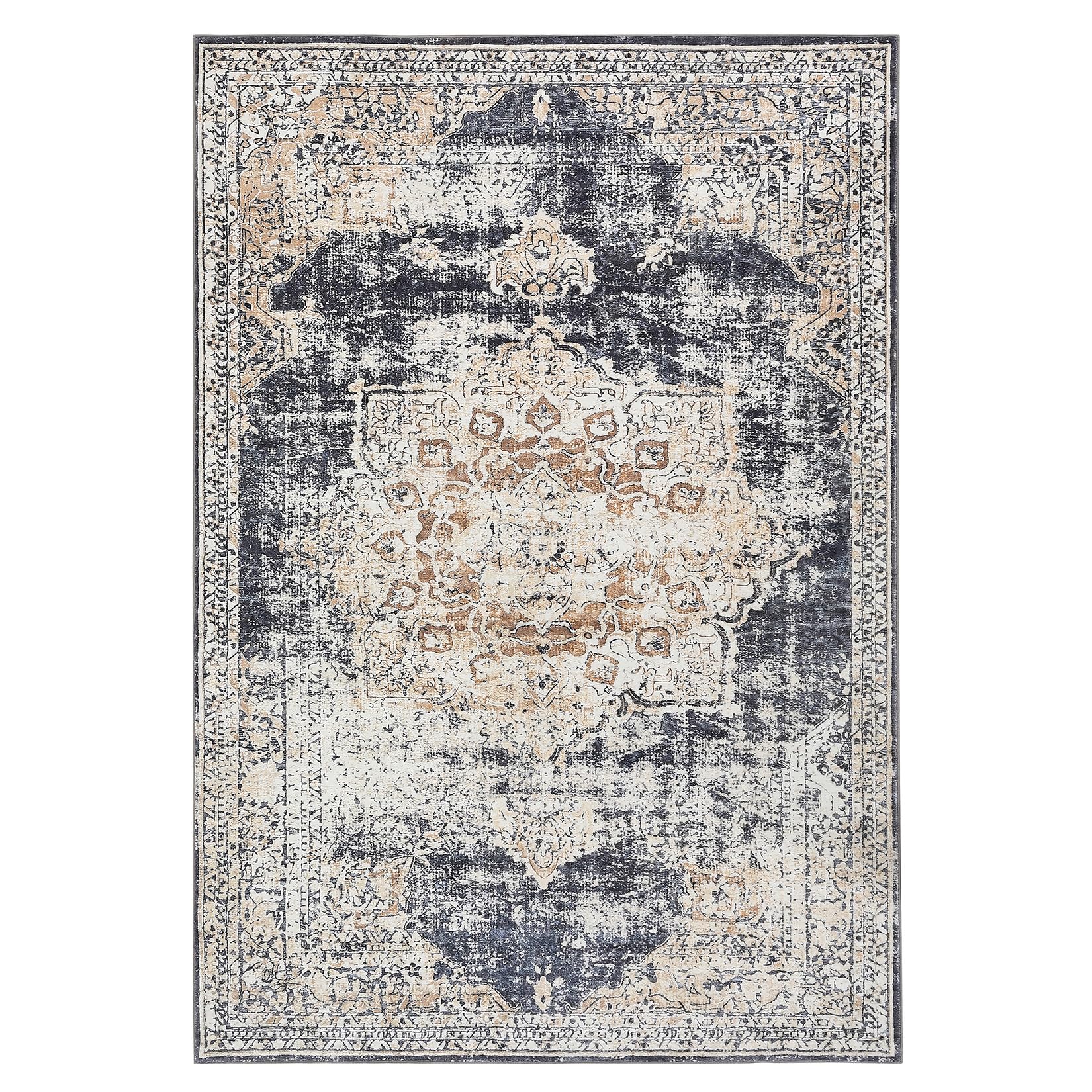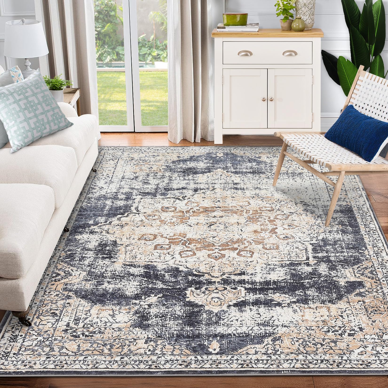
GARVEE Moroccan Area Rugs Boho Rug Modern Tribal Washable Area Rug Soft Low Pile Floorcover Geometric Throw Rug Carpet for Living Room Bedroom Dining Room Entryway Rug Navy/White, 140x270cm
Original price was: $62.99.$18.90Current price is: $18.90.
Description
GARVEE Moroccan Area Rugs Boho Rug Modern Tribal Washable Area Rug Soft Low Pile Floorcover Geometric Throw Rug Carpet for Living Room Bedroom Dining Room Entryway Rug Navy/White, 140x270cm
- SAFE MATERIALS: This Velvet rug is made from polyester and non-toxic. You could feel free to lay on it, barefoot walking, and good for tummy time.
- PERFECT HOME DECOR: This area rug with classic yet modern color which is an ideal choice for home decoration.
- LOW PILE: Low pile area rugs are made of premium micro-fibers, allow for seamless placement underneath furniture, and will not obstruct doorways, are perfect for the living room, dining room, entry, bedroom, or home office
- UNIQUE DESIGN: Each rug with modern & abstract design turns your room into an inviting space.
- EASY CLEAN: These machine washable rugs are highly durable: It’s a Low-pile, indoor rug, we recommend totally machine washable, and regular vacuuming is recommended for minor dust.
Specifications
| Brand | GARVEE |
| Size | 140x200cm |
| Material | Polypropylene |
| Weave Type | Machine Made |
| Pile Height | Low Pile |
| Construction Type | Machine Made |
| Back Material Type | Rubber |
| Color | Navy Border |
| Pattern | Geometric |
| Shape | Rectangular |
| Special Feature | Washable |
| Room Type | Living Room |
| Product Dimensions | 79″L x 56″W |
| Style | Moroccan |
| Model Name | A4231011-DSN-PHO_0W7P57MG-LAN140200 |
| UPC | 196336836724 |
| Item Weight | 8.3 pounds |
.aplus_module STANDARD_PRODUCT_ATTRIBUTES h3{
margin-bottom: 10px;
}
.responsive-table {
border-collapse: collapse;
width: 100%;
margin-bottom: 20px;
}
.responsive-table td {
border: 1px solid #ddd;
padding: 8px;
text-align: left;
}
.responsive-table tr:nth-child(odd) {
background-color: #F2F2F2;
}
.responsive-table tr:nth-child(even) {
background-color: #E6E6E6;
}
.responsive-table tr:hover {
background-color: #DDDDDD;
}
@media screen and (max-width: 800px) {
.responsive-table td {
box-sizing: border-box;
width: 100%;
text-align: left;
padding: 10px;
}
.responsive-table tr:nth-child(odd) td {
background-color: #F2F2F2;
}
.responsive-table tr:nth-child(even) td {
background-color: #E6E6E6;
}
.responsive-table tr:hover td {
background-color: #DDDDDD;
}
}
.aplus_module{
margin-bottom:24px;
}
.aplus_module img{
width:100%;
}
.aplus_module h1,h2,h3,h4,h5,h6{
margin:0 !important;
}
.count_imgs_wrap{
display:flex;
}
.count_imgs_wrap>div{
flex: 1;
margin-right: 30px;
}
.count_imgs_wrap>div:last-child {
margin-right: 0;
}
@media screen and (max-width:800px){
.count_imgs_wrap{
flex-direction: column;
}
.count_imgs_wrap>div{
margin-right: 0;
}
.count_imgs{
display:flex;
justify-content: center;
}
.count_imgs>img{
width:auto;
max-width:100%;
}
}
.img_floatleft{
display:flex;
justify-content:space-between;
}
.leftwrap{
flex:3;
display:flex;
}
.lefttext{
margin:0 30px;
}
.lefttext>ul{
padding:0;
}
.lefttext>ul>li{
padding-bottom:18px;
}
.rightwrap{
flex:1;
}
.rightwrap_inner{
border-left:1px solid #dddddd;
padding-left:30px;
}
.rightwrap_inner>ul{
background-color: white;
padding:18px 32px;
border-radius: 8px;
}
@media screen and (max-width:800px){
.img_floatleft{
flex-direction: column;
}
.leftwrap{
flex-direction: column;
flex: initial;
}
.leftimage{
display:flex;
justify-content: center;
}
.leftimage>img{
max-width:100%;
width:auto;
}
.lefttext{
margin:0;
}
.lefttext>ul{
padding-left:32px;
}
.rightwrap{
flex: initial;
}
.rightwrap_inner{
border-left:0;
padding-left:0;
}
.rightwrap_inner>ul{
padding-right:0;
}
}
Additional information
| Color | Blue |
|---|---|
| Size | 4.6' x 6.5' |
Related products
-
- Sale!
- GARVEE, Home & Kitchen > Rugs > Oriental Rugs
GARVEE – Alfombra clásico Lavable, con Estampado de medallón Oriental, con Respaldo de Goma de Perfil bajo, Ideal para Sala de Estar, Comedor, recámara, Oficina, Color Beige, 3 x 5 Pulgadas
- Original price was: $41.99.$16.80Current price is: $16.80.
- Select options This product has multiple variants. The options may be chosen on the product page
-
- Sale!
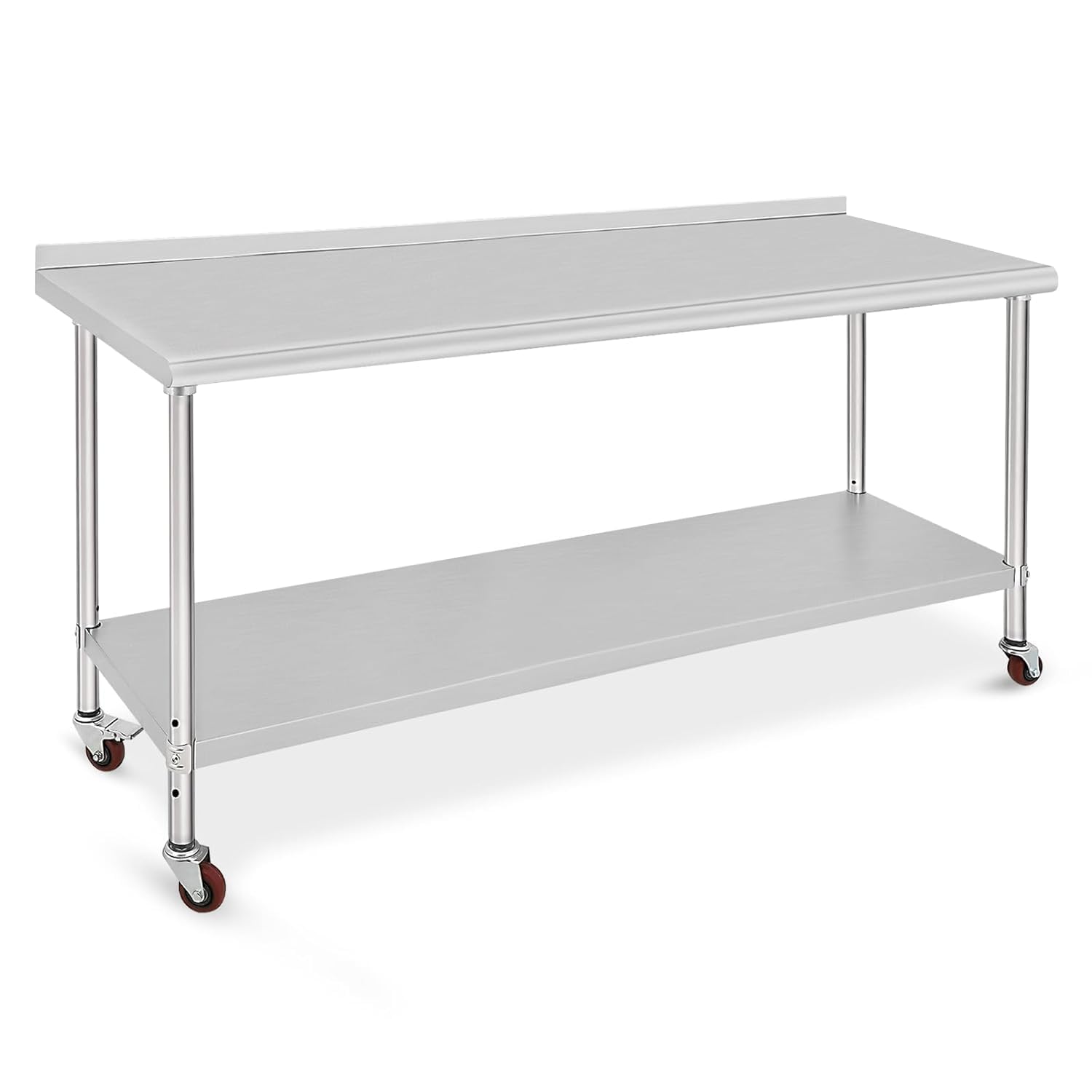
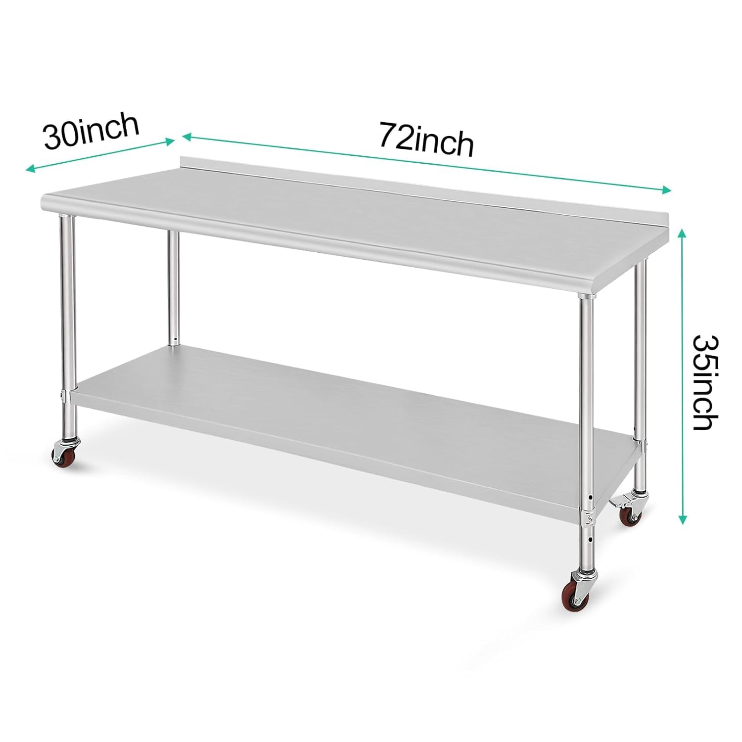
- GARVEE, Restaurant & Food Service > Restaurant Furniture > Stainless Steel Work Table
GARVEE 72x30x35 inch Stainless Steel Table Heavy Duty Double Tier Worktable Ideal for Food Prep Kitchen Restaurant and Commercial Workstation
- Original price was: $454.99.$91.00Current price is: $91.00.
- Select options This product has multiple variants. The options may be chosen on the product page
-
- Sale!
- GARVEE, Home & Kitchen > Rugs > Oriental Rugs
GARVEE – Alfombra clásico Lavable, con Estampado de medallón Oriental, con Respaldo de Goma de Perfil bajo, Ideal para Sala de Estar, Comedor, recámara, Oficina, Color Beige, 5 x 7 Pulgadas
- Original price was: $63.99.$19.20Current price is: $19.20.
- Select options This product has multiple variants. The options may be chosen on the product page