


GARVEE Mud Kitchen for Kids Outdoor – Kids Outdoor Play Kitchen Playset with Cookware Accessories – Perfect for Chef Pretend Play Fashion
Original price was: $94.99.$28.50Current price is: $28.50.
Description
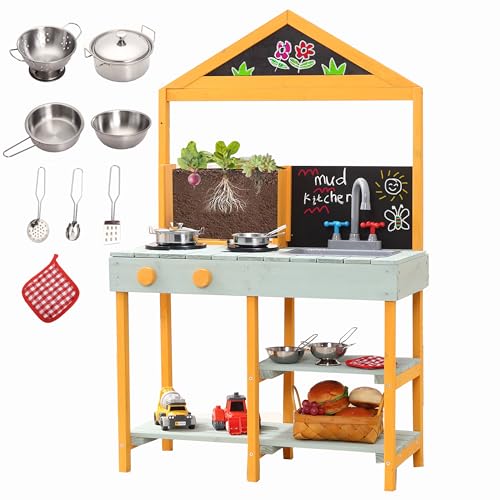
GARVEE Mud Kitchen for Kids Outdoor – Kids Outdoor Play Kitchen Playset with Cookware Accessories – Perfect for Chef Pretend Play
- Safety-Compliant Kids Kitchen: Constructed from natural solid fir wood, which is stable for long-term use. with rounded edges , this play kitchen meets U.S. safety standards, ensuring a secure play environment for your child.
- Interactive Play Experience: The playset includes 1 wooden kitchen and cookware accessories, including 4 pots and pans with 1 cover, 3 cooking utensils and . Encourage basic kitchen skills and culinary enjoyment in children.
- Dimensions for Growing Chefs: With dimensions of 38.6″ (H) x 20.9″ (L) x 14.6 ” (W), this wooden playset is perfect for children aged 3 and above. An ideal gift for birthdays or special occasions, it sparks creativity in aspiring young chefs.
- Convenient Versatility: The mud kitchen is designed for kids, with 2 simulated stoves, 2 rotary knobs, 1 rotary faucet, 1 removable sink and large storage space for for kids to make mud pies, wash, or cook. And also help kids to keep all of their cooking tools & toys, allowing them to develop a good organizing habit.
- Dedicated Customer Support: Detailed installation instructions are provided, and adult assembly is recommended. It takes around 30 MIN to finish. Our responsive customer service team is available to address any queries or issues promptly. Your satisfaction is our top priority.
Specifications
| Product Dimensions | 14.56 x 20.86 x 38.58 inches |
| Item Weight | 17.31 pounds |
| Manufacturer recommended age | 36 months – 8 years |
.aplus_module STANDARD_PRODUCT_ATTRIBUTES h3{
margin-bottom: 10px;
}
.responsive-table {
border-collapse: collapse;
width: 100%;
margin-bottom: 20px;
}
.responsive-table td {
border: 1px solid #ddd;
padding: 8px;
text-align: left;
}
.responsive-table tr:nth-child(odd) {
background-color: #F2F2F2;
}
.responsive-table tr:nth-child(even) {
background-color: #E6E6E6;
}
.responsive-table tr:hover {
background-color: #DDDDDD;
}
@media screen and (max-width: 800px) {
.responsive-table td {
box-sizing: border-box;
width: 100%;
text-align: left;
padding: 10px;
}
.responsive-table tr:nth-child(odd) td {
background-color: #F2F2F2;
}
.responsive-table tr:nth-child(even) td {
background-color: #E6E6E6;
}
.responsive-table tr:hover td {
background-color: #DDDDDD;
}
}
.aplus_module{
margin-bottom:24px;
}
.aplus_module img{
width:100%;
}
.aplus_module h1,h2,h3,h4,h5,h6{
margin:0 !important;
}
.count_imgs_wrap{
display:flex;
}
.count_imgs_wrap>div{
flex: 1;
margin-right: 30px;
}
.count_imgs_wrap>div:last-child {
margin-right: 0;
}
@media screen and (max-width:800px){
.count_imgs_wrap{
flex-direction: column;
}
.count_imgs_wrap>div{
margin-right: 0;
}
.count_imgs{
display:flex;
justify-content: center;
}
.count_imgs>img{
width:auto;
max-width:100%;
}
}
.img_floatleft{
display:flex;
justify-content:space-between;
}
.leftwrap{
flex:3;
display:flex;
}
.lefttext{
margin:0 30px;
}
.lefttext>ul{
padding:0;
}
.lefttext>ul>li{
padding-bottom:18px;
}
.rightwrap{
flex:1;
}
.rightwrap_inner{
border-left:1px solid #dddddd;
padding-left:30px;
}
.rightwrap_inner>ul{
background-color: white;
padding:18px 32px;
border-radius: 8px;
}
@media screen and (max-width:800px){
.img_floatleft{
flex-direction: column;
}
.leftwrap{
flex-direction: column;
flex: initial;
}
.leftimage{
display:flex;
justify-content: center;
}
.leftimage>img{
max-width:100%;
width:auto;
}
.lefttext{
margin:0;
}
.lefttext>ul{
padding-left:32px;
}
.rightwrap{
flex: initial;
}
.rightwrap_inner{
border-left:0;
padding-left:0;
}
.rightwrap_inner>ul{
padding-right:0;
}
}
Additional information
| Color | White |
|---|
Related products
-
- Sale!
- GARVEE, Home & Kitchen > Rugs > Oriental Rugs
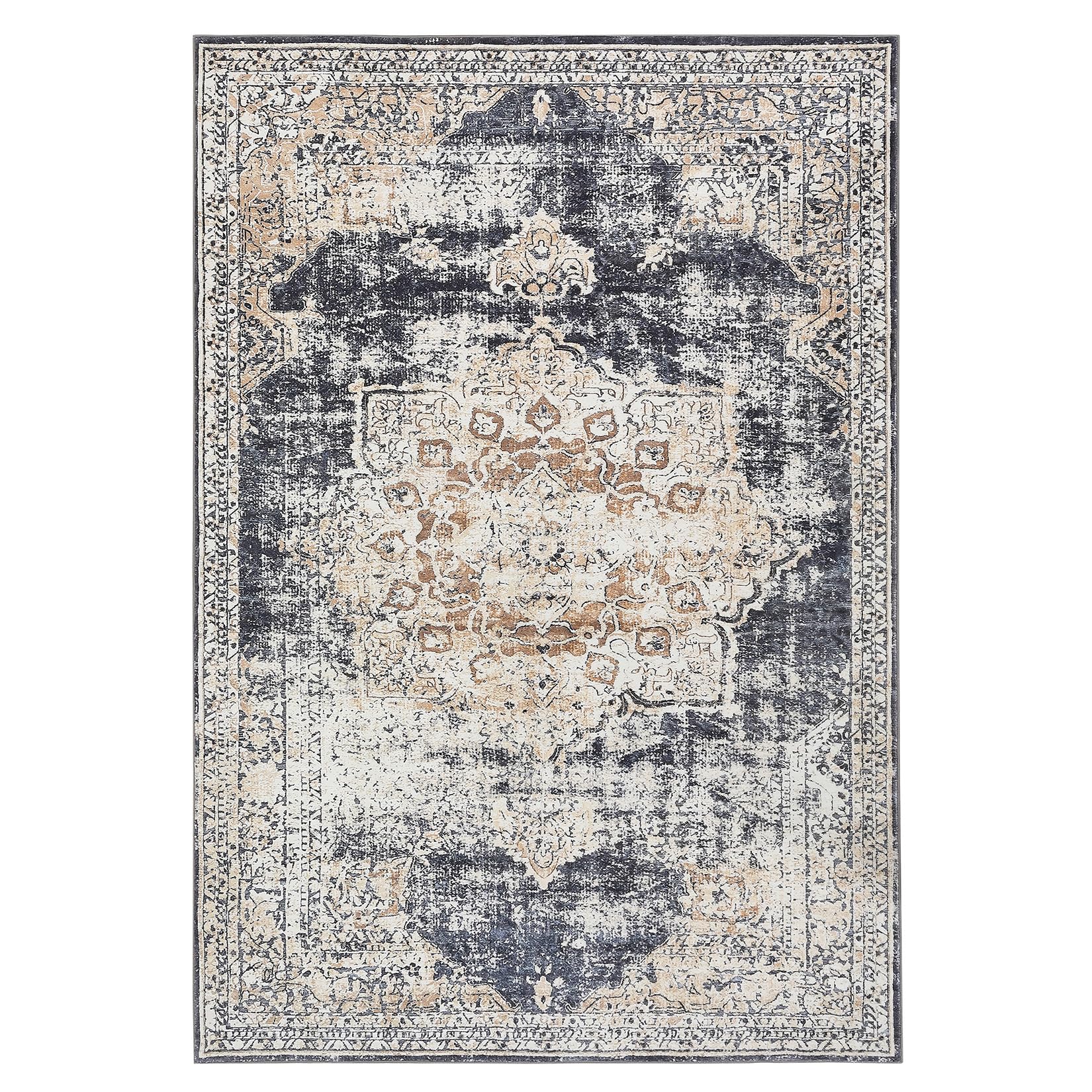
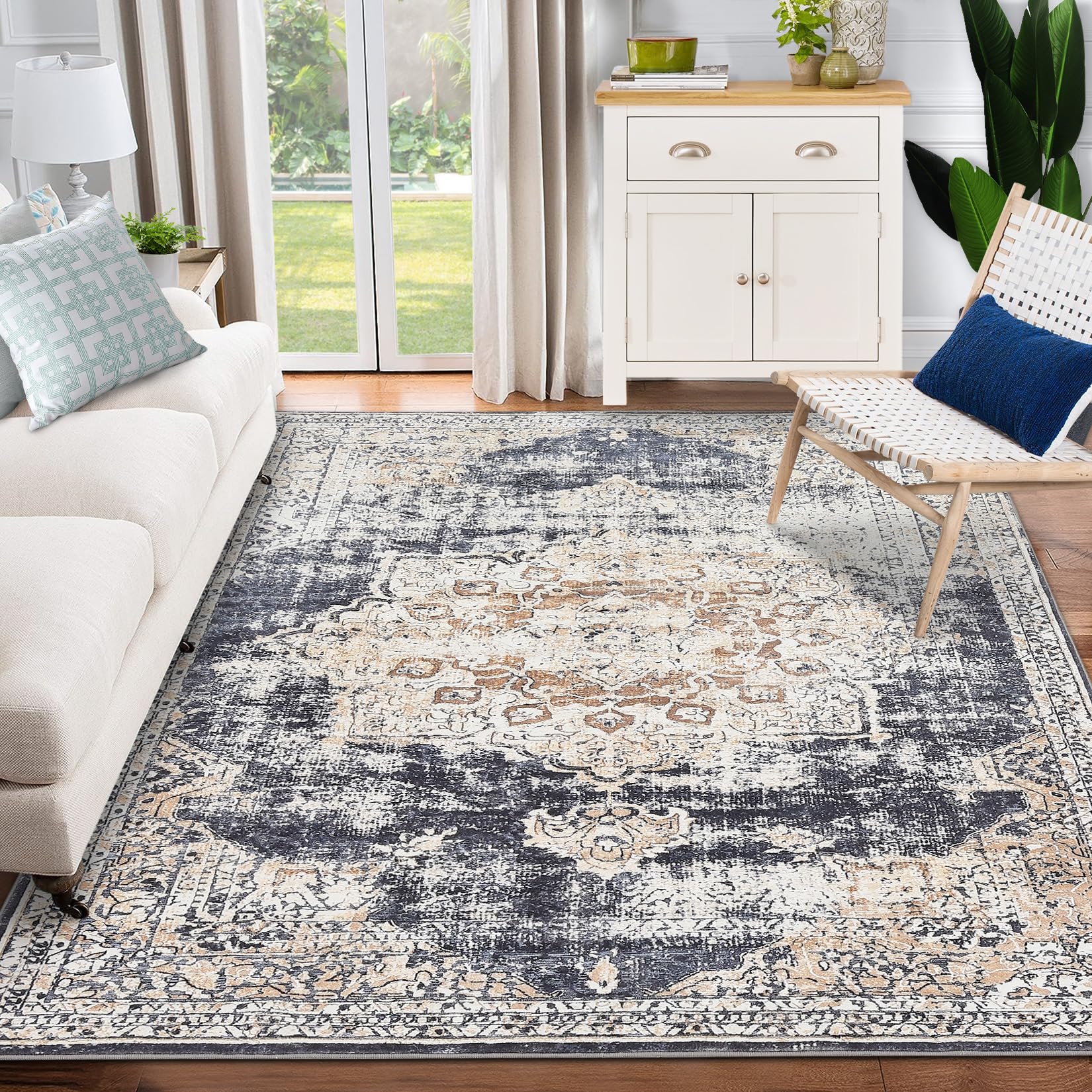
GARVEE – Alfombra clásico Lavable, con Estampado de medallón Oriental, con Respaldo de Goma de Perfil bajo, Ideal para Sala de Estar, Comedor, recámara, Oficina, Color Beige, 9 x 12 Pulgadas
- Original price was: $158.99.$39.75Current price is: $39.75.
- Select options This product has multiple variants. The options may be chosen on the product page
-
- Sale!
- Cleaning & Janitorial Supplies > Trash Cans & Wastebaskets > Pull Out Trash Cans, GARVEE
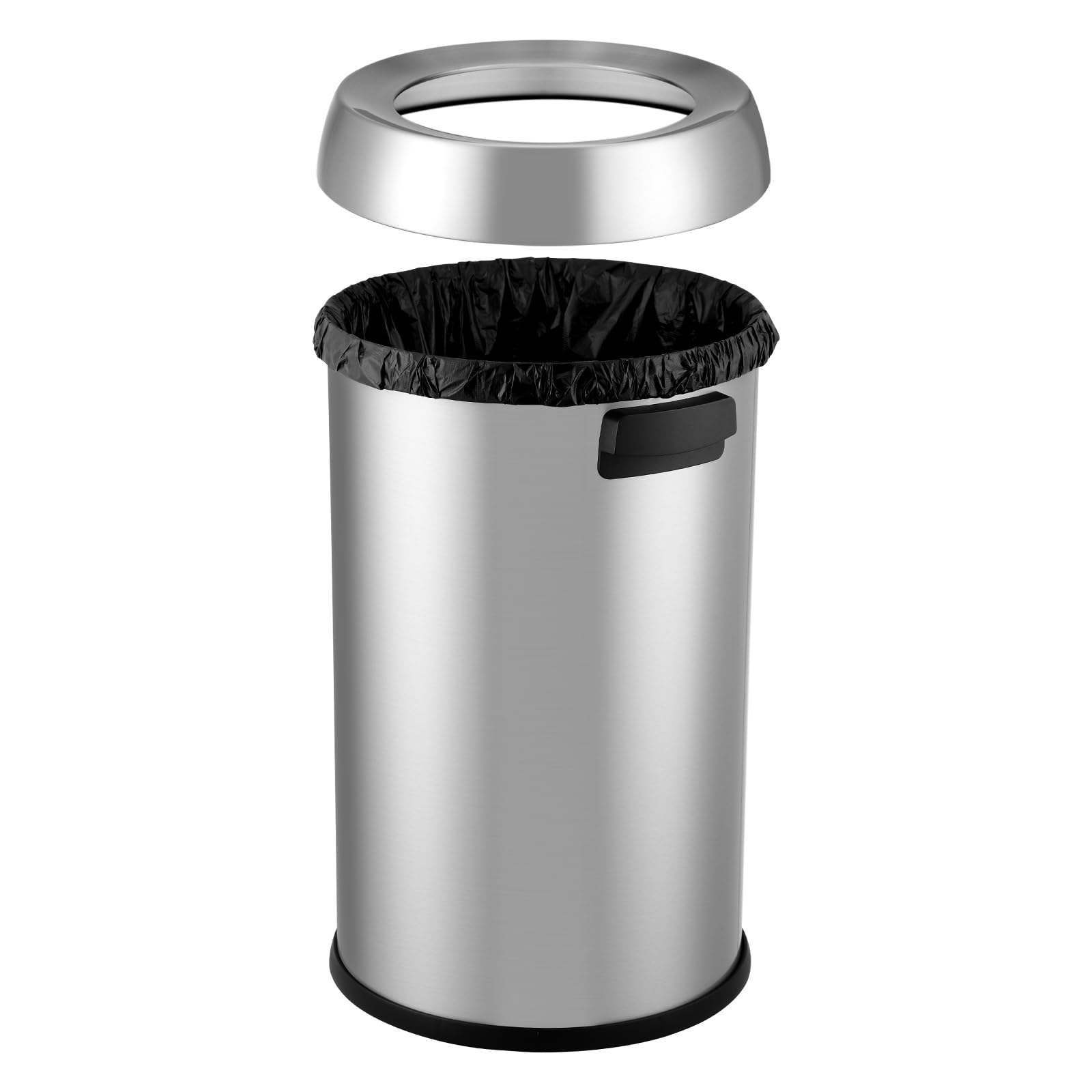
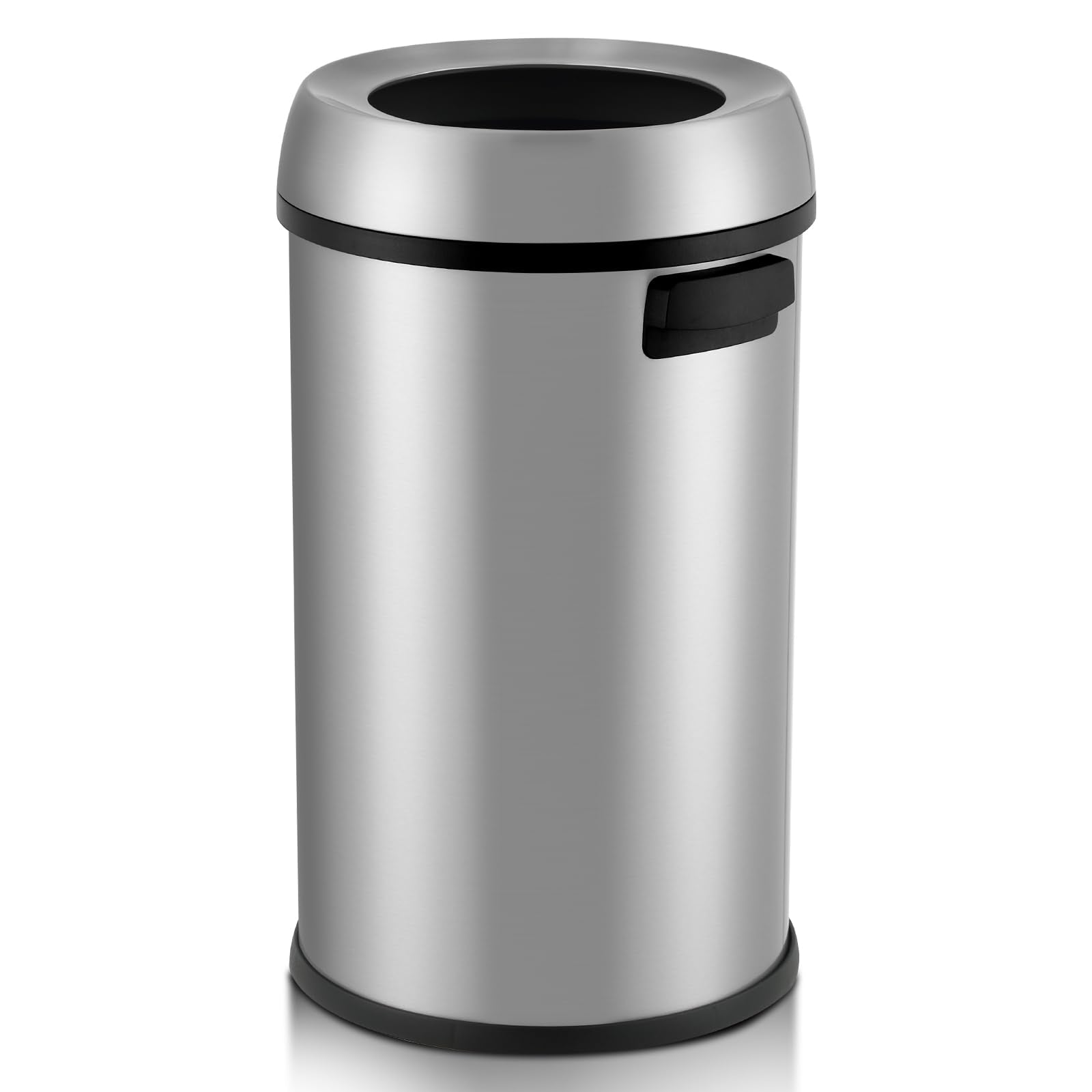
GARVEE 65L/17 Gal Open Top Trash Can Commercial Grade Heavy Duty Brushed Stainless Steel Waste Bins for Outdoor Kitchen Home House Family Online Hot Sale
- Original price was: $102.99.$25.75Current price is: $25.75.
- Select options This product has multiple variants. The options may be chosen on the product page
-
-
Sale!
- GARVEE, Home & Kitchen > Seasonal Decor > Halloween Decorations
GARVEE – Cadena de luces solares para decoración de Halloween, luces solares impermeables al aire última intervensión, luces LED para interiores para decoración de fiesta, patio, jardín, hogar
- Original price was: $30.99.$12.40Current price is: $12.40.
- Select options This product has multiple variants. The options may be chosen on the product page
-
Sale!