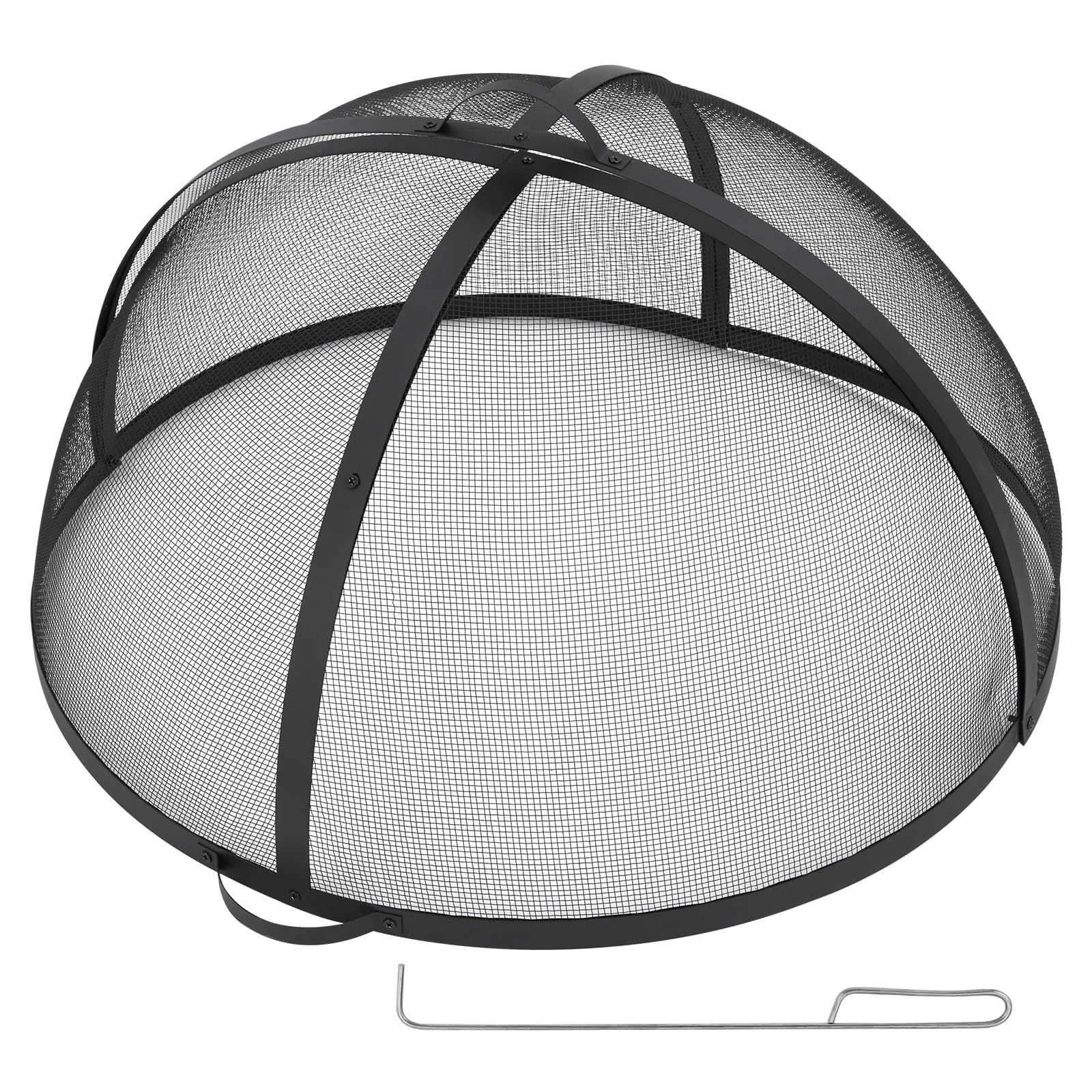


GARVEE Outdoor Fire Pit Spark Screen Cover Accessory – 30 Inch Round Heavy Duty Stainless Steel Ember Cover with Heavy Duty Hinges, Flaky Black Design for Patio Backyard
Original price was: $82.99.$24.90Current price is: $24.90.
Description
GARVEE Outdoor Fire Pit Spark Screen Cover Accessory – 30 Inch Round Heavy Duty Stainless Steel Ember Cover with Heavy Duty Hinges, Flaky Black Design for Patio Backyard
- – **Robust Spark Protection**: The Asypets Outdoor Fire Pit Spark Screen Cover, with its 30-inch round heavy-duty stainless steel build, effectively contains embers and sparks. The sturdy hinges allow for safe access to the fire without needing to remove the cover entirely, ensuring a secure and enjoyable outdoor experience.
- – **Heavy-Duty Design**: Engineered from premium stainless steel, this spark screen offers unwavering protection against the elements. Its durable construction ensures long-lasting fire pit protection, maintaining its flaky black design for years to come and enhancing your patio’s aesthetics.
- – **User-Friendly Handling**: Equipped with ergonomic handles, this fire pit cover enables easy lifting and positioning. The convenient foldable design makes storage and transport simple, while the high-quality stainless steel ensures an anti-corrosion finish for lasting functionality.
- – **Ideal Fit & Functionality**: Perfectly crafted for 30-inch fire pits, this cover ensures a snug fit and exceptional performance. Its perforated mesh design promotes efficient airflow for better combustion, crafting an inviting atmosphere for outdoor gatherings while being easy to clean.
- – **Effortless Setup**: Enjoy hassle-free assembly with no additional tools required. The Asypets spark screen’s foldable structure enables quick disassembly and compact storage, making it an essential weather-resistant accessory for patios and backyards.
Specifications
| Product Dimensions | 27.95 x 27.36 x 0.1 inches |
| Item Weight | 13.4 pounds |
.aplus_module STANDARD_PRODUCT_ATTRIBUTES h3{
margin-bottom: 10px;
}
.responsive-table {
border-collapse: collapse;
width: 100%;
margin-bottom: 20px;
}
.responsive-table td {
border: 1px solid #ddd;
padding: 8px;
text-align: left;
}
.responsive-table tr:nth-child(odd) {
background-color: #F2F2F2;
}
.responsive-table tr:nth-child(even) {
background-color: #E6E6E6;
}
.responsive-table tr:hover {
background-color: #DDDDDD;
}
@media screen and (max-width: 800px) {
.responsive-table td {
box-sizing: border-box;
width: 100%;
text-align: left;
padding: 10px;
}
.responsive-table tr:nth-child(odd) td {
background-color: #F2F2F2;
}
.responsive-table tr:nth-child(even) td {
background-color: #E6E6E6;
}
.responsive-table tr:hover td {
background-color: #DDDDDD;
}
}
.aplus_module{
margin-bottom:24px;
}
.aplus_module img{
width:100%;
}
.aplus_module h1,h2,h3,h4,h5,h6{
margin:0 !important;
}
.count_imgs_wrap{
display:flex;
}
.count_imgs_wrap>div{
flex: 1;
margin-right: 30px;
}
.count_imgs_wrap>div:last-child {
margin-right: 0;
}
@media screen and (max-width:800px){
.count_imgs_wrap{
flex-direction: column;
}
.count_imgs_wrap>div{
margin-right: 0;
}
.count_imgs{
display:flex;
justify-content: center;
}
.count_imgs>img{
width:auto;
max-width:100%;
}
}
.img_floatleft{
display:flex;
justify-content:space-between;
}
.leftwrap{
flex:3;
display:flex;
}
.lefttext{
margin:0 30px;
}
.lefttext>ul{
padding:0;
}
.lefttext>ul>li{
padding-bottom:18px;
}
.rightwrap{
flex:1;
}
.rightwrap_inner{
border-left:1px solid #dddddd;
padding-left:30px;
}
.rightwrap_inner>ul{
background-color: white;
padding:18px 32px;
border-radius: 8px;
}
@media screen and (max-width:800px){
.img_floatleft{
flex-direction: column;
}
.leftwrap{
flex-direction: column;
flex: initial;
}
.leftimage{
display:flex;
justify-content: center;
}
.leftimage>img{
max-width:100%;
width:auto;
}
.lefttext{
margin:0;
}
.lefttext>ul{
padding-left:32px;
}
.rightwrap{
flex: initial;
}
.rightwrap_inner{
border-left:0;
padding-left:0;
}
.rightwrap_inner>ul{
padding-right:0;
}
}
Additional information
| Color | Flake black |
|---|---|
| Size | 30*30*10inch |
Related products
-
-
Sale!
- Furniture > Kids' Furniture > Kids' Tables & Chairs, GARVEE
GARVEE Kids Table and 4 Chairs Set with Graffiti Desktop, Height Adjustable Toddler Table and Chairs Set, 4 in 1 Activity Table Play Table for Reading, Drawing, Playing, Eating,Beige
- Original price was: $133.99.$33.50Current price is: $33.50.
- Select options This product has multiple variants. The options may be chosen on the product page
-
Sale!
-
- Sale!
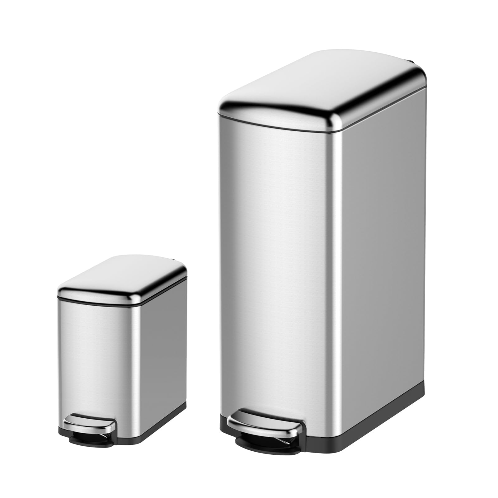
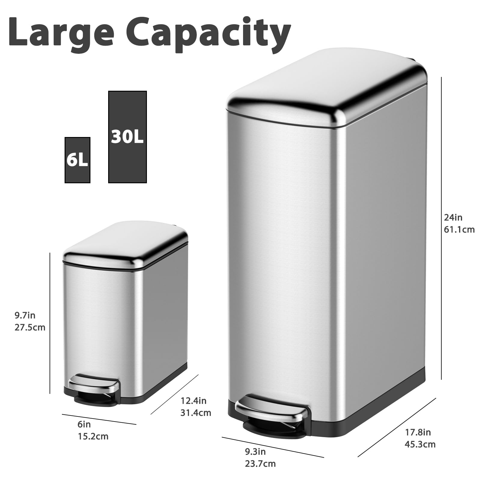
- Cleaning & Janitorial Supplies > Trash Cans & Wastebaskets > Pull Out Trash Cans, GARVEE
GARVEE Trash Can Combo Set, 8 Gallon and 1.6 Gallon Stainless Steel Step Trash Can for Office, Kitchen
- Original price was: $83.99.$25.20Current price is: $25.20.
- Select options This product has multiple variants. The options may be chosen on the product page
-
- Sale!
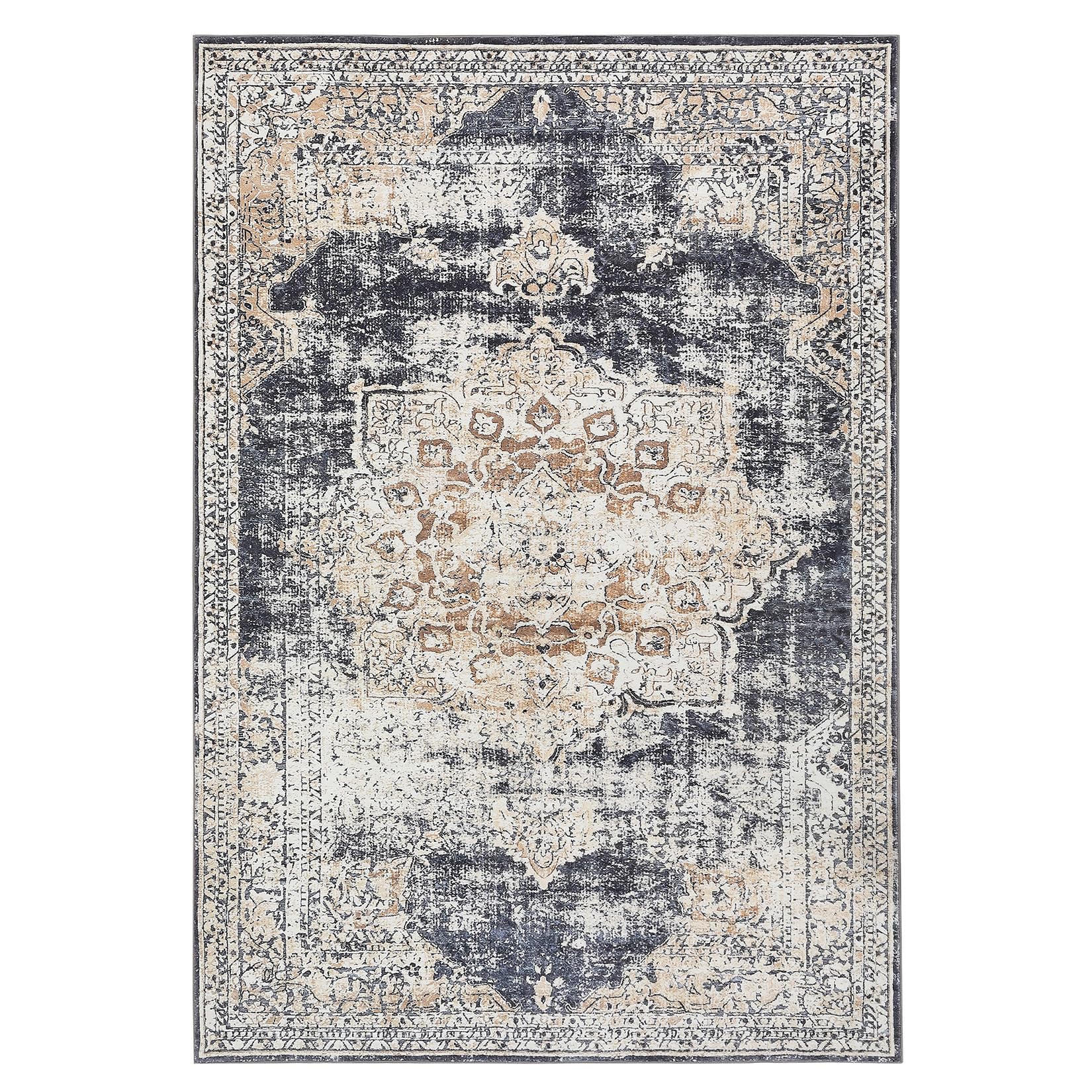
- GARVEE, Home & Kitchen > Rugs > Oriental Rugs
GARVEE – Alfombra clásico Lavable, con Estampado de medallón Oriental, con Respaldo de Goma de Perfil bajo, Ideal para Sala de Estar, Comedor, recámara, Oficina, Color Beige, 5 x 7 Pulgadas
- Original price was: $63.99.$19.20Current price is: $19.20.
- Select options This product has multiple variants. The options may be chosen on the product page