GARVEE Outdoor Rug Waterproof 9×18 Reversible Plastic Straw Camping Carpet Large Area Rugs Mats for RV Backyard Patio Deck Picnic Camping Beach Trailer, Outdoor Modern Area Rugs Diamond Black&White
Original price was: $104.99.$26.25Current price is: $26.25.
Description
GARVEE Outdoor Rug Waterproof 9×18 Reversible Plastic Straw Camping Carpet Large Area Rugs Mats for RV Backyard Patio Deck Picnic Camping Beach Trailer, Outdoor Modern Area Rugs Diamond Black&White
Hecho de 100% plástico, junto con bordes tratados térmicamente para evitar que se deshilache, suave y resistente, de bajo mantenimiento. El material transpirable no daña el césped ni rayará tu terraza. Se siente suave con los pies descalzos. Perfecto para descansar y relajarse. Para una limpieza rápida, simplemente barre la suciedad con agua y aireándola. El agua lava suavemente las manchas, nuestra alfombra de patio al aire libre se seca rápidamente para saludarte como nueva. Las alfombras reversibles para exteriores se pueden plegar en un tamaño compacto para un fácil almacenamiento, viene con una bolsa de transporte y 4 estacas para mayor comodidad. Renueva fácilmente tu espacio al aire libre, como patio, porche, patio, terraza, campamento de caravana, etc.
Specifications
| Brand | GARVEE |
| Size | 5 x 8 FT |
| Material | Plastic |
| Weave Type | Machine Made |
| Pile Height | Low Pile |
| Construction Type | Machine Made |
| Back Material Type | Plastic |
| Color | Cross Black&white |
| Is Stain Resistant | Yes |
| Pattern | Geometric |
| Shape | Rectangular |
| Special Feature | Reversible, Washable |
| Product Dimensions | 96″L x 60″W |
| Rug Form Type | Area Rug |
| Number of Pieces | 1 |
| Model Name | Area Rug |
| UPC | 198290097531 |
| Item Weight | 2.91 pounds |
.responsive-table {
border-collapse: collapse;
width: 100%;
margin-bottom: 20px;
}
.responsive-table td {
border: 1px solid #ddd;
padding: 8px;
text-align: left;
}
.responsive-table tr:nth-child(odd) {
background-color: #F2F2F2;
}
.responsive-table tr:nth-child(even) {
background-color: #E6E6E6;
}
.responsive-table tr:hover {
background-color: #DDDDDD;
}
@media screen and (max-width: 600px) {
.responsive-table td {
box-sizing: border-box;
display: block;
width: 100%;
text-align: left;
padding: 10px;
}
.responsive-table tr:nth-child(odd) td {
background-color: #F2F2F2;
}
.responsive-table tr:nth-child(even) td {
background-color: #E6E6E6;
}
.responsive-table tr:hover td {
background-color: #DDDDDD;
}
}
.aplus_module{
margin-bottom:24px;
}
.aplus_module img{
width:100%;
}
.aplus_module h1,h2,h3,h4,h5,h6{
margin:0 !important;
}
.count_imgs_wrap{
display:flex;
}
.count_imgs_wrap>div{
flex: 1;
margin-right: 30px;
}
.count_imgs_wrap>div:last-child {
margin-right: 0;
}
@media screen and (max-width:800px){
.count_imgs_wrap{
flex-direction: column;
}
.count_imgs_wrap>div{
margin-right: 0;
}
.count_imgs{
display:flex;
justify-content: center;
}
.count_imgs>img{
width:auto;
max-width:100%;
}
}
.img_floatleft{
display:flex;
justify-content:space-between;
}
.leftwrap{
flex:3;
display:flex;
}
.lefttext{
margin:0 30px;
}
.lefttext>ul{
padding:0;
}
.lefttext>ul>li{
padding-bottom:18px;
}
.rightwrap{
flex:1;
}
.rightwrap_inner{
border-left:1px solid #dddddd;
padding-left:30px;
}
.rightwrap_inner>ul{
background-color: white;
padding:18px 32px;
border-radius: 8px;
}
@media screen and (max-width:800px){
.img_floatleft{
flex-direction: column;
}
.leftwrap{
flex-direction: column;
flex: initial;
}
.leftimage{
display:flex;
justify-content: center;
}
.leftimage>img{
max-width:100%;
width:auto;
}
.lefttext{
margin:0;
}
.lefttext>ul{
padding-left:32px;
}
.rightwrap{
flex: initial;
}
.rightwrap_inner{
border-left:0;
padding-left:0;
}
.rightwrap_inner>ul{
padding-right:0;
}
}
Additional information
| Color | Black & White |
|---|---|
| Size | 9' x 18' |
Related products
-
- Sale!
- Automotive > Tire & Wheel Tools > UTV & ATV Tires, GARVEE
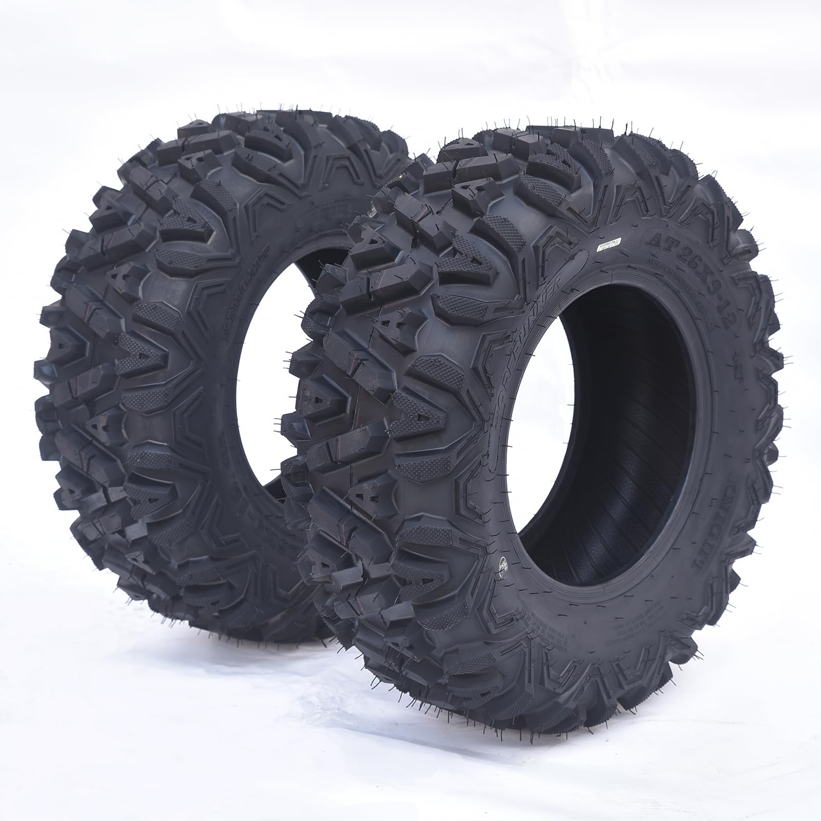
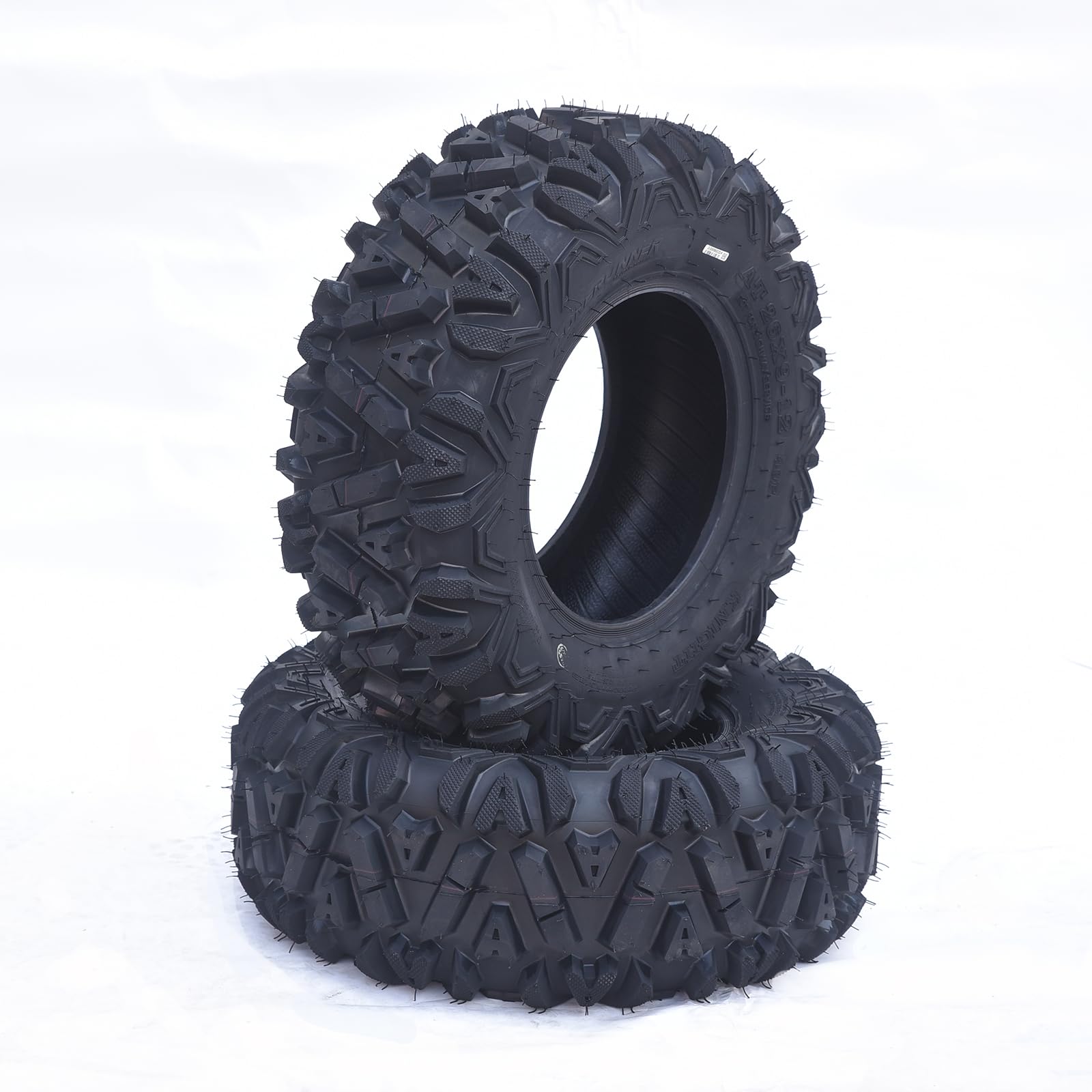
GARVEE AT26x9-12-6PR TL KNIGHT Set of 2 ATV Trail Tires 6PR Knobby Sport Tires, Tubeless – AT26x9-12-6PR TL KNIGHT
- Original price was: $175.99.$44.00Current price is: $44.00.
- Select options This product has multiple variants. The options may be chosen on the product page
-
- Sale!
- Cleaning & Janitorial Supplies > Trash Cans & Wastebaskets > Pull Out Trash Cans, GARVEE
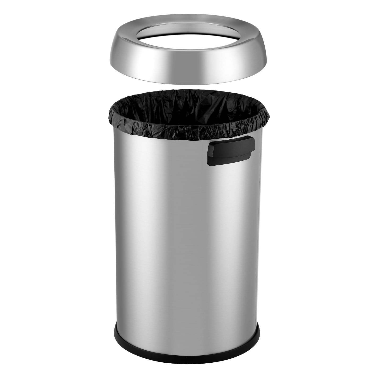
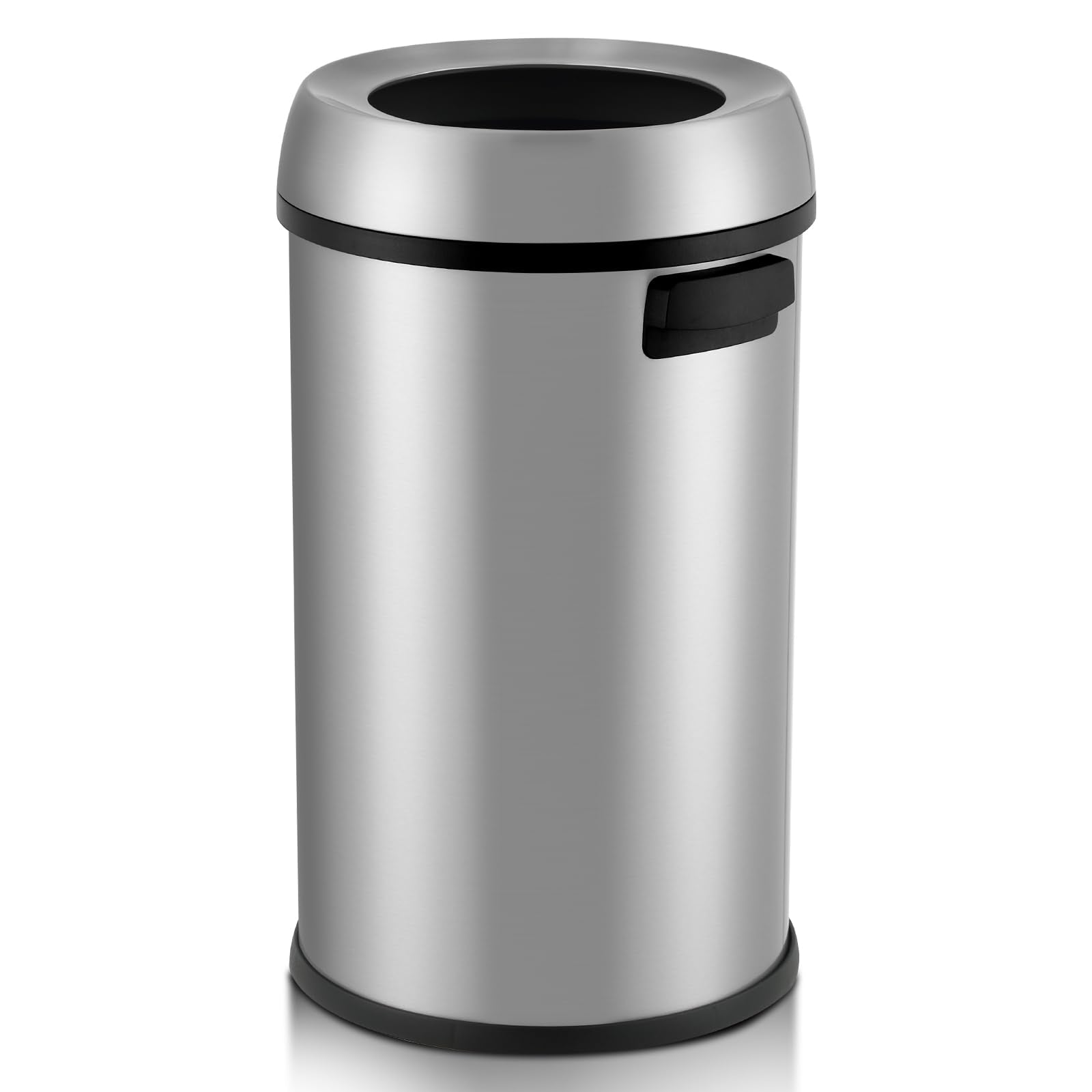
GARVEE 65L/17 Gal Open Top Trash Can Commercial Grade Heavy Duty Brushed Stainless Steel Waste Bins for Outdoor Kitchen Home House Family Online Hot Sale
- Original price was: $102.99.$25.75Current price is: $25.75.
- Select options This product has multiple variants. The options may be chosen on the product page
-
- Sale!
- GARVEE, Restaurant & Food Service > Cooking Equipment > Range Hood
430 Stainless Steel Commercial Baffle Grease Filter | 5FT UL Listed Restaurant Hood Filter | NSF Certified
- Original price was: $489.98.$98.00Current price is: $98.00.
- Select options This product has multiple variants. The options may be chosen on the product page