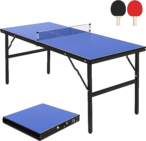
GARVEE Portable Wheelchair Ramp 3FT, Weight Capacity Up to 800 Lbs, Non-Slip Aluminum Folding Handicap Ramp, Portable Aluminum Foldable Mobility Scooter Ramp, for Home, Stairs, Steps, Curbs, Doorways
Original price was: $164.99.$41.25Current price is: $41.25.
Description
GARVEE Portable Wheelchair Ramp 3FT, Weight Capacity Up to 800 Lbs, Non-Slip Aluminum Folding Handicap Ramp, Portable Aluminum Foldable Mobility Scooter Ramp, for Home, Stairs, Steps, Curbs, Doorways
- Lightweight & Portable: Crafted from high-quality aluminum, this 3FT foldable ramp combines durability with lightweight convenience. An updated comfortable handle makes transportation easy, preventing hand injuries.
- Enhanced Non-Slip Design: Features dual non-skid protection with its aluminum surface folds and an additional non-slip layer; ensures maximum grip and safety. Comes with screws for secure wooden platform attachment.
- Safety First: Equipped with corrosion-resistant stainless steel hinges, side baffles, and reflective warning stickers for increased visibility and safety. Transition plates enable smoother entries and exits, minimizing accidents.
- High Weight Capacity: Robust construction allows this portable aluminum ramp to safely support up to 800 lbs. Ideal for mobility scooters, wheelchairs, and walkers, ensuring a wide range of users can benefit.
- Multi-Use Application: Perfect for overcoming obstacles around the home, stairs, steps, curbs, and doorways. This versatile ramp improves accessibility for everyone, offering independence and ease of movement.
Specifications
| Brand | GARVEE |
| Material | Aluminum |
| Color | Non-slip 2ft |
| Item Weight | 13.96 pounds |
| Product Dimensions | 25.2″L x 16.54″W x 3.94″H |
| Load Capacity | 800 LBS |
| Is Foldable | Yes |
.aplus_module STANDARD_PRODUCT_ATTRIBUTES h3{
margin-bottom: 10px;
}
.responsive-table {
border-collapse: collapse;
width: 100%;
margin-bottom: 20px;
}
.responsive-table td {
border: 1px solid #ddd;
padding: 8px;
text-align: left;
}
.responsive-table tr:nth-child(odd) {
background-color: #F2F2F2;
}
.responsive-table tr:nth-child(even) {
background-color: #E6E6E6;
}
.responsive-table tr:hover {
background-color: #DDDDDD;
}
@media screen and (max-width: 800px) {
.responsive-table td {
box-sizing: border-box;
width: 100%;
text-align: left;
padding: 10px;
}
.responsive-table tr:nth-child(odd) td {
background-color: #F2F2F2;
}
.responsive-table tr:nth-child(even) td {
background-color: #E6E6E6;
}
.responsive-table tr:hover td {
background-color: #DDDDDD;
}
}
.aplus_module{
margin-bottom:24px;
}
.aplus_module img{
width:100%;
}
.aplus_module h1,h2,h3,h4,h5,h6{
margin:0 !important;
}
.count_imgs_wrap{
display:flex;
}
.count_imgs_wrap>div{
flex: 1;
margin-right: 30px;
}
.count_imgs_wrap>div:last-child {
margin-right: 0;
}
@media screen and (max-width:800px){
.count_imgs_wrap{
flex-direction: column;
}
.count_imgs_wrap>div{
margin-right: 0;
}
.count_imgs{
display:flex;
justify-content: center;
}
.count_imgs>img{
width:auto;
max-width:100%;
}
}
.img_floatleft{
display:flex;
justify-content:space-between;
}
.leftwrap{
flex:3;
display:flex;
}
.lefttext{
margin:0 30px;
}
.lefttext>ul{
padding:0;
}
.lefttext>ul>li{
padding-bottom:18px;
}
.rightwrap{
flex:1;
}
.rightwrap_inner{
border-left:1px solid #dddddd;
padding-left:30px;
}
.rightwrap_inner>ul{
background-color: white;
padding:18px 32px;
border-radius: 8px;
}
@media screen and (max-width:800px){
.img_floatleft{
flex-direction: column;
}
.leftwrap{
flex-direction: column;
flex: initial;
}
.leftimage{
display:flex;
justify-content: center;
}
.leftimage>img{
max-width:100%;
width:auto;
}
.lefttext{
margin:0;
}
.lefttext>ul{
padding-left:32px;
}
.rightwrap{
flex: initial;
}
.rightwrap_inner{
border-left:0;
padding-left:0;
}
.rightwrap_inner>ul{
padding-right:0;
}
}
Additional information
| Size | 3 feet |
|---|
Related products
-
- Sale!
- Automotive > Replacement Parts > Engine Parts, GARVEE
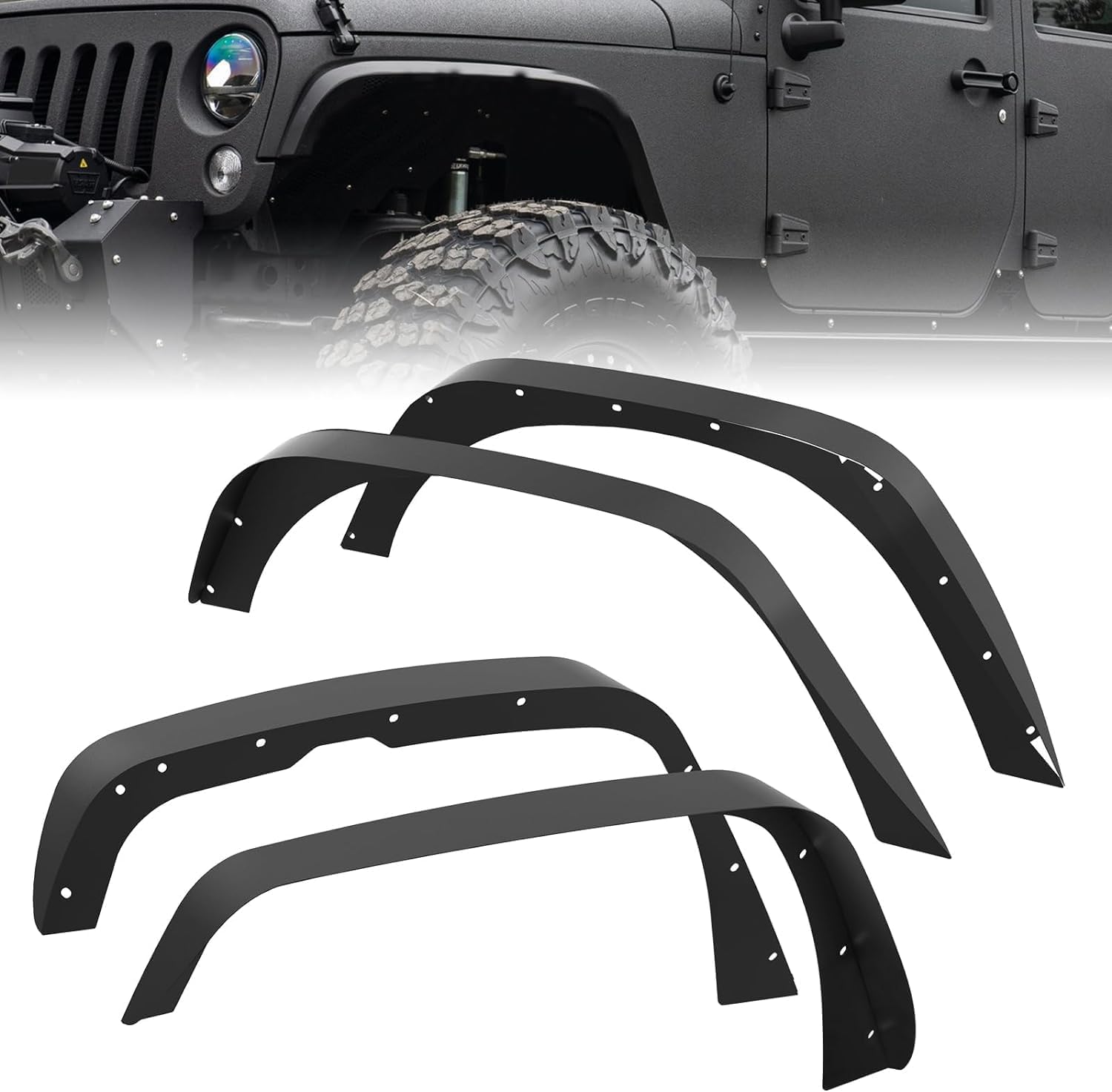
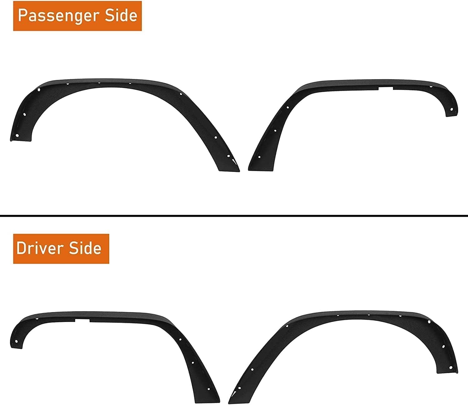
GARVEE ’18-’24 Wrangler JL Thick Solid Steel Front & Rear Fender Flares
- Original price was: $133.99.$33.50Current price is: $33.50.
- Select options This product has multiple variants. The options may be chosen on the product page
-
- Sale!
- GARVEE, Home & Kitchen > Rugs > Oriental Rugs
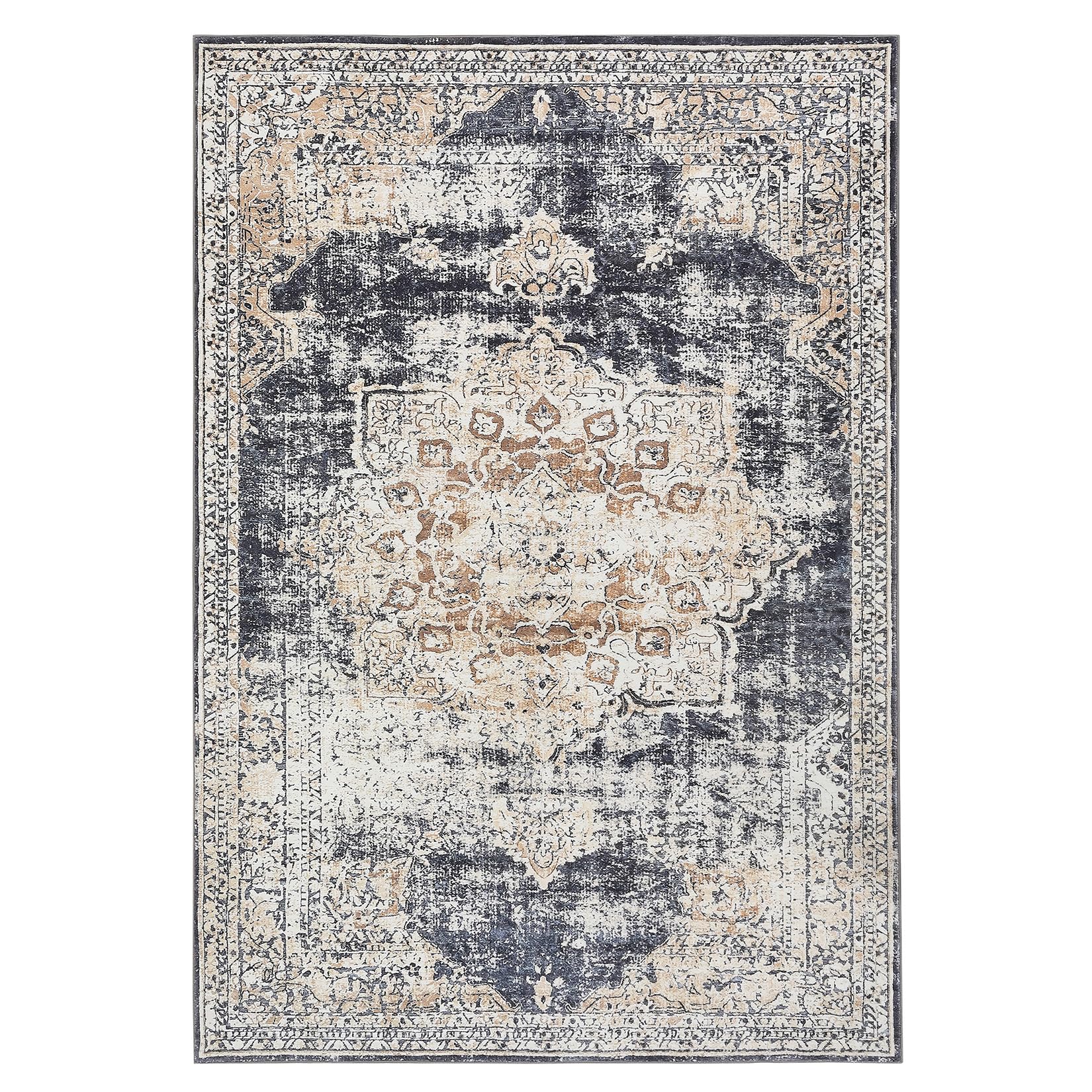
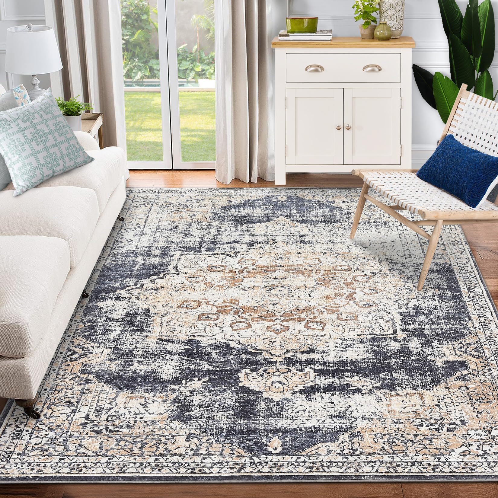
GARVEE – Alfombra clásico Lavable, con Estampado de medallón Oriental, con Respaldo de Goma de Perfil bajo, Ideal para Sala de Estar, Comedor, recámara, Oficina, Color Beige, 9 x 12 Pulgadas
- Original price was: $158.99.$39.75Current price is: $39.75.
- Select options This product has multiple variants. The options may be chosen on the product page
-
-
Sale!
- GARVEE, Home & Kitchen > Seasonal Decor > Halloween Decorations
GARVEE – Cadena de luces solares para decoración de Halloween, luces solares impermeables al aire última intervensión, luces LED para interiores para decoración de fiesta, patio, jardín, hogar
- Original price was: $30.99.$12.40Current price is: $12.40.
- Select options This product has multiple variants. The options may be chosen on the product page
-
Sale!