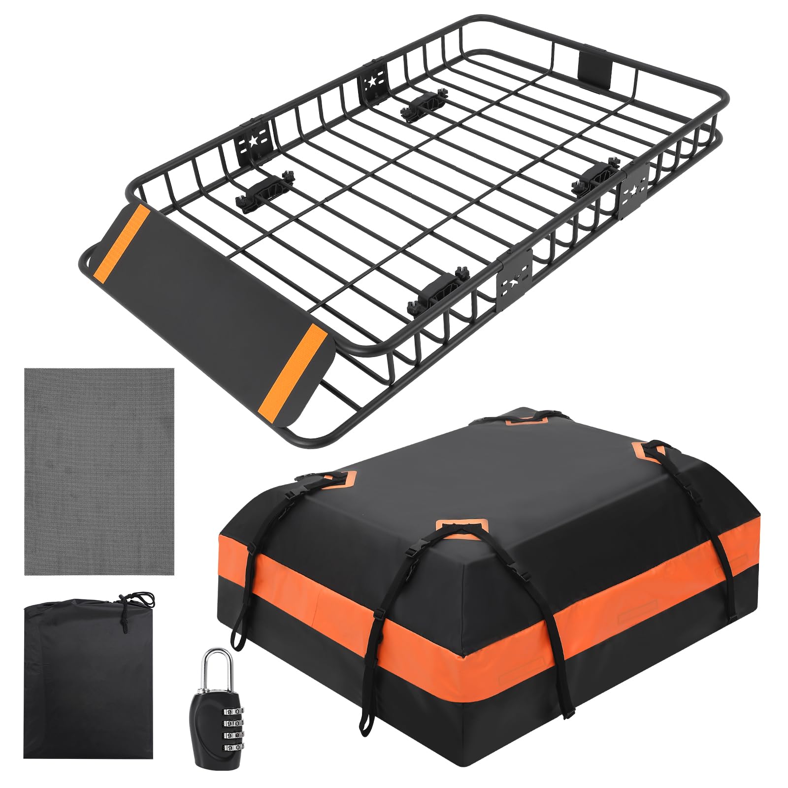
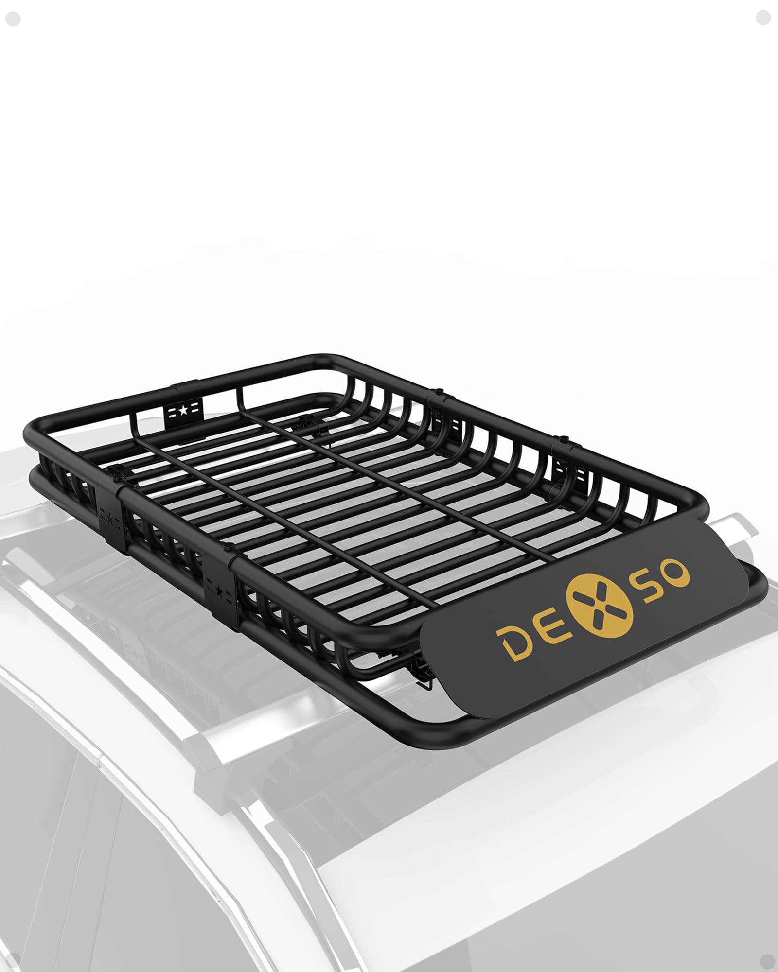


GARVEE Roof Rack Cargo Basket 64″x39″x6″ + Waterproof Cargo Bag 21 Cubic Feet – High Capacity, Premium Material, 200 LBS Capacity, Universal Carrier for SUV, Truck, Perfect for Travel
Original price was: $169.99.$42.50Current price is: $42.50.
Description
GARVEE Roof Rack Cargo Basket 64″x39″x6″ + Waterproof Cargo Bag 21 Cubic Feet – High Capacity, Premium Material, 200 LBS Capacity, Universal Carrier for SUV, Truck, Perfect for Travel
- High Capacity & Large Space: Supports up to 200 lbs with a 15 cubic foot waterproof cargo bag (46″ x 36″ x 4.5″). Perfect for reducing trunk pressure and maximizing vehicle storage space. [Rooftop cargo carrier bag included]
- Premium Material: Constructed from PU steel with an electrophoretic black powder coating, this roof rack ensures superior corrosion resistance and durability. Thickened pipe diameter and seamless splicing enhance strength.
- Perfect for Travel: Ideal for transporting irregularly shaped items such as camping gear, bikes, and kayaks. This high-capacity luggage rack transforms your SUV or truck into the ultimate travel companion.
- Safe & Scientific Design: Features an aerodynamic front deflector to minimize wind resistance and noise. Includes an outdoor combination lock for secure roof storage, protecting your belongings during high-speed travel.
- Easy Assembly: Quick and simple to assemble and mount on your vehicle’s crossbars. This universal carrier fits most SUVs and trucks, turning your vehicle into a versatile automotive roof storage solution.
Specifications
| Brand | GARVEE |
| Model | xx5XDv7PqT0afabXQi6NpA1K |
| Item Weight | 55.3 pounds |
| Product Dimensions | 40.94 x 28.35 x 8.27 inches |
.aplus_module STANDARD_PRODUCT_ATTRIBUTES h3{
margin-bottom: 10px;
}
.responsive-table {
border-collapse: collapse;
width: 100%;
margin-bottom: 20px;
}
.responsive-table td {
border: 1px solid #ddd;
padding: 8px;
text-align: left;
}
.responsive-table tr:nth-child(odd) {
background-color: #F2F2F2;
}
.responsive-table tr:nth-child(even) {
background-color: #E6E6E6;
}
.responsive-table tr:hover {
background-color: #DDDDDD;
}
@media screen and (max-width: 800px) {
.responsive-table td {
box-sizing: border-box;
width: 100%;
text-align: left;
padding: 10px;
}
.responsive-table tr:nth-child(odd) td {
background-color: #F2F2F2;
}
.responsive-table tr:nth-child(even) td {
background-color: #E6E6E6;
}
.responsive-table tr:hover td {
background-color: #DDDDDD;
}
}
.aplus_module{
margin-bottom:24px;
}
.aplus_module img{
width:100%;
}
.aplus_module h1,h2,h3,h4,h5,h6{
margin:0 !important;
}
.count_imgs_wrap{
display:flex;
}
.count_imgs_wrap>div{
flex: 1;
margin-right: 30px;
}
.count_imgs_wrap>div:last-child {
margin-right: 0;
}
@media screen and (max-width:800px){
.count_imgs_wrap{
flex-direction: column;
}
.count_imgs_wrap>div{
margin-right: 0;
}
.count_imgs{
display:flex;
justify-content: center;
}
.count_imgs>img{
width:auto;
max-width:100%;
}
}
.img_floatleft{
display:flex;
justify-content:space-between;
}
.leftwrap{
flex:3;
display:flex;
}
.lefttext{
margin:0 30px;
}
.lefttext>ul{
padding:0;
}
.lefttext>ul>li{
padding-bottom:18px;
}
.rightwrap{
flex:1;
}
.rightwrap_inner{
border-left:1px solid #dddddd;
padding-left:30px;
}
.rightwrap_inner>ul{
background-color: white;
padding:18px 32px;
border-radius: 8px;
}
@media screen and (max-width:800px){
.img_floatleft{
flex-direction: column;
}
.leftwrap{
flex-direction: column;
flex: initial;
}
.leftimage{
display:flex;
justify-content: center;
}
.leftimage>img{
max-width:100%;
width:auto;
}
.lefttext{
margin:0;
}
.lefttext>ul{
padding-left:32px;
}
.rightwrap{
flex: initial;
}
.rightwrap_inner{
border-left:0;
padding-left:0;
}
.rightwrap_inner>ul{
padding-right:0;
}
}
Additional information
| Size | 64+21 |
|---|
Related products
-
- Sale!
- Automotive > Automotive Accessories > Tonneau Cover, GARVEE
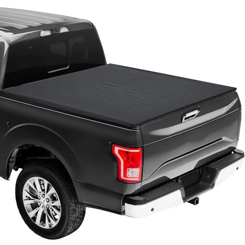
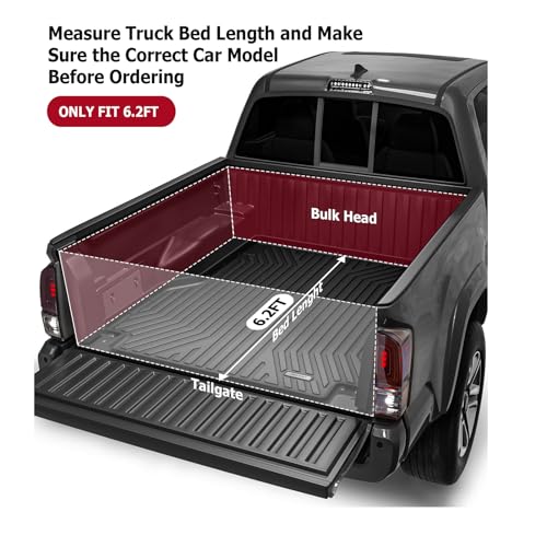
GARVEE ’15-’23 Colorado 6.2ft Soft Roll-Up Tonneau Cover Online Hot Sale
- Original price was: $164.99.$41.25Current price is: $41.25.
- Select options This product has multiple variants. The options may be chosen on the product page
-
- Sale!
- Furniture > Living Room Furniture > Cabinets & Chests, GARVEE
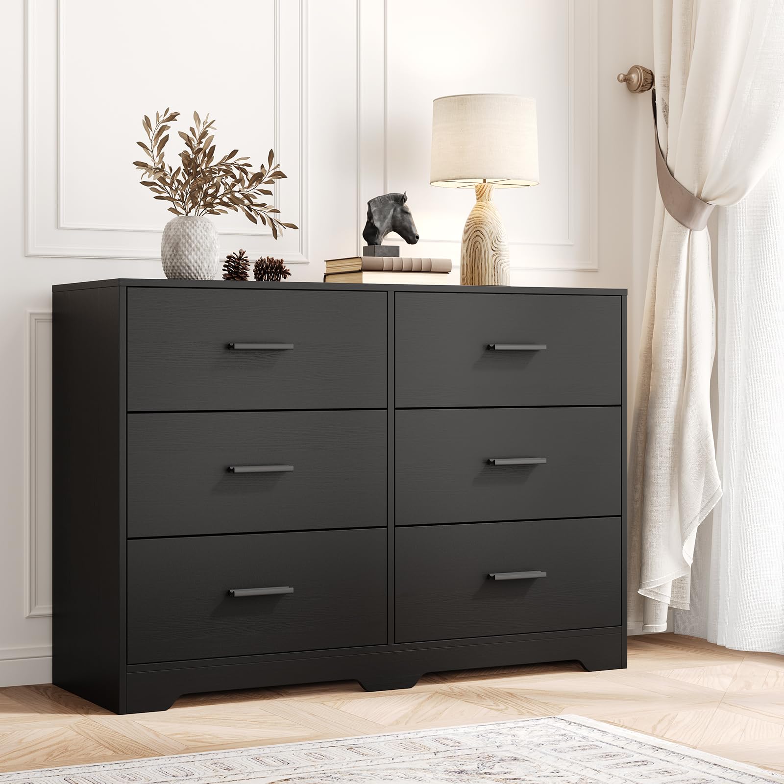
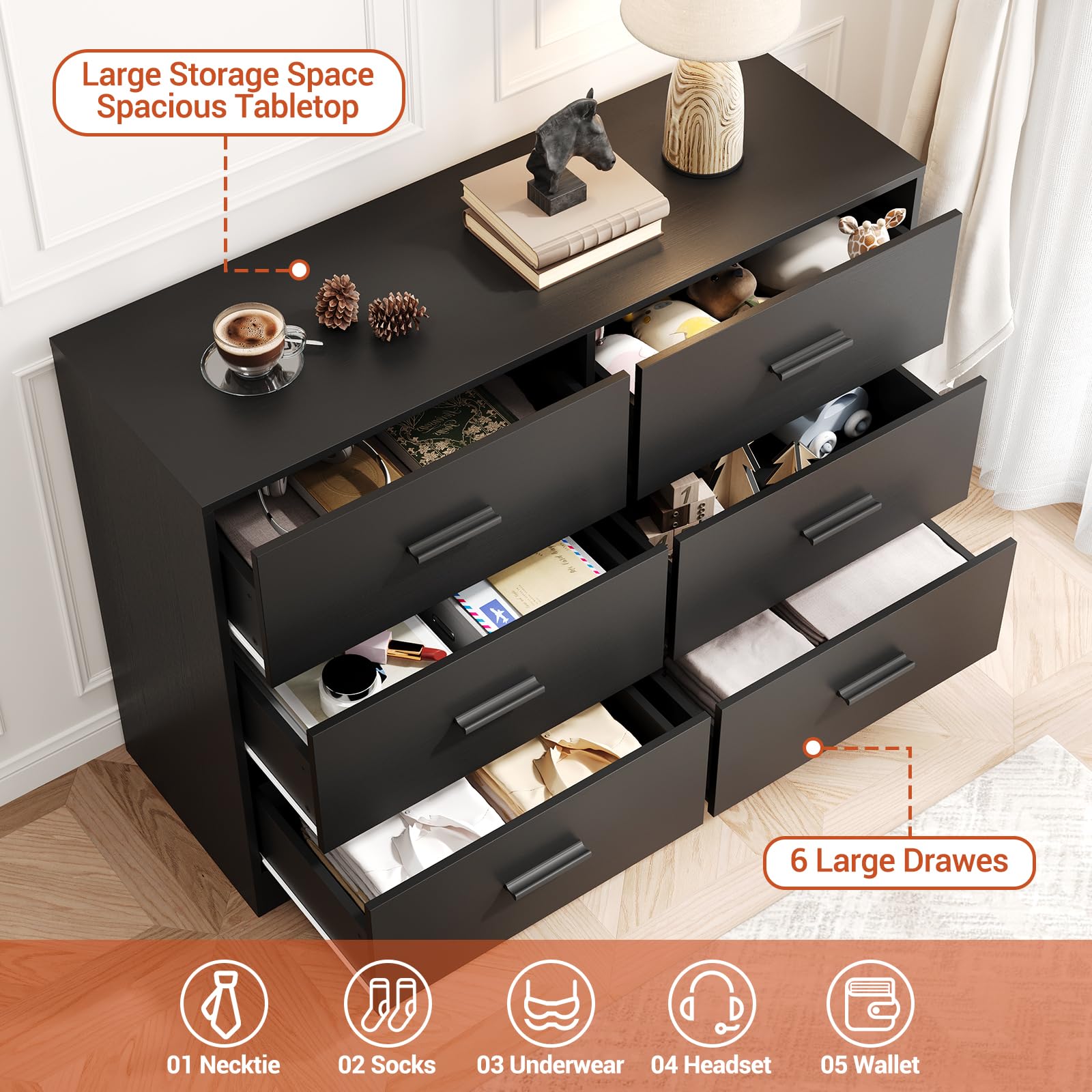
GARVEE Chest of Drawers with 6 Drawers, Modern Drawer Dresser Durable Structure with Deep Drawers,Anti-Tipping Device for Home,Office, Living Room In Black
- Original price was: $312.99.$62.60Current price is: $62.60.
- Select options This product has multiple variants. The options may be chosen on the product page
-
- Sale!
- GARVEE, Restaurant & Food Service > Cooking Equipment > Range Hood
430 Stainless Steel Commercial Baffle Grease Filter | 5FT UL Listed Restaurant Hood Filter | NSF Certified
- Original price was: $489.98.$98.00Current price is: $98.00.
- Select options This product has multiple variants. The options may be chosen on the product page