GARVEE Stainless Steel Equipment Grill Stand, 48 x 28 x 24 inch Grill Stand Table with Adjustable Storage Undershelf, Equipment Stand Grill Table, for Hotel, Home, Commercial Restaurant Kitchen
Original price was: $171.99.$43.00Current price is: $43.00.
Description
GARVEE Stainless Steel Equipment Grill Stand, 48 x 28 x 24 inch Grill Stand Table with Adjustable Storage Undershelf, Equipment Stand Grill Table, for Hotel, Home, Commercial Restaurant Kitchen
Material:
Crafted from heavy-duty stainless steel, built to last
Max Load:
Top shelf with a 1000 lbs
Bottom shelf supporting up to 220 lbs
Features:
Adjustable legs
2″ edge baffle
Size:
24x28x24 inch/36*28×24 inch/48*28×24 inch/24*24×24 inch
36*30×24 inch/48*30×24 inch/60*30×24 inch
Easy assembly with detailed instructions
Ideal for kitchens, outdoor barbecues, restaurants, canteens, and commercial spaces
@media screen and (max-width:800px){
.standard_image_sidebar .rightwrap_inner{
display:flex;
flex-direction:column;
align-items: center;
}
.standard_image_sidebar .rightwrap_inner>img{
width:auto;
max-width:100%;
}
.standard_image_sidebar .rightwrap_inner>ul{
width:100%;
}
.standard_image_sidebar .rightwrap{
order:1;
margin-bottom:10px;
}
.standard_image_sidebar .leftwrap{
order:2;
}
}
Stain steel prefabricated tableKitchen machinery (exhaust hood, stove, dishwasher…)Replaceable accessories (Hood Filters)Rubber floor matCleaning toolsCooler
Specifications
| Part Number | BUVOe44jZcCZfJYkW19IfQ1x0U |
| Item Weight | 44.1 pounds |
| Product Dimensions | 48 x 28 x 24 inches |
| Size | 48″ x 28″ x 24″ |
| Color | Silver |
| Finish | Stainless Steel |
| Material | Stainless Steel |
| Shape | Square |
| Item Package Quantity | 1 |
| Number Of Pieces | 1 |
| Included Components | Stainless Steel Equipment Grill Stand |
| Batteries Required? | No |
.aplus_module STANDARD_PRODUCT_ATTRIBUTES h3{
margin-bottom: 10px;
}
.responsive-table {
border-collapse: collapse;
width: 100%;
margin-bottom: 20px;
}
.responsive-table td {
border: 1px solid #ddd;
padding: 8px;
text-align: left;
}
.responsive-table tr:nth-child(odd) {
background-color: #F2F2F2;
}
.responsive-table tr:nth-child(even) {
background-color: #E6E6E6;
}
.responsive-table tr:hover {
background-color: #DDDDDD;
}
@media screen and (max-width: 800px) {
.responsive-table td {
box-sizing: border-box;
width: 100%;
text-align: left;
padding: 10px;
}
.responsive-table tr:nth-child(odd) td {
background-color: #F2F2F2;
}
.responsive-table tr:nth-child(even) td {
background-color: #E6E6E6;
}
.responsive-table tr:hover td {
background-color: #DDDDDD;
}
}
.aplus_module{
margin-bottom:24px;
}
.aplus_module img{
width:100%;
}
.aplus_module h1,h2,h3,h4,h5,h6{
margin:0 !important;
}
.count_imgs_wrap{
display:flex;
}
.count_imgs_wrap>div{
flex: 1;
margin-right: 30px;
}
.count_imgs_wrap>div:last-child {
margin-right: 0;
}
@media screen and (max-width:800px){
.count_imgs_wrap{
flex-direction: column;
}
.count_imgs_wrap>div{
margin-right: 0;
}
.count_imgs{
display:flex;
justify-content: center;
}
.count_imgs>img{
width:auto;
max-width:100%;
}
}
.img_floatleft{
display:flex;
justify-content:space-between;
}
.leftwrap{
flex:3;
display:flex;
}
.lefttext{
margin:0 30px;
}
.lefttext>ul{
padding:0;
}
.lefttext>ul>li{
padding-bottom:18px;
}
.rightwrap{
flex:1;
}
.rightwrap_inner{
border-left:1px solid #dddddd;
padding-left:30px;
}
.rightwrap_inner>ul{
background-color: white;
padding:18px 32px;
border-radius: 8px;
}
@media screen and (max-width:800px){
.img_floatleft{
flex-direction: column;
}
.leftwrap{
flex-direction: column;
flex: initial;
}
.leftimage{
display:flex;
justify-content: center;
}
.leftimage>img{
max-width:100%;
width:auto;
}
.lefttext{
margin:0;
}
.lefttext>ul{
padding-left:32px;
}
.rightwrap{
flex: initial;
}
.rightwrap_inner{
border-left:0;
padding-left:0;
}
.rightwrap_inner>ul{
padding-right:0;
}
}
Additional information
| Size | 48*28in |
|---|
Related products
-
-
Sale!
- GARVEE, Home & Kitchen > Rugs > Geometric Rugs
GARVEE Area Rug 9×12 Modern Washable Rug Abstract Rug Lines Print Non Slip Accent Rug Indoor Soft Floor Cover Contemporary Rug Carpet Living Room Bedroom Kitchen Dining Room Grey
- Original price was: $157.99.$39.50Current price is: $39.50.
- Select options This product has multiple variants. The options may be chosen on the product page
-
Sale!
-
- Sale!
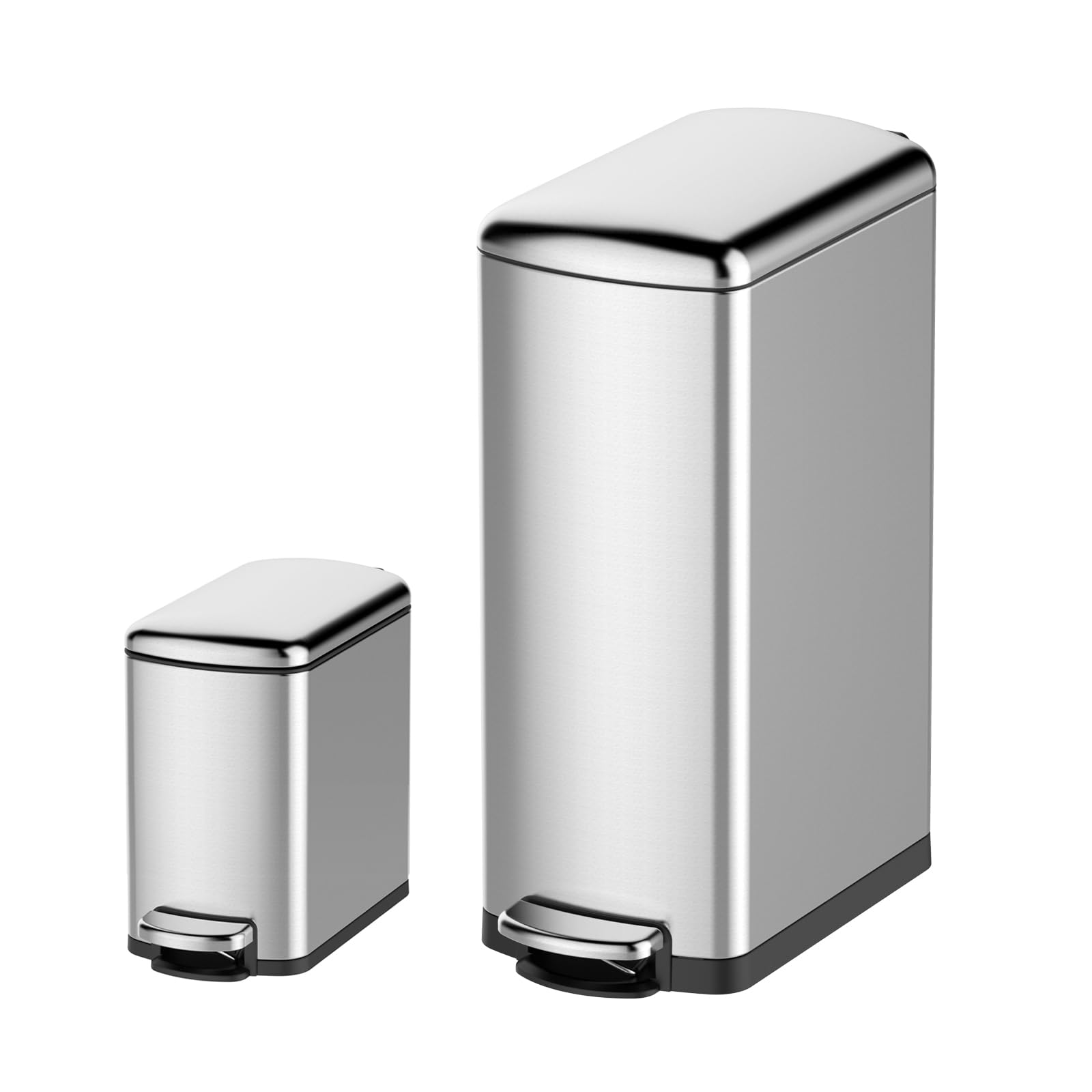
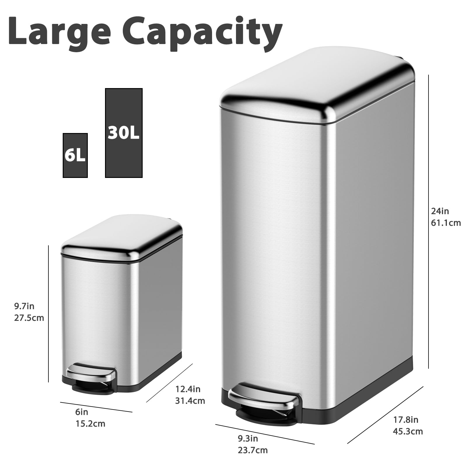
- Cleaning & Janitorial Supplies > Trash Cans & Wastebaskets > Pull Out Trash Cans, GARVEE
GARVEE Trash Can Combo Set, 8 Gallon and 1.6 Gallon Stainless Steel Step Trash Can for Office, Kitchen
- Original price was: $83.99.$25.20Current price is: $25.20.
- Select options This product has multiple variants. The options may be chosen on the product page
-
- Sale!
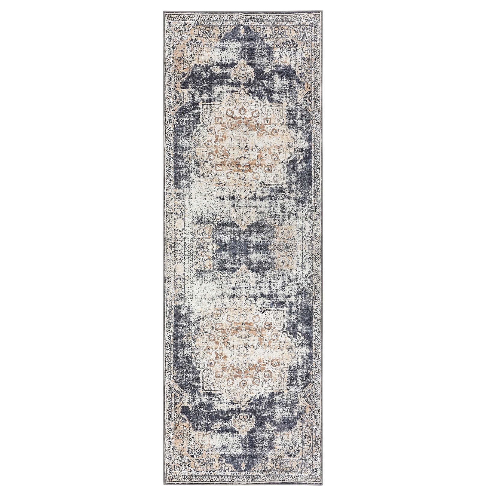
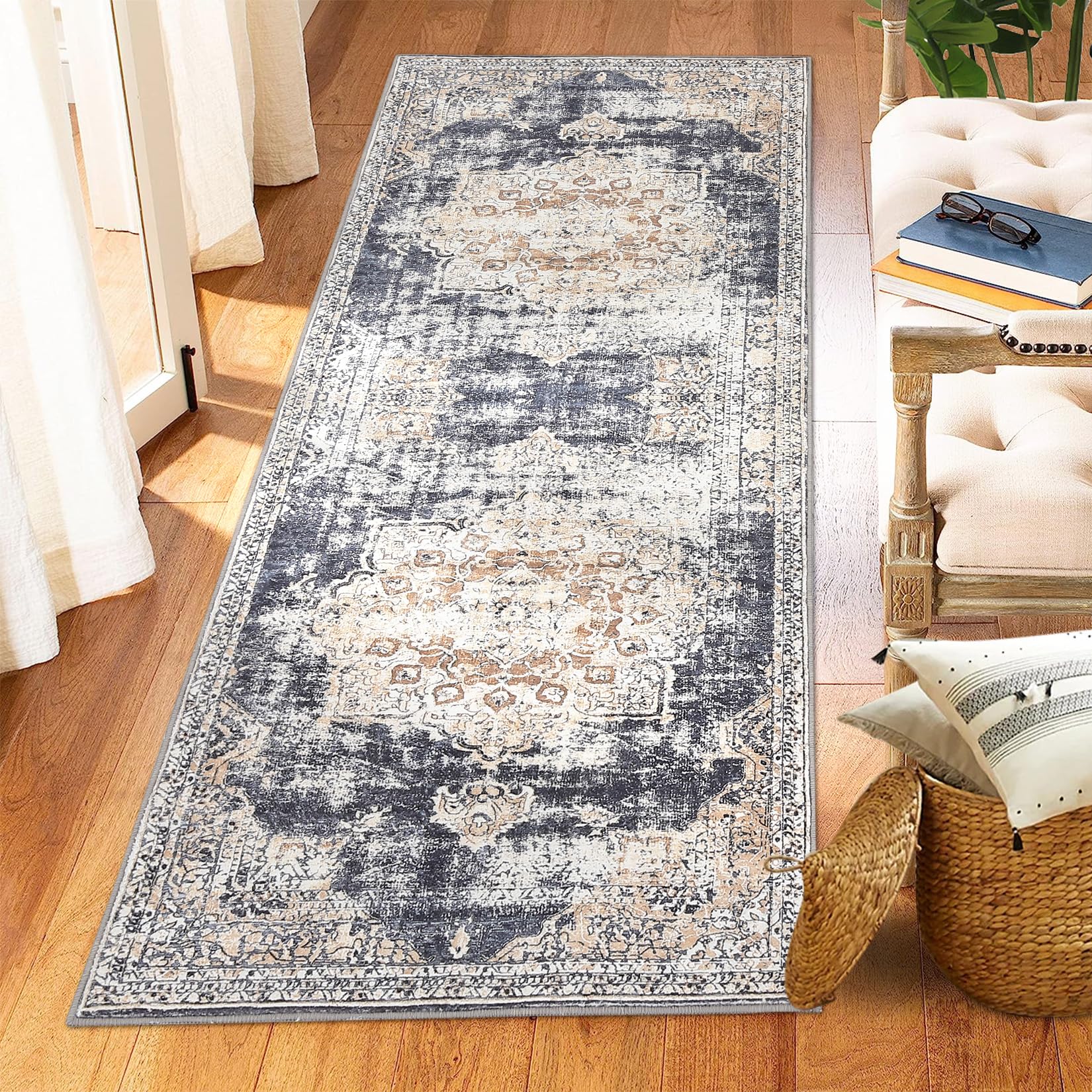
- GARVEE, Home & Kitchen > Rugs > Oriental Rugs
GARVEE – Alfombra clásico Lavable, de 2 x 6 Pulgadas, con diseño de medallón Oriental, Parte Trasera de Goma de Perfil bajo, Ideal para Sala de Estar, Comedor, recámara, Oficina, Color Beige
- Original price was: $38.99.$15.60Current price is: $15.60.
- Select options This product has multiple variants. The options may be chosen on the product page