


GARVEE Trunk Bed Tent for Camping – Waterproof PU2000mm, Spacious Double Layer Design, Includes Rainfly and Storage Bag
Original price was: $97.99.$29.40Current price is: $29.40.
Description
GARVEE Trunk Bed Tent for Camping – Waterproof PU2000mm, Spacious Double Layer Design, Includes Rainfly and Storage Bag
- 【Quick & Easy Setup】: The GARVEE Trunk Bed Tent features an integrated design for hassle-free assembly. Simply secure it with ropes after setup and enjoy a seamless camping experience.
- 【Superior Ventilation】: The top mesh window design ensures excellent airflow and transparency, allowing you to enjoy the outdoor ambiance without worrying about mosquito bites or stuffy surroundings.
- 【Spacious Interior】: With a 5.5-foot standing height, this trunk bed tent offers ample room to stretch, relax, and store your gear. Comfortably sleeps 2 adults, making it perfect for couples or solo adventurers.
- 【Weatherproof Protection】: Constructed with water-resistant fabric and tape-sealed seams (PU 2000mm), this trunk bed tent keeps you dry and comfortable in any weather, ensuring a cozy night’s sleep.
- – 【Durable & Secure】: The sturdy frame and strapping system provide stability even in windy conditions. Suitable for various truck models, including Ford, Ram, Titan, Colorado, Sierra, and Tacoma.
Specifications
| Brand | GARVEE |
| Product Dimensions | 98″L x 63″W x 67″H |
| Item Weight | 11.68 Pounds |
| Recommended Uses For Product | Camping & Hiking |
| Occupancy | 2 Person |
| Seasons | 4 Season |
| Included Components | truck bed tents |
| Occupant Capacity | 2 |
| Material | Polyester |
| Color | Grey |
| Product Care Instructions | Machine Wash |
| Size | Mid Size |
| Closure Type | Zipper |
| Water Resistance Level | Waterproof |
| Model Name | truck bed tents |
| Item Package Dimensions L x W x H | 20 x 10 x 9.5 inches |
| Package Weight | 5.74 Kilograms |
| Item Dimensions LxWxH | 98 x 63 x 67 inches |
| Brand Name | GARVEE |
| Warranty Description | 30 days manufacturer |
| Part Number | -pPri326nXueRV8W8VdJUwwu7I |
.aplus_module STANDARD_PRODUCT_ATTRIBUTES h3{
margin-bottom: 10px;
}
.responsive-table {
border-collapse: collapse;
width: 100%;
margin-bottom: 20px;
}
.responsive-table td {
border: 1px solid #ddd;
padding: 8px;
text-align: left;
}
.responsive-table tr:nth-child(odd) {
background-color: #F2F2F2;
}
.responsive-table tr:nth-child(even) {
background-color: #E6E6E6;
}
.responsive-table tr:hover {
background-color: #DDDDDD;
}
@media screen and (max-width: 800px) {
.responsive-table td {
box-sizing: border-box;
width: 100%;
text-align: left;
padding: 10px;
}
.responsive-table tr:nth-child(odd) td {
background-color: #F2F2F2;
}
.responsive-table tr:nth-child(even) td {
background-color: #E6E6E6;
}
.responsive-table tr:hover td {
background-color: #DDDDDD;
}
}
.aplus_module{
margin-bottom:24px;
}
.aplus_module img{
width:100%;
}
.aplus_module h1,h2,h3,h4,h5,h6{
margin:0 !important;
}
.count_imgs_wrap{
display:flex;
}
.count_imgs_wrap>div{
flex: 1;
margin-right: 30px;
}
.count_imgs_wrap>div:last-child {
margin-right: 0;
}
@media screen and (max-width:800px){
.count_imgs_wrap{
flex-direction: column;
}
.count_imgs_wrap>div{
margin-right: 0;
}
.count_imgs{
display:flex;
justify-content: center;
}
.count_imgs>img{
width:auto;
max-width:100%;
}
}
.img_floatleft{
display:flex;
justify-content:space-between;
}
.leftwrap{
flex:3;
display:flex;
}
.lefttext{
margin:0 30px;
}
.lefttext>ul{
padding:0;
}
.lefttext>ul>li{
padding-bottom:18px;
}
.rightwrap{
flex:1;
}
.rightwrap_inner{
border-left:1px solid #dddddd;
padding-left:30px;
}
.rightwrap_inner>ul{
background-color: white;
padding:18px 32px;
border-radius: 8px;
}
@media screen and (max-width:800px){
.img_floatleft{
flex-direction: column;
}
.leftwrap{
flex-direction: column;
flex: initial;
}
.leftimage{
display:flex;
justify-content: center;
}
.leftimage>img{
max-width:100%;
width:auto;
}
.lefttext{
margin:0;
}
.lefttext>ul{
padding-left:32px;
}
.rightwrap{
flex: initial;
}
.rightwrap_inner{
border-left:0;
padding-left:0;
}
.rightwrap_inner>ul{
padding-right:0;
}
}
Additional information
| Size | Mid Size |
|---|
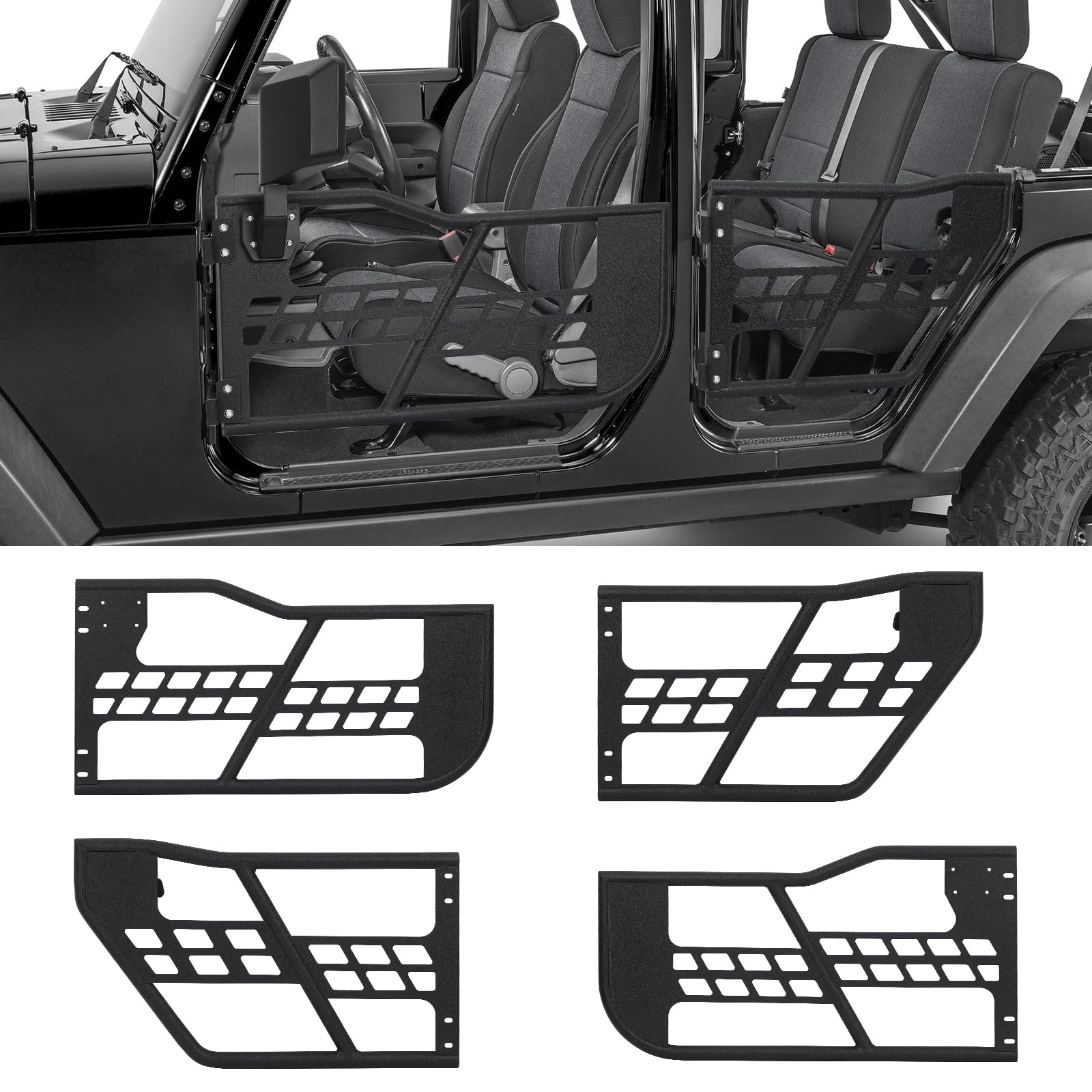
Related products
-
- Sale!
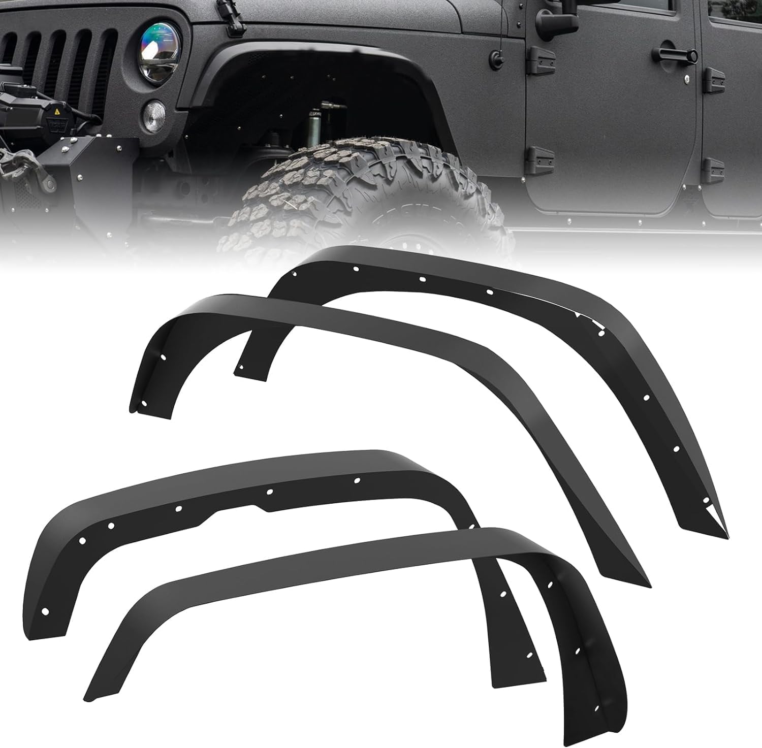
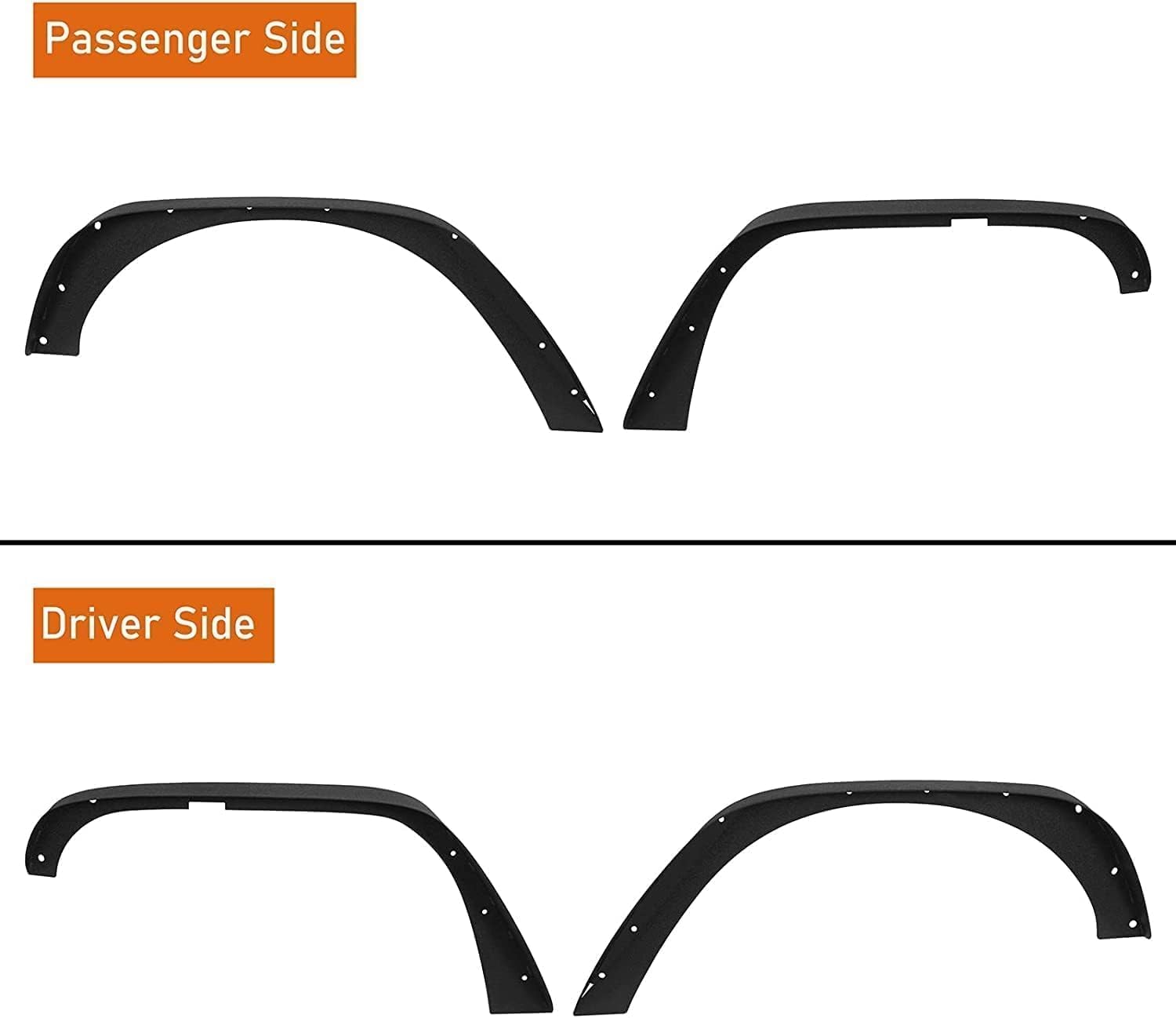
- Automotive > Replacement Parts > Engine Parts, GARVEE
GARVEE ’18-’24 Wrangler JL Thick Solid Steel Front & Rear Fender Flares
- Original price was: $133.99.$33.50Current price is: $33.50.
- Select options This product has multiple variants. The options may be chosen on the product page
-
- Sale!
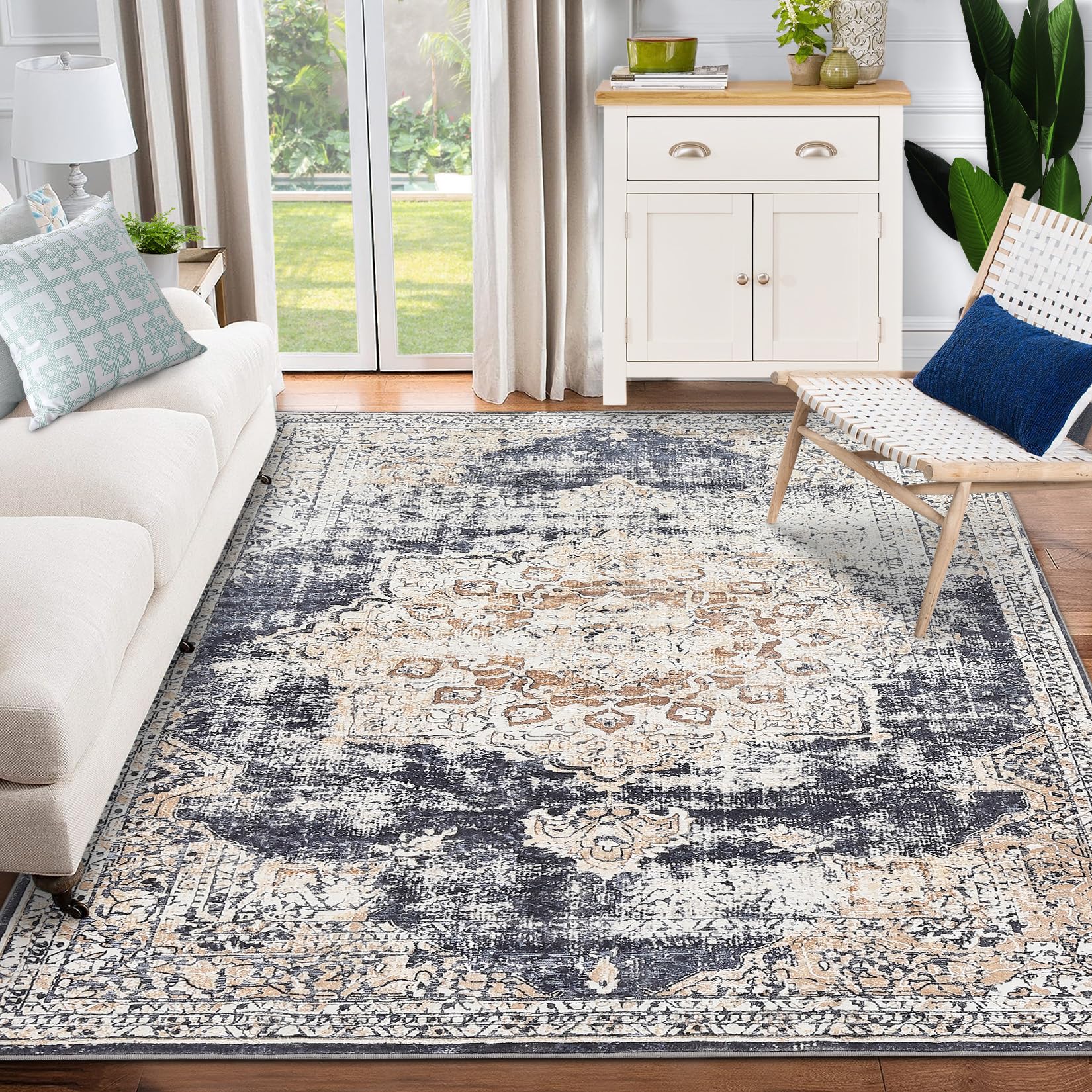
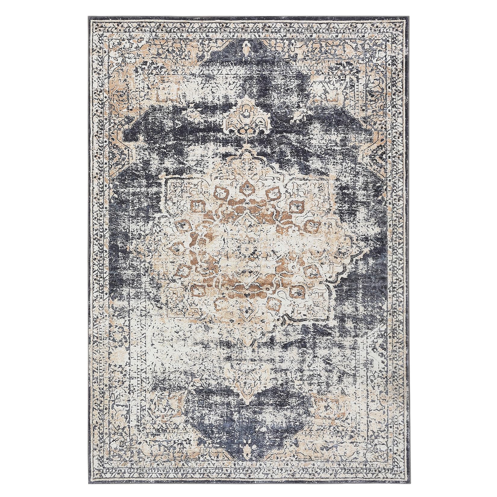
- GARVEE, Home & Kitchen > Rugs > Oriental Rugs
GARVEE – Alfombra clásico Lavable, con Estampado de medallón Oriental, con Respaldo de Goma de Perfil bajo, Ideal para Sala de Estar, Comedor, recámara, Oficina, Color Beige, 8 x 10 Pulgadas
- Original price was: $124.99.$31.25Current price is: $31.25.
- Select options This product has multiple variants. The options may be chosen on the product page
-
- Sale!
- GARVEE, Home & Kitchen > Rugs > Oriental Rugs
GARVEE – Alfombra clásico Lavable, con Estampado de medallón Oriental, con Respaldo de Goma de Perfil bajo, Ideal para Sala de Estar, Comedor, recámara, Oficina, Color Beige, 4 x 6 Pulgadas
- Original price was: $50.99.$15.30Current price is: $15.30.
- Select options This product has multiple variants. The options may be chosen on the product page