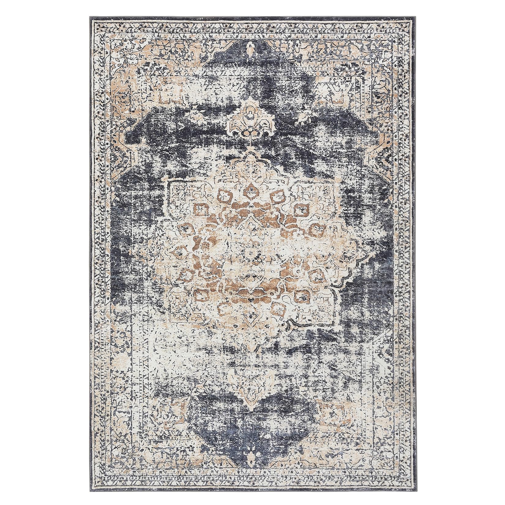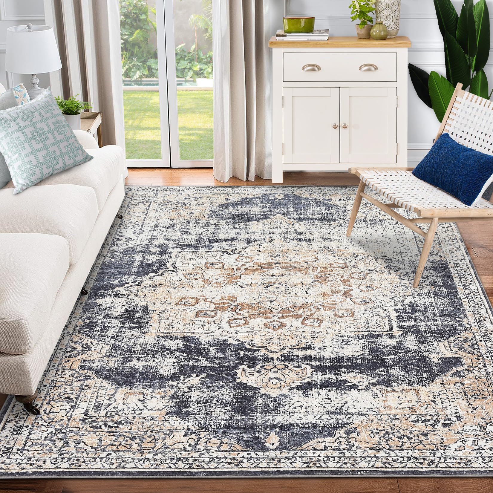
GARVEE Vintage Area Rugs, Boho Traditional Washable Rug Floral Print Carpet, Low Pile Non-Slip Rubber Backing Foldable Mat for Bedroom Dining Room Office Living Room, Blue, 8×10
Original price was: $124.99.$31.25Current price is: $31.25.
Description
GARVEE Vintage Area Rugs, Boho Traditional Washable Rug Floral Print Carpet, Low Pile Non-Slip Rubber Backing Foldable Mat for Bedroom Dining Room Office Living Room, Blue, 8×10
Generously sized rug offers a statement piece for a variety of interior settings, making it an ideal choice for home decor.
Whether placed in the entryway to create a warm and welcoming first impression, in the bedroom to enhance the cozy and relaxing ambiance, or in the living room, kitchen or office to add an artistic touch, this rug effortlessly complements different spaces.
Its versatile size creates a captivating focal point that unites the aesthetic and functional aspects of room design, providing a harmonious and visually appealing base for other decor elements.
Specifications
| Brand | GARVEE |
| Size | 8×10 |
| Material | Polyester |
| Weave Type | Machine Made |
| Pile Height | Low Pile |
| Construction Type | Machine Made |
| Back Material Type | Rubber |
| Color | Blue |
| Indoor/Outdoor Usage | Indoor |
| Theme | Floral |
| Pattern | Floral |
| Shape | Rectangular |
| Special Feature | Non Slip |
| Room Type | Dining Room |
| Product Dimensions | 120″L x 96″W |
| Rug Form Type | Area Rug |
| Style | Bohemian |
| Model Name | GAOWQ-0ZXCOF58 |
| UPC | 196336987709 |
| Item Weight | 20 pounds |
.responsive-table {
border-collapse: collapse;
width: 100%;
margin-bottom: 20px;
}
.responsive-table td {
border: 1px solid #ddd;
padding: 8px;
text-align: left;
}
.responsive-table tr:nth-child(odd) {
background-color: #F2F2F2;
}
.responsive-table tr:nth-child(even) {
background-color: #E6E6E6;
}
.responsive-table tr:hover {
background-color: #DDDDDD;
}
@media screen and (max-width: 600px) {
.responsive-table td {
box-sizing: border-box;
display: block;
width: 100%;
text-align: left;
padding: 10px;
}
.responsive-table tr:nth-child(odd) td {
background-color: #F2F2F2;
}
.responsive-table tr:nth-child(even) td {
background-color: #E6E6E6;
}
.responsive-table tr:hover td {
background-color: #DDDDDD;
}
}
.aplus_module{
margin-bottom:24px;
}
.aplus_module img{
width:100%;
}
.aplus_module h1,h2,h3,h4,h5,h6{
margin:0 !important;
}
.count_imgs_wrap{
display:flex;
}
.count_imgs_wrap>div{
flex: 1;
margin-right: 30px;
}
.count_imgs_wrap>div:last-child {
margin-right: 0;
}
@media screen and (max-width:800px){
.count_imgs_wrap{
flex-direction: column;
}
.count_imgs_wrap>div{
margin-right: 0;
}
.count_imgs{
display:flex;
justify-content: center;
}
.count_imgs>img{
width:auto;
max-width:100%;
}
}
.img_floatleft{
display:flex;
justify-content:space-between;
}
.leftwrap{
flex:3;
display:flex;
}
.lefttext{
margin:0 30px;
}
.lefttext>ul{
padding:0;
}
.lefttext>ul>li{
padding-bottom:18px;
}
.rightwrap{
flex:1;
}
.rightwrap_inner{
border-left:1px solid #dddddd;
padding-left:30px;
}
.rightwrap_inner>ul{
background-color: white;
padding:18px 32px;
border-radius: 8px;
}
@media screen and (max-width:800px){
.img_floatleft{
flex-direction: column;
}
.leftwrap{
flex-direction: column;
flex: initial;
}
.leftimage{
display:flex;
justify-content: center;
}
.leftimage>img{
max-width:100%;
width:auto;
}
.lefttext{
margin:0;
}
.lefttext>ul{
padding-left:32px;
}
.rightwrap{
flex: initial;
}
.rightwrap_inner{
border-left:0;
padding-left:0;
}
.rightwrap_inner>ul{
padding-right:0;
}
}
.content-block:not(:first-child) {
display: none;
}
.content-block{
display:flex;
}
.content-block>img{
width:auto;
max-width:50%;
margin-right:35px;
}
.selection-area{
display:flex;
margin:15px 0;
}
.selection{
width:80px;
margin-right:30px;
cursor: pointer;
}
.selection img{
border:1px solid #888888;
}
.selection_img_wrap{
position:relative;
}
.selection_mouseover::before {
content: “”;
position: absolute;
top: 0;
left: 0;
width: 100%;
height: 100%;
background: rgba(255, 255, 255, 0.5);
}
@media screen and (max-width:800px){
.selection-area{
display:none;
}
.content-block{
display:flex !important;
flex-direction:column;
align-item:center;
}
.content-area .content-block>img{
width:auto;
max-width:100%;
margin-right:0;
}
.multiple_image_text{
width:100%;
}
}
Additional information
| Color | Blue |
|---|---|
| Size | 8' x 10' |
Related products
-
- Sale!
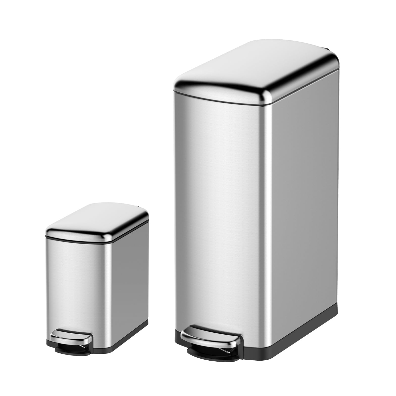
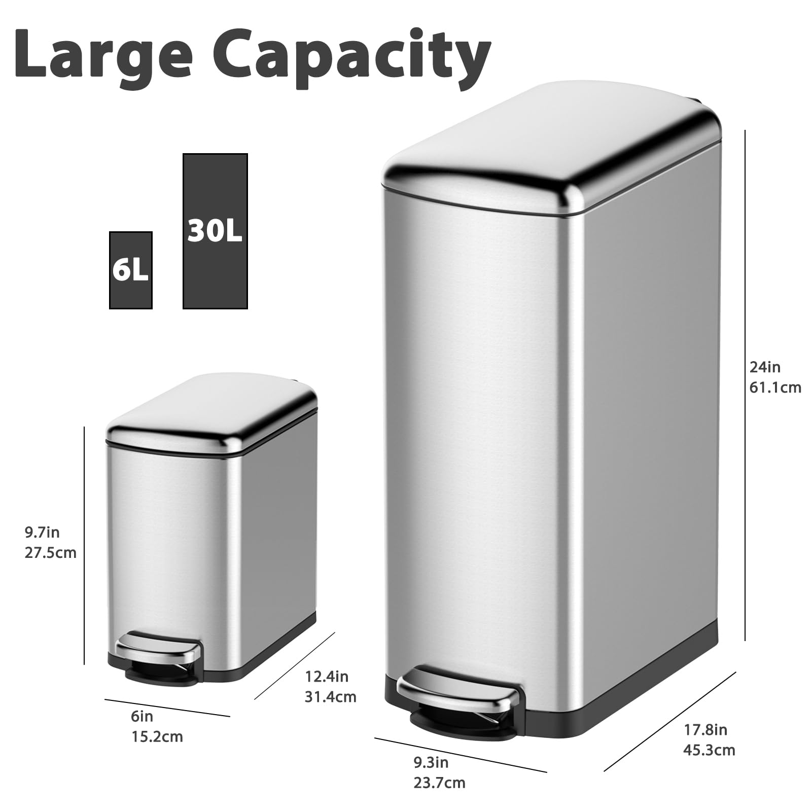
- Cleaning & Janitorial Supplies > Trash Cans & Wastebaskets > Pull Out Trash Cans, GARVEE
GARVEE Trash Can Combo Set, 8 Gallon and 1.6 Gallon Stainless Steel Step Trash Can for Office, Kitchen
- Original price was: $83.99.$25.20Current price is: $25.20.
- Select options This product has multiple variants. The options may be chosen on the product page
-
- Sale!
- GARVEE, Home & Kitchen > Rugs > Oriental Rugs
GARVEE – Alfombra clásico Lavable, con Estampado de medallón Oriental, con Respaldo de Goma de Perfil bajo, Ideal para Sala de Estar, Comedor, recámara, Oficina, Color Beige, 5 x 7 Pulgadas
- Original price was: $63.99.$19.20Current price is: $19.20.
- Select options This product has multiple variants. The options may be chosen on the product page
-
- Sale!
- GARVEE, Home & Kitchen > Rugs > Oriental Rugs
GARVEE – Alfombra clásico Lavable, con Estampado de medallón Oriental, con Respaldo de Goma de Perfil bajo, Ideal para Sala de Estar, Comedor, recámara, Oficina, Color Beige, 9 x 12 Pulgadas
- Original price was: $158.99.$39.75Current price is: $39.75.
- Select options This product has multiple variants. The options may be chosen on the product page